Presenting Environmental Data
What can we do with environmental data to understand it and communicate with it?
There are some first things we can do with data to get an idea of what’s happening, like plotting a sensor measurement against time. Then there are ways we can ultimately present environmental data so that it communicates something meaningful, spurs advocacy, and avoids reducing real environmental harms to a data point.
Data visualizations like graphs, charts, maps, art, and other interactive media can tell a story. We can also use non-visual ways, like sound and touch.
We’re collecting resources below on kinds of environmental data and ways to present it--please add to this page to improve it and make it more helpful! Creative ideas that go beyond trend lines or bar graphs are super welcome and appreciated!
Questions about presenting data
Questions tagged with question:presenting-data will appear here
Activities about presenting data
Activity posts tagged with activity:presenting-data will appear here
| Title | Author | Updated | Likes | Comments |
|---|---|---|---|---|
| Visualize data from a Simple Air Sensor using onboard serial hardware | @bhamster | over 3 years ago | 1 | 2 |
| How to visualize your location-based data in QGIS | @laurel_mire | over 3 years ago | 3 | 1 |
| Data Visualization with Sheet Mapper: How to connect a live spreadsheet to a web map | @laurel_mire | over 3 years ago | 3 | 2 |
| Creating a Box Plot to Identify Potential Outliers Using CODAP | @mimiss | almost 5 years ago | 1 | 5 |
Activities should include a materials list, costs and a step-by-step guide to construction with photos. Learn what makes a good activity here.
Kinds of environmental data you might have
Environmental data can come in many forms depending on how and where you collect it. Here are some common examples:
Measurements from sensors
- Data collected continuously over time from a sensor that stays in one place.
- Example: an air quality monitor placed outside your home that measures particulate matter concentrations every 10 seconds 24 hours a day
- Data you’ll have: date/time, environmental measurements. Potentially lots of data if the sensor is capturing data frequently.
- Data collected intermittently (at certain times of the day) at a single location or at several different locations
- Example: a portable water quality sensor taken to different locations along a stream every morning for several months
- Data you’ll have: date/time, environmental measurements, location (maybe noted manually, separate from the sensor data).
Measurements from collected samples
- Grab samples
- Example: an air bucket monitor taken to a landfill site soon after nearby residents report strong odors. The monitor collects an air sample at a specific location and time and is analyzed in a lab.
- Data you’ll have: environmental measurements for a sample, reported from the testing lab. Each sample measurement is associated with a sampling location and time (or, an average measurement if you’ve mixed samples from different locations and times).
More forms of environmental data
- Visual observations
- Odor logs
- Oral histories
The air quality data wiki also has a section with examples of different kinds of data
If you haven’t started collecting data yet, check out some guidance on designing an environmental study---the design step is where you figure out where and when to collect data based on the specific questions you have about a local concern. There’s also more information on sampled data and continuous monitoring data in the “Types of Samples” section.
Ways to present environmental data
Scatter plots and line graphs
Shows how individual data points change against another kind of measure. With environmental data, line graphs often plot how something you measured in your environment changes over time.

Example 1.
Scatter plot showing particulate matter (PM2.5) concentrations measured by an air quality sensor in an apartment building. Each black dot is an individual measurement. The PM concentrations spike during a fireworks celebration. Data from @LESBreathe.
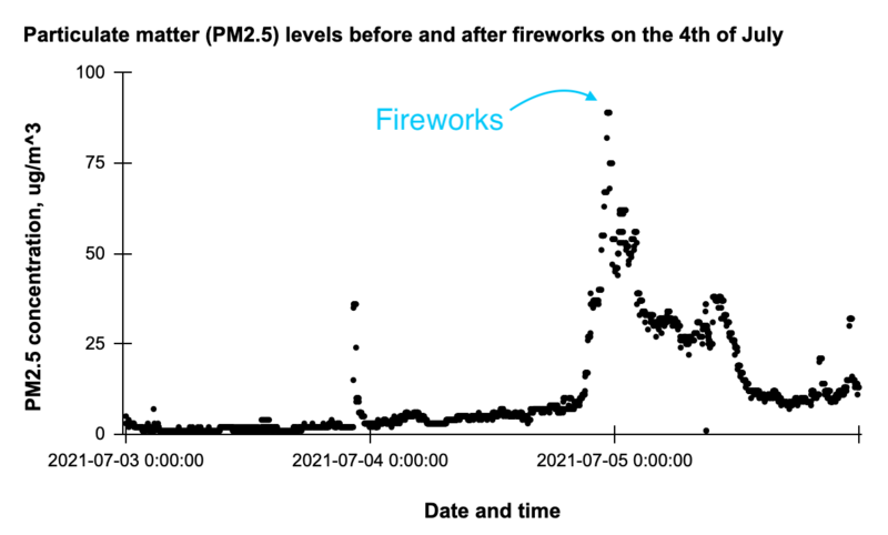
Air quality data from @LESBreathe
Example 2.
A 2-day average trendline showing dissolved oxygen (DO) in treated wastewater, measured by a sensor. The DO goes up and down throughout the day, spiking when air is injected into the water and decreasing as sewage-cleaning bacteria use it up.
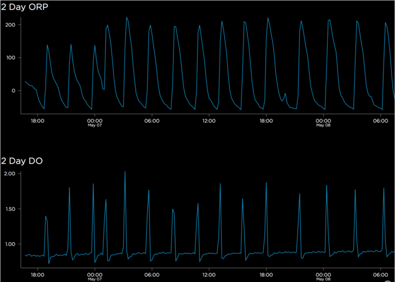
Dissolved oxygen (DO) and redox potential (ORP) sensor data from treated wastewater, by @jesseslone in this comment
More examples
- Pollutants before and after shelter in place
- Time series does not have to be linear! Here is an example visualizing Jakarta’s air quality in the form of a calendar
Trends with respect to measures other than time
- See “Effect of City Size on Air Pollution” chart from American Pollution
Bar graphs
Shows how measurements vary among different categories
Flaticon from Dinosoftlabs
Example 1.
Histograms
Made by dividing data into several non-overlapping bins of the same size (x axis) and counting the number of values that fall into each bin (y axis). Histograms look like bar graphs but display numerical data rather than categorical data. Histograms are favorable because they are easy to interpret. However, you cannot distinguish between variables if they fall into the same bin, sacrificing the “true values” to see the overall distribution of data.
Smooth Density Plots
Similar to a histogram with very small bins and a curve that runs through the top of each bar. With a bin size of 1, the y axis of a smooth density plot displays the proportion of values within that bin. Unlike a histogram, frequency (or density) is computed and displayed on the y axis rather than count. Smooth density plots are useful for ease of comparison between two different distributions or data sets.
Boxplots
Aka box and whisker plots, provide a 5 number summary of your data. Whiskers show the range of data with a box split along the quantiles (or 25th, 50th, and 75th percentiles). Outliers are shown as individual points outside of the range whisker.
Maps and aerial images
Shows how measurements vary by location. Mapping can help you show geographic patterns in data, such as pollution hotspots, or how pollution moves across space.
Example 1.
A map of soil test results from around a pond neighboring a salvage yard. Data for each heavy metal detected is shown on the map as a number times the health standard for that metal (e.g., 2x higher than the standard). From Workshop guide: Mapping soil data by @kgradow1, adapted from Statistics for Action Air Quality "Mapping Data" and generously shared with permission.
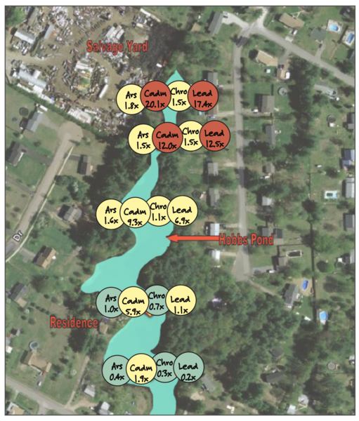
Map of Hobbs Pond with color-coded samples for each chemical found in the soil
More examples:
- Mapping the waste stream of Southern California
- Check out examples from this wiki page on using maps for community organizing and advocacy
- Storymap: Visualizing Violations of Environmental Justice Spatial Inequalities of Health and Pollution Exposure in Southwest Detroit
- Tree equity map: example from Seattle, WA
Infographics
Combine images, text, and numbers to present information.
Example 1.
A graphic about logging complex odors, by @sarasage.
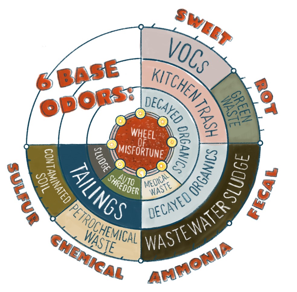
Image: Infographic about complex odors, from this post by @sarasage
Additional ways to present data
More data visualization
Audio
- Riffle-ito Rhapsody: More Data Auralization/Sonification by @lilybui
- The Coqui, a device that presents sensor information as an audible tone
Tools for data visualization and presentation


Data Visualization with Sheet Mapper: How to connect a live spreadsheet to a web map
Post by @laurel_mire 2 | over 3 years ago

More resources on understanding and presenting data
Wikis
| Title | Updated | Version | Views | Likes | |
|---|---|---|---|---|---|
| Air Quality Data | over 3 years ago by bhamster | 8 | 285 | 1 | |
| Presenting Environmental Data | over 3 years ago by bhamster | 6 | 944 | 0 | |
| Cleaning and Organizing Environmental Data | over 3 years ago by bhamster | 4 | 325 | 0 |
- Statistics for Action activities: a rich collection of resources on understanding and communicating with environmental data for community organizers.
- Rstudio Talk: The Glamour of Graphics: A talk at the 2020 RStudio conference covering design principles to make charts more persuasive and more accurately perceived.
- Environmental data visualisation for non-scientific contexts: Literature review and design framework, a paper by Sam Grainger, Feng Mao, and Wouter Buytaert. 2016. Environmental Modelling & Software, 85: 299-318
- Hands-On Data Visualization: Interactive Storytelling from Spreadsheets to Code. Open-access web edition, by Jack Dougherty and Ilya Ilyankou.