For a long time, folks making new pages and interfaces at PublicLab.org have not had much (if any) guidance or direction, and, understandably, have brought their own ideas to the project. This is great initiative, but we could do a better job setting some clear design conventions, and the whole site would benefit from some more consistency.
@sylvan and I have been working on a Style Guide to serve this purpose. This guide is designed to support coders, designers, and writers building and designing pages on PublicLab.org.
We're at a point where we could use some input and feedback, so here's a draft!
Our goals include:
Simpler and more consistent design
- Easier to understand and use: clear and well-explained guidance for design will make it easier to start doing UI work at Public Lab, and easier for people using PublicLab.org to use.
- Less customization: using standard libraries like Bootstrap 4 (http://getbootstrap.com) and less custom code will make it less fragile, more compatible and accessible, and easier to upgrade. We strongly encourage using widely familiar interface design conventions, so people don't to have to "learn how to use PublicLab.org."
- Easier to maintain: with a set of standards, it will be clearer what UI /should/ look like, and less likely that it will diverge and become inconsistent or messy. Less code will be easier to maintain at a high level of quality in the long term.
- More support and guidance for people designing new pages/interfaces
Increased stability
- Better organized UI code: cleaning up our code, reducing redundancy, and standardizing (and re-using) templates will make it easier for everyone to do good UI design overall.
- Better UI tests: our new System Tests enable testing of complex client/server interactions exactly like a user will experience them. We aim for high coverage: https://github.com/publiclab/plots2/issues/5316
- Fewer UI breakages: all of this should contribute to fewer bugs system-wide.
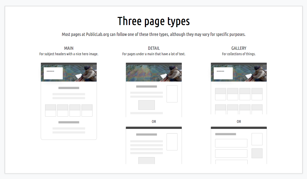
This guide won't cover every situation, but will establish an overall approach to UI design that all our work should build on cohesively.
Check out the draft style guide here -- comments and input are very welcome!
We'll be adding more and more annotations as we go, so that it's clear /why/ we've made these recommendations, and how to apply them.
We'll also be following up in a later version with code samples and links to templates!
Update
For developing more complex mockups and prototypes, this may be a great tool!
16 Comments
@warren has marked @sylvan as a co-author.
Reply to this comment...
Log in to comment
Looks great! Also, is there a Barnstar for most impressive use of GooglePresentations for layout? You two would get it.
Is this a question? Click here to post it to the Questions page.
Reply to this comment...
Log in to comment
Notes from discussion with @pdurbin:
so, we can embed gists
i'd like to embed something where you can switch to see the rendered HTML too, though
anyone know a site like that?
best would be doing that through a GitHub repository even!
yeah maybe the slide deck will be the working document
with messier comments and such
Test of embedding code example Gists in a collapsible section:
Is this a question? Click here to post it to the Questions page.
Reply to this comment...
Log in to comment
Nice!
Reply to this comment...
Log in to comment
Hi @warren I saw your comment in one of the slides regarding blue buttons everywhere. How about keeping blue for primary and main buttons but for other features like tags and all, we can have many more great combinations. I tried this in one of my PR. And this looks great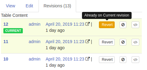
Bootstrap has many button color classes, we can try them.
Is this a question? Click here to post it to the Questions page.
Reply to this comment...
Log in to comment
Oh, interesting -- can you share a screenshot? In general, I am wondering if we can be quite sparing with colored buttons so as not to overwhelm people with choices. But I'm open to suggestions and would love to see what you've got!
On Thu, May 9, 2019 at 1:22 PM \<notifications@publiclab.org> wrote:
Is this a question? Click here to post it to the Questions page.
Oh, sorry, i didn't see the screenshot in the email, maybe I didn't wait for it to load. Thanks!
So, on a very detailed technical page like the revisions page I'm not so worried. But on leading pages, especially "above the fold," I think the question of "too many choices" and too noisy colors is something to be cautious about.
Also noting, as I commented in https://publiclab.org/notes/warren/04-22-2019/user-interface-projects-update-and-dial-osc-project-recap, that this Style Guide has expanded upon and refined work from the DIAL UI projects (in that link), and we may need to update those designs a bit.
But fundamentally the Style Guide incorporates, refines upon, and "generalizes" a lot of the work that went into that project. So they largely still stand, but the Style Guide is an attempt to make a more holistic guidance document from them that can be applied to other pages as well!
I especially wanted to note the shift, which was a major breakthrough of the DIAL UI project, away from listing all posts in a single "firehose," and towards displaying our topics. This has some really serious and excellent ramifications:
This is all still evolving, but is an important part of our Style Guide so we'd love to hear input.
Is this a question? Click here to post it to the Questions page.
Reply to this comment...
Log in to comment
Hey guys! I wanted to provide some feedback on our topic cards that have replaced the smaller tags on posts. I've been getting a lot of feed-back from first time users and have some proposals that I think can help to solve theses those users are having.
First, students are having trouble adding tags because our tag editor box is short and they're not easily able to see the entirety of what they're typing. A wider tag editor box on posts could help to alleviate this.
Is this a question? Click here to post it to the Questions page.
Reply to this comment...
Log in to comment
The next part of this can be viewed on page 6 of the mockups (https://docs.google.com/presentation/d/1TCZoTfuhamRVrUak8aDgqJAwSgyhRtZg2Pgacl2_4zc/edit#slide=id.g5d175a1318_0_0), based on page 6 of the Style Guide (https://docs.google.com/presentation/d/1-XHlVn3KQxSjS5WzHgc1l1qvFwqUC5f3-7GXugUP9u4/edit?ts=5cab5403#slide=id.g58d9556a0e_1_528).
Based on some feedback, I'm hoping to get at the following issues:
Please take a look at the proposed changes here:
Is this a question? Click here to post it to the Questions page.
Love this. this is all perfect. Great short texts too. If folks are ready, we can start chopping this up into pieces for implementation.
One note - there are some tags which don't contain a colon (so aren't technically "power tags" which are for almost entirely utility use:
methodandprojectcome to mind. Should we make a short list of those which should, like power tags, be pushed to the bottom of the list in the "grey" boxes?Is this a question? Click here to post it to the Questions page.
One more thing that may be a little odd. The tag input form makes sense above the power tag zone. But when entering, we may have to add extra code to ensure that tags get properly added /above/ vs. /below/ that box, depending on what kind of tag they are. Just noting because this will be a little tricky to get wired properly.
Reply to this comment...
Log in to comment
These changes also raise the issue of what it would look like if the only additional tags not shown in the large topic cards are power tags. I think that it could look something like this:
Is this a question? Click here to post it to the Questions page.
Reply to this comment...
Log in to comment
Also thanks to @Liz for help in formatting and putting this together!
Reply to this comment...
Log in to comment
Added a note:
For developing more complex mockups and prototypes, this may be a great tool!
https://www.layoutit.com
Reply to this comment...
Log in to comment
Login to comment.