Over the past eight months, we've been developing a range of UI design projects to tackle better UI design on PublicLab.org at a number of levels. We've developed a community-facing public workflow for user interface design and development, based around our page at PublicLab.org/ui. In collaboration with @edie_blues, @kelv, @sylvan, a number of different fellows in the Rails Girls and Google Summer of Code programs, a set of design challenges was identified, broken up, and solved, providing a template workflow for larger design issues such as those in this project. Support from the DIAL Open Source Center has made possible a huge amount of UI work to progress across many facets of the Public Lab infrastructure.
Overview
After wrapping up clean-sheet design explorations and implementations of new Welcome page and Tag/Topic pages, we hosted a User Experience Open Hour in early December 2018 to reflect upon, brainstorm, critique, and ideate around UI challenges, goals, and ideas for the Public Lab platform.
Initial code tests established a usable open source design vocabulary for our projects, based around the Froala Design Blocks system, which builds on the well-known Bootstrap library. Building out of the login, subscription, and navigation challenges identified across all of the pages in the DIAL UI project, we progressed toward a unified modal-based login UI, integrated subscription/login system (led by @bansal_sidharth2996), as well as overall Bootstrap UI library upgrades essential to implementation of the remaining site pages outlined in our statement of work (led by @souravirus).
More broadly, we've successfully integrated UI design into our community-driven problem identification and task-creation workflow, with dozens of Google Code-In contributors identifying, documenting, designing toward, discussing, and implementing UI issues and solutions throughout November and December. The bandwidth and energy that Google Code-In has brought has dovetailed nicely with the capacity to plan, facilitate, execute, and evaluate UI work across our project, which has been made possible by DIAL OSC support.
Finally, we've seen increased interest in UI work from community contributors, reflected in our Outreachy applications as well as a variety of posts on PublicLab.org exploring design solutions to different parts of the site:
This project created a lot of positive energy across our community, engaging a huge number of new contributors and forging a pathway for design projects to be a regular and ongoing part of our community's work. Looking forward, we are excited to build on this work to extend the UI advances and refinements across the entire platform.
Project update
We've completed interface designs across several major pages, including our People, Places, Topics, Questions, and Dashboard interfaces, building on the design vocabulary established and refined early in the project. We've completed a series of facilitated evaluation and input sessions with key community representatives, which provides a solid foundation for understanding the efficacy of our UI work to date, as well as to chart our next steps beyond the end of the DIAL grant period. While UI workflow has been a bottleneck in years past, this project has enabled us to imagine, prototype, test, and refine a process for continuous user interface critique, input, design, and implementation, which we are excited to see carry us into the coming months and years with a more effective and accessible platform for community contribution.
Main topics page
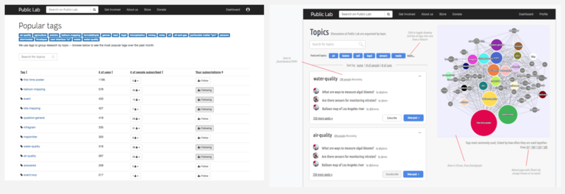
One of the central goals of the UI project, this redesign built out a "card UI" approach to representing topical areas, and established a visual vocabulary upon which the rest of the major designs were built. (above, before to the left, after to the right)
An interactive Cytoscape-based node graph visualization, made possible with considerable back-end optimization, allows for a graphical visualization of tags and their inter-relationships. Cleaner page layout, as well as the idea of "Post on this topic" better define this tagging system as a set of topical discussion groups, forefronting the people who make up Public Lab rather than the technologies they work on.
This is already live at: PublicLab.org/tags
Community Directory
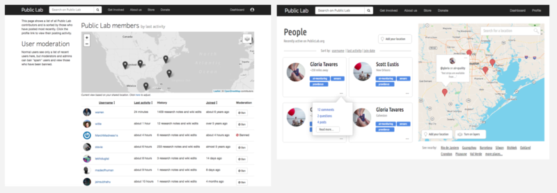
Our overall design analysis led us to make people, groups, and organizations more visible across the site. The new community directory page is the centerpiece of this design strategy, and features people, their profile photos, and their interests prominently without losing the ability to sort. (Above, before and after.)
The new geographic features are shown prominently in this new design, encouraging local and regional support networks and place-based organizing.
Dashboard
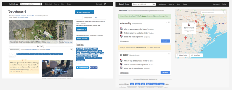
After extended design iterations and discussions, we took a bold new direction with our new dashboard design, dropping the Activity feed for a listing of topics, each displaying a few recent items. The new design is much less cluttered, and makes posting into a topic much more intuitive. It also streamlines the "subscriptions" system by making anything shown on your dashboard a subscribed-to topic. Again, it centers people rather than content, and also prominently displays our new geographic features. (Above, before and after.)
Questions page
In another radical departure from our former page design, our new Questions page design features a "welcome" area, which also features a curated set of questions, and emphasizes the community knowledge exchange that makes Public Lab work. Compared to the former page design, it is less overwhelming and requires fewer clicks to begin drafting your own question. We pared back the metadata display and pushed the questions browsing interface below the fold. (Above, before and after.)
Profile pages
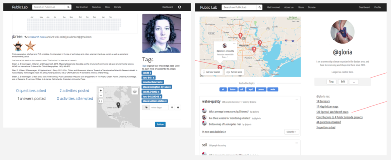
The profile page redesign was also quite challenging, with many different user-related content types and settings needing a home on this page. We adopted the common UI convention from other pages on the site of displaying content by topic, while again highlighting geographic context. Beyond that, we consolidated several components of the page with standard content listings elsewhere on the site to reduce the page's complexity. (Above, before and after.)
What's next
Thanks to a huge effort from many different people (not even all named here!), this project has enabled us to test and develop a solid and highly productive workflow for UI improvements, which we have adopted as a template for all UI design work moving forward, including community-based approaches to user research, design analysis, brainstorming, refinement of wireframes and mockups, and more.
We have a few more UI projects ongoing, including an overall analysis of the site based on in-depth recorded interviews, follow-up on @sylvan's post here: https://publiclab.org/notes/sylvan/03-04-2019/findings-from-ui-analysis-of-pl-website and the big Bootstrap 4 upgrade, among other projects.
We are also planning to develop and publish a UI Style Guide in the coming weeks which will lay out best practices and preferred conventions for design work on our platform, laying a foundation for more stable, more consistent, easier to maintain, and more intuitive UI across PublicLab.org. Among our goals will be:
- better organized UI code
- better UI tests
- fewer UI breakages
- easier to maintain, less customization
- easier to understand and use
- more support and guidance for people designing new pages/interfaces
Stay tuned! Thanks all!


6 Comments
@lekhikadugtal @divyabaid16 @souravirus @sylvan @bansal_sidharth2996 @milaaraujo @stefannibrasil and many more, this may be interesting!!! If you'd like to follow the
uitag please do!This Looks greatttttt 😃
Looking forward to contributions towards the aim of better user-interface.
Thanks !!!
Reply to this comment...
Log in to comment
OK, and, as promised, here's our Draft Style Guide!
https://publiclab.org/notes/warren/05-07-2019/introducing-a-draft-style-guide-for-public-lab
We'd love input over there! Thanks!
Reply to this comment...
Log in to comment
@gautami_gg and @lekhidugtal, this has been expanded upon and refined a bit with the Style Guide, and we may need to update these designs a bit. But fundamentally the Style Guide incorporates, refines upon, and "generalizes" a lot of the work that went into this work. So these largely still stand, but the Style Guide is an attempt to make a more holistic guidance document from this that can be applied to other pages as well!
Reply to this comment...
Log in to comment
One more thing! @gautami_gg and @lekhidugtal if you could both try to "follow" the #ui topic that would be great. Thanks!
Thanks for this. @warren. Till Now, I've been following ui-designs. No wonder there weren't many posts in my digest. Thanks again.
Reply to this comment...
Log in to comment
Login to comment.