In 2019 we published a style guide for the PublicLab.org website, to set some clear design conventions, and improve consistency. This guide is designed to support coders, designers, and writers building and designing pages on PublicLab.org. [Link to draft Style Guide](https://publiclab.org/notes/warren/05-07-2019/introducing-a-draft-style-guide-for-public-lab)  **** Notes for staff (and anyone else who's interested) on a consistent style language for Public Lab materials -- if you're interested in consistency across PL materials, feel free to use these guidelines! ## Logos See [this page for logos in different sizes and formats](/logos) ## Flyer Generator You can use this **flyer generator** to make graphics following these guidelines: http://jywarren.github.io/flyer/ ## Fonts, sizes We use Junction Light in large sizes with relatively large margins on white backgrounds for many things. Sometimes Chunk Five can be used if extreme emphasis is needed. Both fonts are open source and available from the [League of Movable Type](https://www.theleagueofmoveabletype.com/). ## Icons On our website, we use Font Awesome icons in version 4.5+ -- https://fontawesome.com/v4.7.0/ [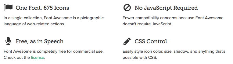](/i/26669) ### Text slide For text slides, 80% dark grey for lead title and 60% grey for subtitles works well: [](https://i.publiclab.org/system/images/photos/000/009/532/original/Screen_Shot_2015-04-02_at_1.00.26_PM.png) A good alternative is to use 5% light grey as a background and a darker 90% grey for the main title: [](https://i.publiclab.org/system/images/photos/000/009/533/original/Screen_Shot_2015-04-02_at_1.04.32_PM.png) ## Slide with image Images can be full-bleed with no margins, with white text over them. One image per slide is preferred. [](https://i.publiclab.org/system/images/photos/000/009/530/original/Screen_Shot_2015-04-02_at_12.54.54_PM.png) If your image (see image guidelines below) does not have clear space near the bottom, you can put the text near the top, too: [](https://i.publiclab.org/system/images/photos/000/009/531/original/Screen_Shot_2015-04-02_at_12.55.21_PM.png) ## Images * Good images have good contrast, but are not too busy that text won't read well. Dense high contrast patterns don't work well * Images should be at least 750px wide for web use * Text needs to be REALLY SHORT to fit over an image effectively. Think: title of 3 words, next line <8 words * Either overall light or overall dark images work best, as we'll put either white or black text over them. Here are a few examples of nice images to run text over: [](https://i.publiclab.org/system/images/photos/000/008/765/original/IMG_1530.JPG) [](https://i.publiclab.org/system/images/photos/000/005/435/original/14370756105_b1ddde6b02_k.jpg) [](https://i.publiclab.org/system/images/photos/000/000/909/original/WarnerLkVis7344TrapaSH1800.jpg) [](https://i.publiclab.org/system/images/photos/000/009/643/original/4948314953_68052f75ef_b.jpg) ### Using difficult images Some images are great but it's still hard to get text to stand out over them: [](https://i.publiclab.org/system/images/photos/000/009/534/original/Screen_Shot_2015-04-02_at_1.07.20_PM.png) You can lay text over a white background with even spacing above/below where you can't get text to stand out well enough: [](https://i.publiclab.org/system/images/photos/000/009/535/original/Screen_Shot_2015-04-02_at_1.10.03_PM.png) ## Print documents Letter sized documents can use a 1 inch margin and 48pt Junction Light, all text in black, with body text in 12pt with 18pt line spacing. [](https://i.publiclab.org/system/images/photos/000/009/536/original/Screen_Shot_2015-04-02_at_1.16.42_PM.png) Images can fit into this with 0.6 inch padding below: [](https://i.publiclab.org/system/images/photos/000/009/537/original/Screen_Shot_2015-04-02_at_1.20.31_PM.png) ...
| Author | Comment | Last activity | Moderation | ||
|---|---|---|---|---|---|
| jhondue123456 | "https://www.google.com " | Read more » | 9 months ago | |||
| warren | "Added a note: For developing more complex mockups and prototypes, this may be a great tool! https://www.layoutit.com " | Read more » | over 4 years ago | |||
| Mubbu | "Hi helpful https://www.thehindilyrics.com " | Read more » | about 5 years ago | |||
| cess | "Gotcha, yeah I am available " | Read more » | about 5 years ago | |||
| warren | "Hi, Cess! I think we need only one for notes, for now. The questions one already exists, and this new one would be an alternate template for pubicl..." | Read more » | about 5 years ago | |||
| cess | "Hey @jywarren, do we want to have two different templates for this? One for the questions and another one for the wiki? Thanks " | Read more » | about 5 years ago | |||
| warren | "One more thing that may be a little odd. The tag input form makes sense above the power tag zone. But when entering, we may have to add extra code ..." | Read more » | about 5 years ago | |||
| warren | "Love this. this is all perfect. Great short texts too. If folks are ready, we can start chopping this up into pieces for implementation. One note ..." | Read more » | about 5 years ago | |||
| mimiss | "Also thanks to @Liz for help in formatting and putting this together! " | Read more » | about 5 years ago | |||
| mimiss | "These changes also raise the issue of what it would look like if the only additional tags not shown in the large topic cards are power tags. I thin..." | Read more » | about 5 years ago | |||
| mimiss | "The next part of this can be viewed on page 6 of the mockups (https://docs.google.com/presentation/d/1TCZoTfuhamRVrUak8aDgqJAwSgyhRtZg2Pgacl2_4zc/e..." | Read more » | about 5 years ago | |||
| mimiss | "Hey guys! I wanted to provide some feedback on our topic cards that have replaced the smaller tags on posts. I've been getting a lot of feed-back f..." | Read more » | about 5 years ago | |||
| latestmehndidesign | "Mehndi has been a basic part of traditional system for a long time! Also known as Henna, it is now very popular in western countries too. Pakistan..." | Read more » | over 5 years ago | |||
| lekhidugtal | "Thanks for this. @warren. Till Now, I've been following ui-designs. No wonder there weren't many posts in my digest. Thanks again. " | Read more » | over 5 years ago | |||
| warren | "I especially wanted to note the shift, which was a major breakthrough of the DIAL UI project, away from listing all posts in a single "firehose," a..." | Read more » | over 5 years ago | |||
| warren | "Also noting, as I commented in https://publiclab.org/notes/warren/04-22-2019/user-interface-projects-update-and-dial-osc-project-recap, that this S..." | Read more » | over 5 years ago | |||
| warren | " Oh, sorry, i didn't see the screenshot in the email, maybe I didn't wait for it to load. Thanks! So, on a very detailed technical page like the r..." | Read more » | over 5 years ago | |||
| warren | "One more thing! @gautami_gg and @lekhidugtal if you could both try to "follow" the #ui topic that would be great. Thanks! " | Read more » | over 5 years ago | |||
| warren | "@gautami_gg and @lekhidugtal, this has been expanded upon and refined a bit with the Style Guide, and we may need to update these designs a bit. Bu..." | Read more » | over 5 years ago | |||
| warren | "OK, and, as promised, here's our Draft Style Guide! https://publiclab.org/notes/warren/05-07-2019/introducing-a-draft-style-guide-for-public-lab ..." | Read more » | over 5 years ago | |||
| warren | "Oh, interesting -- can you share a screenshot? In general, I am wondering if we can be quite sparing with colored buttons so as not to overwhelm pe..." | Read more » | over 5 years ago | |||
| lekhidugtal | " Hi @warren I saw your comment in one of the slides regarding blue buttons everywhere. How about keeping blue for primary and main buttons but for ..." | Read more » | over 5 years ago | |||
| icarito | "Nice! " | Read more » | over 5 years ago | |||
| warren | " Notes from discussion with @pdurbin: so, we can embed gists i'd like to embed something where you can switch to see the rendered HTML too, though..." | Read more » | over 5 years ago |