Just sharing notes from our really great OpenHour on Usability! So many good ideas and identified issues... we'll have to have meet-ups like this on a regular basis!
Notes were kept in https://pad.publiclab.org/p/openhour, but to copy them in here:
This fall and winter, we've embarked on a set of projects to improve the usability and user interface design of PublicLab.org. Have you gotten stuck or lost while browsing people's work on Public Lab, or been frustrated or confused trying to find or do things? Then we need your constructive input to make improvements.
Our growing community of code contributors -- many of whom are making their first contributions to open source -- are looking to improve things, and would love to hear some of your experiences and ideas. We're looking for both general impressions and specific issues -- please show up ready to pitch in and help make Public Lab a better place.
Join us at 1pm ET (see different time zones here https://everytimezone.com/#2018-12-3,360,b8jj) to take part!
NOTES
Attended: Jeff, Joe, Liz, Bronwen, Sagarpreet, Stefanni, Sidharth, Leslie, Lis, Ceciliah, Gaurav, Oorjit
Intro- We've got lots of functionalities, user groups, platforms. As we grow we're trying to strike a balance so that as many people as possible can access and use what they need.
Upload screenshots -- you can share screenshots by logging into this page: https://publiclab.org/wiki/ui/comments
Make mockups or sketches in this shared Google Presentation: https://docs.google.com/presentation/d/1TCZoTfuhamRVrUak8aDgqJAwSgyhRtZg2Pgacl2_4zc/edit#slide=id.g3211328fd3_0_0
https://publiclab.org/ui is a central place for working on UI across Public Lab
3 types of input
We're collecting input in three formats:
- Issues - i.e. problems or hiccups or ambiguities we'd like to address
- Goals - overarching aims we'd like to achieve
- Ideas - possible design solutions to address the above
Example: We've made it easier to register for an account via other platforms (google, facebook, etc). 1. After registration user would be sent to dash, but 2. we wanted a more seamless process, now 3. new users are taken back to the original page they logged in on. (1. issue, 2. goal, 3. idea)
ISSUES
- @zengirl2: SRAP have some issues getting in, on right hand page fonts are small/not emphasized. (idea: simply enlarge the font). Tabs there are also a little confusing
- @liz: log in page "proprietary" - "you must be logged in" - tone language, emphasizes, makes you feel you're not "a part of" - this comes up in many big blue buttons when you are prompted to log in
- @sagarpreet:
geo input sequence for nodes I wanted to discuss about --- how to change the way we geotag a node (showing erros with tagging on Silica post)

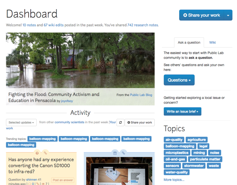
- @bansal_sidharth2996: Dashboard is too messy according to me. We have Activity, questions, wiki etc. we need to make it more understandable to new - https://github.com/publiclab/plots2/issues/3283
- @Bronwen: comments push down full posts and take over the dashboard.
- @sylvan: Notifications over email aren't always clear that they're from PL (unless something specific is in email heading)
- @sylvan "somebody tagged X to Y" - make more actionable.
- @sylvan: Not always obvious why an email is coming (or how to not get them) Siddarth has added an issue: https://github.com/publiclab/plots2/issues/4109 created an issue.
- @zengirl: So if someone new is coming to the board, they don't see a large array of issues--may leave.
- @bansal_sidharth2996: I want to point out that the mismatching size of comments, questions, events, etc on https://publiclab.org/dashboard. This results in huge spaces in between them

- @stefannibrasil: UX is a big and complex thing, need to get into the mindset of the users. Design systems might be helpful . Applies some solutions already figured out by bigger orgs (with dedicated teams of developers), Air BNB, Medium as examples of places to look for UX that has already solved some problems. https://twitter.com/i/moments/994601867987619840
- @bansal_sidharth2996: I also agree upon too much information in small area at many places at PL JW: Eva who isn't here is working on this and might be able to contribute to this conversation.
- @warren publiclab.org /places, /people, /maps,
- @bansal_sidharth2996: I also agree upon too much information in small area at many places at PL
- @bansal_sidharth2996 - User finds difficulty in understanding what different types are. Many websites have pop up for new users which indicate what kind of features we have
GOALS
- @zengirl2: help ppl know how to get involved, on dashboard
- @liz: make new account landing page nicer/more welcoming
- @sagarpreet: make it possible to geotag in notes w/o lat/lon
- @bansal_sidharth2996: Node subscriptions. more buttons, sharing options, etc. Incl comment moderation project. W/ 2nd email address called "comment moderators" to divert some comments to
- @zengirl2: if we can start to show people around the world that there are other people out there, they won't feel alone -- Who else has the same issue? Who has tools? How do I communicate with these people? Easiest way to communicate across time zones.

IDEAS
- @zengirl2: enlarge text, rearrange columns, on dash to address above
- @liz - friendlier language on the Signup/Login page
- @warren: Make it more like logging in rather than signing up (as with "log in with Facebook/Google, etc"
- @bansal_sidharth2996: Yeah, we will be creating modals so that user interface will be improved. Screens/web pages will not be changed
- @gauravano: Can make the colors/fonts/etc more friendly, starting with the alerts (success. warning, or error).
- @warren: Show a smaller map on every node page, ability to clear or refine a location
- @Bronwen: compact comment display to make space? Only highlight hot comments? -- Leslie: +1 for what Bronwen is talking about! +1 @liz +1 @joyofsoy +1 @bansal_sidharth2996
- @sylvan: Manage "notifications" and how many time Public Lab shows up on inbox row
- @sylvan: email notifications can be changed to ID PL and type of notification. If something is actionable (a question, etc) could be called out more so than a tag.
- Subject line more readable, content of notification should specify action needed, if adding other ways of being notified (twitter, etc), these may need to adopt different formats. Lis will include graphic when she posts github issue.
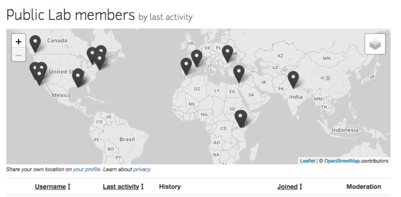
- @liz: lots of maps, can we also get different kinds of content together in one place? Map of people only shows 10 if you don't zoom in, doesn't provide most accurate picture. Multiple types of info on one map. What about the limit? JW (let's display 10 at a time, 50 at a time, etc).
- https://publiclab.org/settings (email settings)
- @zengirl2: Map on front page? Now people see it, what's the communication/connect strategy.
- @liz: map of all PL content at publiclab.org/map
- @liz: messaging by area?
- @sagarpreet: navigation bar for maps content
- @bansal_sidharth2996: Yeah interlinking on different categories like activities, wiki, research, maps is really important
- All: interlinking different types of maps
- @liz: more different types of content showing up together
- @bansal_sidharth2996: Github whenever introduces a feature it also introduces tutorial for new users. We can also incorporate that feature As soon as person comes the tutorial, the prompt closes.
- @zengirl2: For maps of people/research notes it would be cool to have color coded pinpoints matching our google groups--like air quality, water quality etc.
- @joyofsoy: +1 on that, @Zengirl2
- @oorjit_chowdhary: I think for website tours... We can use modals to introduce different sections of the site... you know we can add that kind of thing and that would work when a new user comes to the site for the first time
- @warren: google codin might be a time we could develop these. JW: Animated gifs of new things? @liz - Tutorials for things on the website: Liz suggests that things change a lot! Tutorials take a lot of capacity and for things that might change quickly it's going to be a challenge to keep up.
This was a really great Open Hour - thanks to everyone who came, and we have a lot to work on now!


4 Comments
@bansal_sidharth2996 @gauravano @gaurav @zengirl2 @sagarpreet @joyofsoy @xose @oorjit_chowdhary @silvan @bronwen @hagit @cindy_excites @ann thanks everyone!
Reply to this comment...
Log in to comment
Hey! @liz how does this sound? "Please log in to comment"
would it go in place of things like this?
Is this a question? Click here to post it to the Questions page.
Reply to this comment...
Log in to comment
@warren opinions: Make everything like Metafilter, the web's best anglophone community website, and not like Airbnb, the people evicting all of my friends.
also
Reply to this comment...
Log in to comment
I think Public lab has a lot of functionality, but not a lot of sense of the "whole"
And I feel like i'm going to lose my thread of thought if i go down one of the many hallways
You can give a sense of the whole with simple text summaries, and counts of the number of posts, etc. you guys love images, and images are cool (and i use too many), but they need to be smaller because people read things
also, once someone posts a bunch on something, you should gather those links on the right, and prompt them to add to the wiki on that something
also, the less you make the site like twitter, the better. if it starts to look like twitter, fire someone
Reply to this comment...
Log in to comment
Login to comment.