I downloaded Purple Air data for Keller, Texas, as described in the Download & Analyze Purple Air Data activity.
I was curious over the course of 1 week, what percentage of the time are people that live in Keller, Texas. being exposed to "Good", "Moderate", "Unhealthy for sensitive groups" or "Unhealthy" categories on the AQI index. This seemed especially relevant as I've learned about how the EPA federally regulates particulate matter from conversations with the Rhode Island Department of Environmental Management. They essentially look for short term spikes when the air is questionable. If it is below the EPA limit, then the state is compliant with federal standards. However, what the states aren't really held accountable for in their air quality monitoring is if certain parts of the state are living with more prolonged exposure to mediocre air while other parts of the state have pristine air - and whether or not to do anything to more evenly distribute the environmental burden.
Sidenote: I do recognize that this data is only for 1 week so it may not be representative for typical exposures in Keller.
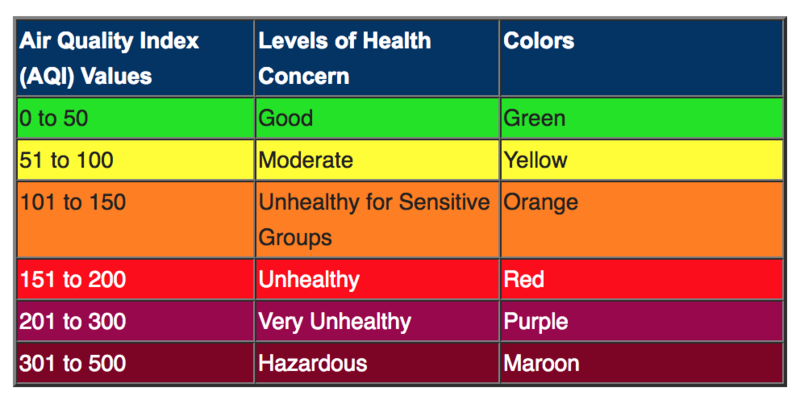
This is a typical AQI chart for the United States that I've used in my analysis:

This data is for the week of Aug 21-28, 2018. First I referenced this website that has a conversion chart for mass concentrations into AQI that I have included below.

Then, I created the charts using excel. I'm not an excel pro but with some googling I was able to figure out some formulas that would get me what I wanted. For the PM 2.5 column of data I essentially asked excel to tally how often the AQI was above the endpoints for each AQI category from the above image (12, 35.5, 55.5 etc). Below is a screenshot of one of the formulas:

The colors on the following pie charts may be a bit confusing but essentially, for the first 3 pie charts, I wanted to identify how often the AQI is in one area of the chart vs another area, as opposed to comparing each individual category on the same chart.
This pie chart shows that the air is only in the best AQI category - "Good"- for 3% of the time over the course of the week. 
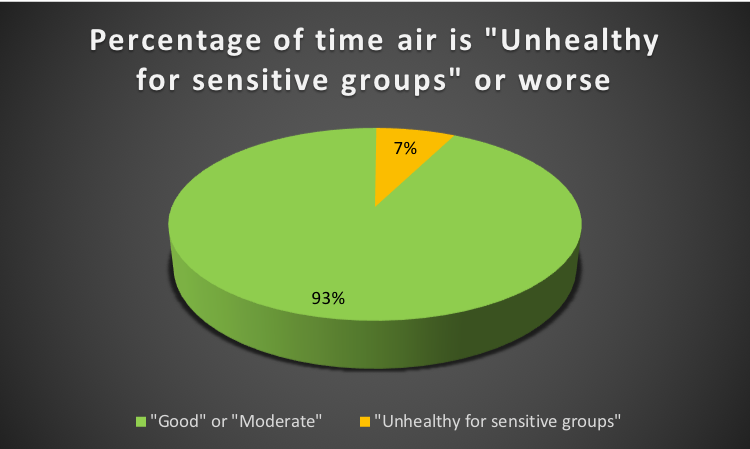
This pie chart shows that the air in Keller is typically in the "Good" or "Moderate" category over the course of the week. 93% of the time.

This pie chart shows that the air in Keller is never in the "Unhealthy" (for everyone) category, 0%. Or, in other words, the air is always either "Good", "Moderate" or "Unhealthy for sensitive groups". 
7 Comments
I believe you are not quite correct in the determination of the AQI. First, the downloaded data from purple air gives concentrations, for pm2.5 this is µg/m3. In your explanation it seems you call the concentration the AQI and you then count AQI's between certain standard values. You are actually counting concentrations between certain values. In addition the actual EPA AQI is an estimate of the average concentration over a 24 hour period; see https://en.wikipedia.org/wiki/Air_quality_index#Computing_the_AQI in particular the table in the section titled "Computing the AQI" It uses some past data along with an estimate of future data for a 24 hour period since the pm standards refer to 24 hour averages, not to a current measure. The section goes on to state "Real time monitoring data from continuous monitors are typically available as 1-hour averages. However, computation of the AQI for some pollutants requires averaging over multiple hours of data. (For example, calculation of the ozone AQI requires computation of an 8-hour average and computation of the PM2.5 or PM10 AQI requires a 24-hour average.) To accurately reflect the current air quality, the multi-hour average used for the AQI computation should be centered on the current time, but as concentrations of future hours are unknown and are difficult to estimate accurately, EPA uses surrogate concentrations to estimate these multi-hour averages. " It's an easy error to make.
Reply to this comment...
Log in to comment
Hey @jeffalk . I am well aware that the Purple Air data sheets are logged in units µg/m3. I referenced airnow.gov that has conversion calculators from concentrations into an AQI range. As explained in my post, I used these calculators to convert the concentrations into an AQI range estimation.
I've worked with the air forecasters at the RI Department of Environmental management quite a bit at this point. My understanding of the forecasting process is that they use data from FEM monitors (hourly averages) sensor, to broadcast the air quality forecasts on their websites at the end of each hour.
Besides, even if the AQI standard is meant to reflect a 24 hour average, I think a 1-hour average probably contains more useful information about what's in the air at different times of the day - which is what i want to know.
Is this a question? Click here to post it to the Questions page.
Reply to this comment...
Log in to comment
Here is a google Colab recreating this: https://colab.research.google.com/drive/1rADQ9hbIEP-DO1hsLpVWAOz2wJu4SuwM
Reply to this comment...
Log in to comment
jiteovien: I realize you have put a considerable amount of effort into your project and are trying to do an excellent job. I believe you are exhibiting an important misconception, one that I too, when I began being involved in air quality analysis, exhibited for a long time. I will confine my comments to your last sentence: "Besides, even if the AQI standard is meant to reflect a 24 hour average, I think a 1-hour average probably contains more useful information about what's in the air at different times of the day - which is what i want to know." The transformation from concentration to AQI is a linear transformation and as such adds no new information. It is like a transformation from degrees centigrade to degrees farenheit. This is a difference of scale only. However I believe you are not just doing a scale transformation. You are including the "levels of health concern" categories. These health concern categories were set up by the epa on the basis of epidemiological evidence using 24 hour averages. It is speculation to attribute the same categories of health concern to concentrations or aqi's that are determined by using shorter times for averaging. There is little or no evidence that 5 minutes of exposure at aqi of 151 to 200 is "unhealthy" for example. It might very well be discomforting, maybe irritating, I don't know. But there is no reason to use the same "unhealthy" categorization as for a 24 hour average at that level. As illustration: some years ago I learned that almonds contain a very small amount of cyanide. There are levels of cyanide ingestion that are very dangerous but so far the cyanide dangers of snacking on almonds have not been shown. And although I tend to quiver when I hear cyanide mentioned, I still eat an almond once in a while. There is not the same health concern. I would maintain it is a similar misconception for the health concern aqi categories to be used at substantially shorter average time intervals. They were not designed to be used that way. I agree with you. What I would want to know is what's in the air at different times and a concentration or aqi number would tell me that without the addition of an unsubstantiated "level of health concern". And the fact that the aqi as a number, not a category, doesn't tell me any more than the concentration would, is why I prefer the straight forward concentration. But different people different ways. Except for the epa which bases their pm regulations on 24 hour average concentrations only, and ignores the information, especially useful for attribution to local sources, of much shorter time intervals.
Reply to this comment...
Log in to comment
Isn't he doing not a 24 h average, but a week average in this case? That sounds like it would have merit.
One thing I'm legitimately curious about: let's say air quality is consistently in the orange levels between 12 and 5 pm each day, but improves overnight. Could this be cumulative environmental exposure, but with daily averages in the healthy range?
Is this a question? Click here to post it to the Questions page.
Reply to this comment...
Log in to comment
@jeffalk PM concentrations do not have meaning if there isn't an understanding of how the concentrations affect health and well being. Perhaps I used the term 'AQI' incorrectly but I think that this "important misconception" as you call it is actually the least important part of this analysis. The relative differences between the categories and the length of exposure to each category is what matters. If you prefer, I can create my own index that I will name the "Jite Index" that ranks from 'low -> medium -> high -> really high' PM concentrations. I can arbitrarily decide what the cutoff points will be for each category and I would result in the exact same pie chart as shown in the post representing the length of exposure to different categories.
Reply to this comment...
Log in to comment
@pdhixenbaugh If I understand your comment correctly, that is exactly the point I am trying to make. Perhaps, we need to create our own AQI index if I am indeed misusing it. But the relevant information is that the federal reference methods that the EPA uses, often does not really identify the length of time people are exposed to moderate/bad air since the air is averaged over an entire day, thus flattening out any several hour spikes that you may have experienced that day. Meanwhile, research has well characterized that long term exposure to moderate/bad air has more adverse health affects than short term exposure. It is important to understand this long term exposure.
Reply to this comment...
Log in to comment
Login to comment.