To do this activity you do not need to actually have a PurpleAir.
On the PurpleAir Map, you can search by ID name or location to find a PurpleAir that is actively logging data. If you have your own PurpleAir setup, you can search for that one. If there is another location you are interested in, you can search for that city and see if there are any PurpleAirs setup in that area.
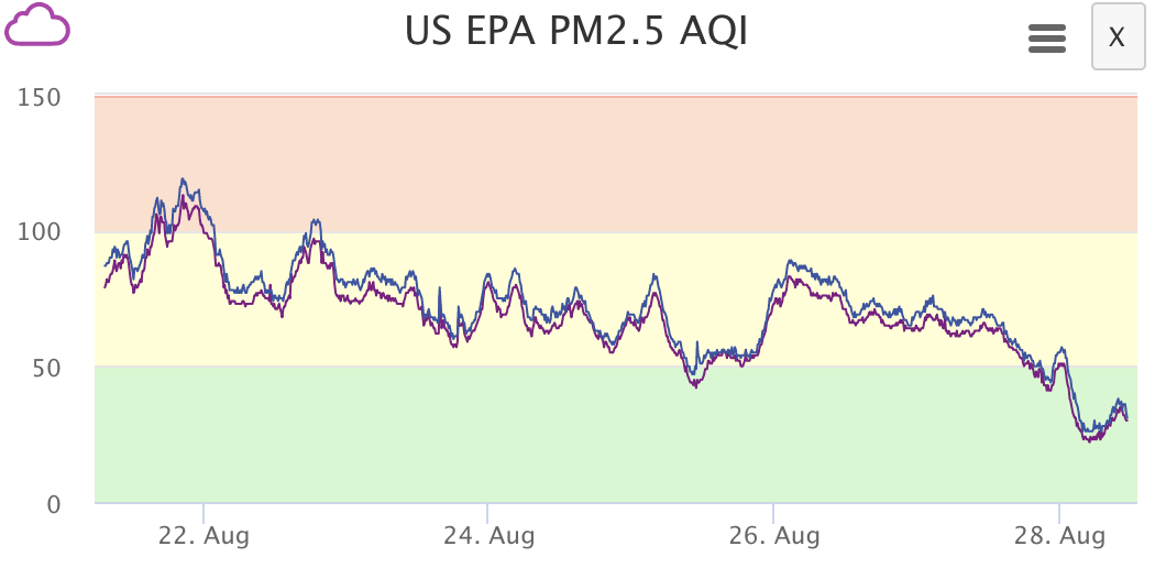
For example, I am from Keller, Texas, so i decided to search for that location. I found one live PurpleAir in that area. Take note of the ID name for the data you are interested in. The ID name of the sensor is '908 Bellstone Dr' as shown on the graph.

Once you have selected a PurpleAir you want to work with, go to purpleair.com/sensorlist where you can download data from any PurpleAir sensor whether or not you own one. Unfortunately, there isn't a search by ID function but the sensors are in alphanumeric order so you can find your ID that way. Then select a range of dates that you are interested in. I selected a range of dates of one week because on the map, it looked like the AQI changed a lot in that period of time. Press download. Select both the channel A (not labeled A) and channel B.

For each sensor that you download, the excel files should be named something along the lines of:
SensorIDname Primary
SensorIDname Secondary
SensorIDname B Primary
SensorIDname B Secondary
The difference between Primary and Secondary data is described on the Purple Air wiki page. Generally, you'll be interested in just the Primary data but you may want the Secondary data as well. Channel A and Channel B are intended to be redundant data. Briefly browse 'SensorIDname Primary' next to 'SensorIDname B Primary'. The data should be mostly similar but might have different time steps. See Below:

At this step, you may either choose to work with just one of the channel's or you may use both if you're interested in comparing them - up to you!
Now, decide how you want to manipulate and present your data. You can use excel to insert graphs or you can use a programming language such as Python, Java or Arduino to analyze it.
Some ideas for graphs:
- You could do a simple concentration over time line graph
- You could compare several closeby locations
- You could compare PurpleAir data to Federal AQ data. Details about accessing Federal data are described on the Purple Air wiki page.
- How closely does your PurpleAir match Federal Data?
- How often does your PurpleAir read higher or lower than Federal data?
- Using the concentration -> AQI conversion chart, you could parse your excel file to see how often the air quality index is above a certain reading. Read more about AQI here.
- For example, how often is your PM 2.5 AQI in the "moderately unhealthy" category?
- How long does the AQI stay in a "hazardous" category
Try it out and see what types of trends you can find!
15 Comments
I took a different route. Wanting to know when to switch on the air purifier based on readings, I developed a micro service pulling JSON data at regular intervals and sending push notifications if appropriate. I can set intervals (to a certain degree, PaaS limitations apply), thresholds and message. So I don’t have to look at the map all the time. Looking into Apple HomeKit with geofencing to calculate exposure averages when I am home.
Reply to this comment...
Log in to comment
wu_ming2 - I just installed my PurpleAir and like the idea of triggers, maybe even through IFTT. WOuld love to see what you've done.
Care to share that work either here or on Git?
Is this a question? Click here to post it to the Questions page.
Reply to this comment...
Log in to comment
@bohemian let me see what I can do. Didn’t use IFTTT because don’t wanted to install another iOS messaging app. So I used Discord instead.
Reply to this comment...
Log in to comment
Got it.
Yeah, IFTT is one of those things - you either use it or you don't and it's not worth taking the leap unless you are doing a bunch of things. But like Lambda, it's kinda like crack - once you get a taste ... well, you know.
Reply to this comment...
Log in to comment
Wanted simply to upload a zip file with everything but for some reasons didn't work. Anyway here is it: https://repo.or.cz/purpleair-notify.git
It can run on any service but you will need a Iron Cache account and a private Discord server with webhook. Mine runs on heroku.com free tier with Scheduler and Iron Cache add-ons.
Discord iOS app don't need to run in background. Push notifications are working well, if Discord server doesn't miss to receive the message for some reasons. Sometimes it does. The upside for me are private channel and one single URL for access and authentication.
If you are interested to just see it working I can invite you to my Discord server.
Reply to this comment...
Log in to comment
If anyone is interested I have completely re-written the micro-service that notifies you while a sensor PM2.5 reading crosses a threshold.
With start / stop commands, 3rd party data source for temperature and humidity, data format check (PurpleAir recently introduced a string of changes). And more clear messages.
Contact me if you believe it’s worth sharing.
That's awesome, we'd love to see it in a post on PublicLab.org if you're interested in sharing!
I just updated https://repo.or.cz/purpleair-notify.git
It's a complete re-write adding Discord
!startand!stopcommands.Also:
Give it a try.
On a side note PurpleAir recognises the cumulative averages used now are very slow moving. It is their nature. I hope they will switch to simple moving averages soon.
Wow this is awesome! Thank you for these contributions @wu_ming2
cool stuff, would like to learn about being notified
purple air is different now, you have to click the very obscure download link on the map page
They also discuss selecting an AOI on the map, but it's unclear how to do that.
Scott
How to access this tool There are two ways you can view sensors in this list: From the PurpleAir map, click the download button in the bottom right corner after selecting an area of interest. Or click on a sensor on the PurpleAir map, then mouse over the 'Get this widget' link. A download link will then be displayed for that individual sensor. For information on the data and the API's provided by PurpleAir, please see this document: https://docs.google.com/document/d/15ijz94dXJ-YAZLi9iZ_RaBwrZ4KtYeCy08goGBwnbCU/edit?usp=sharing
Is this a question? Click here to post it to the Questions page.
I prefer notifications because my sensor is indoor and don't want to keep checking the map to know when is time to switch on the purifier.
Very simply you get a push notification text message through Discord app when PM2.5 crosses a certain threshold. Discord because is the only free push notification service I have found.
thanks! i have now talked to programmers that might help me with this. i think i have a discord account
Reply to this comment...
Log in to comment
I did this! but it's different in 2020
Is this a question? Click here to post it to the Questions page.
Reply to this comment...
Log in to comment
There's now a secondary download option, from a lat long exclusion bbox:
Here's an example of a sensorlist generated with a exclusion bbox, for New Orleans / SE Louisiana:
https://www.purpleair.com/sensorlist?exclude=true&nwlat=30.080951607035246&selat=29.843896975630273&nwlng=-90.5031662803746&selng=-89.83375003567346
Is this a question? Click here to post it to the Questions page.
Reply to this comment...
Log in to comment
Login to comment.