Revisions for sandbox-presenting-data
| 5 CURRENT | bhamster |
August 16, 2021 16:46
| over 2 years ago
this page is a work in progress! What can we do with environmental data to understand it and communicate with it? There are some first things we can do with data to get an idea of what’s happening, like plotting a sensor measurement against time. Then there are ways we can ultimately present environmental data so that it communicates something meaningful, spurs advocacy, and avoids reducing real environmental harms to a data point. Data visualizations like graphs, charts, maps, art, and other interactive media can tell a story. We can also use non-visual ways, like sound and touch. We’re collecting resources below on kinds of environmental data and ways to present it--please add to this page to improve it and make it more helpful! Creative ideas that go beyond trend lines or bar graphs are super welcome and appreciated! Kinds of environmental data you might haveEnvironmental data can come in many forms depending on how and where you collect it. Here are some common examples: Measurements from sensors
Measurements from collected samples
If you haven’t started collecting data yet, check out some guidance on designing an environmental study---the design step is where you figure out where and when to collect data based on the specific questions you have about a local concern. There’s also more information on sampled data and continuous monitoring data in the “Types of Samples” section. Ways to present environmental dataScatter plots and trend linesShows how individual data points change against another kind of measure (called a variable). Often, this can be how something you measured in your environment changes over time. If you have continuous data, plotting it against time is one of the first things you can do to start understanding the data.
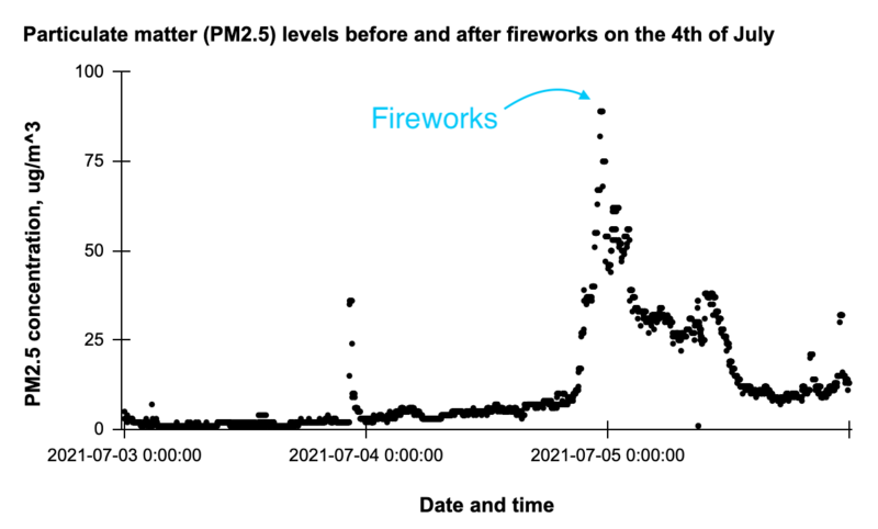
Example 1. Scatter plot showing particulate matter (PM2.5) concentrations measured by an air quality sensor in an apartment building. Each black dot is an individual measurement. The PM concentrations spike during a fireworks celebration. Data from @LESBreathe.
Air quality data from @LESBreathe Example 2.
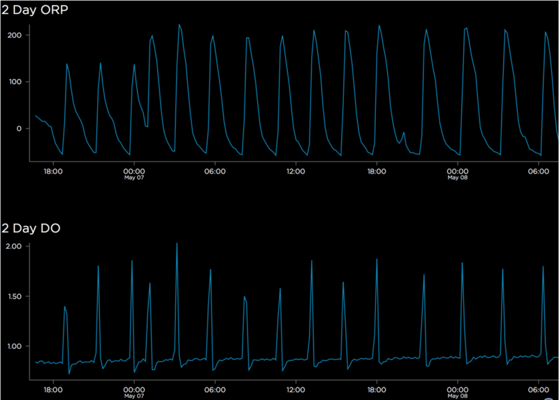
Dissolved oxygen (DO) and redox potential (ORP) sensor data from treated wastewater, by @jesseslone in this comment More examples
Trends with respect to measures other than time
Bar graphsShows how measurements vary among different categories
Flaticon from Dinosoftlabs Example 1. MapsShows how measurements vary by location. Mapping can help you show geographic patterns in data, such as pollution hotspots, or how pollution moves across space. Example 1.
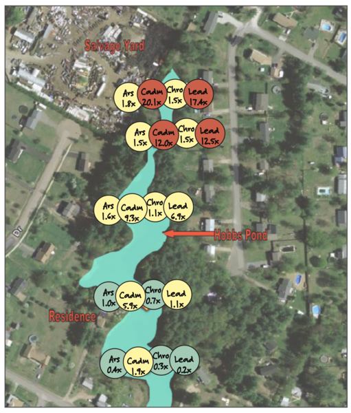
Map of Hobbs Pond with color-coded samples for each chemical found in the soil More examples:
Additional ways to present dataAudio Others? Tools for data visualization and presentation
More resources on understanding and presenting data
|
Revert | |
| 4 | bhamster |
August 10, 2021 15:58
| over 2 years ago
this page is a work in progress! What can we do with environmental data to understand it and communicate with it? There are some first things we can do with data to get an idea of what’s happening, like plotting a sensor measurement against time. Then there’s ways we can present environmental data so that it communicates something meaningful, spurs advocacy, and avoids reducing real environmental harms to a data point. There are also plenty of ways to present data and tell a story with it. We can visualize data with graphs, charts, maps, art, and other interactive media. We can also use non-visual ways, like sound and touch. We’re collecting resources below on kinds of environmental data and ways to present it--please add to this page to improve it and make it more helpful! Creative ideas that go beyond trend lines or bar graphs are super welcome and appreciated! Kinds of environmental data you might haveEnvironmental data can come in many forms depending on how and where you collect it! Here are some common examples: Measurements from sensors
Measurements from collected samples
If you haven’t started collecting data yet, check out some guidance on designing an environmental study---the design step is where you figure out where and when to collect data based on the specific questions you have about a local concern. There’s also more information on sampled data and continuous monitoring data in the “Types of Samples” section. Ways to present environmental dataScatter plots and trend linesShow how a measurement changes against another kind of measure (called a variable). Often, this can be how something you measured in your environment changes over time.
Example 1. Scatter plot showing particulate matter (PM2.5) concentrations measured by an air quality sensor in an apartment building. Each black dot is an individual measurement. The PM concentrations spike during a fireworks celebration. Data from @LESBreathe.
Air quality data from @LESBreathe Example 2. A 2-day average trendline showing dissolved oxygen (DO) in treated wastewater, measured by a sensor. The DO goes up and down throughout the day, spiking when air is injected into the water and decreasing as sewage-cleaning bacteria use it up.
Dissolved oxygen (DO) and redox potential (ORP) sensor data from treated wastewater, by @jesseslone in this comment More examples
Trends with respect to measures other than time
Bar graphsShow how measurements vary among different categories Example 1. MapsShow how measurements vary by location Examples:
Additional ways to present dataAudio Others? Tools for data visualization and presentation
More resources on understanding and presenting data
|
Revert | |
| 3 | bhamster |
August 10, 2021 15:56
| over 2 years ago
this page is a work in progress! What can we do with environmental data to understand it and communicate with it? There are some first things we can do with data to get an idea of what’s happening, like plotting a sensor measurement against time. Then there’s ways we can present environmental data so that it communicates something meaningful, spurs advocacy, and avoids reducing real environmental harms to a data point. There are also plenty of ways to present data and tell a story with it. We can visualize data with graphs, charts, maps, art, and other interactive media. We can also use non-visual ways, like sound and touch. We’re collecting resources below on kinds of environmental data and ways to present it--please add to this page to improve it and make it more helpful! Creative ideas that go beyond trend lines or bar graphs are super welcome and appreciated! Kinds of environmental data you might haveEnvironmental data can come in many forms depending on how and where you collect it! Here are some common examples: Measurements from sensors
Measurements from collected samples
If you haven’t started collecting data yet, check out some guidance on designing an environmental study---the design step is where you figure out where and when to collect data based on the specific questions you have about a local concern. There’s also more information on sampled data and continuous monitoring data in the “Types of Samples” section. Ways to present environmental dataScatter plots and trend linesShow how a measurement changes against another kind of measure (called a variable). Often, this can be how something you measured in your environment changes over time.
Example 1. Scatter plot showing particulate matter (PM2.5) concentrations measured by an air quality sensor in an apartment building. Each black dot is an individual measurement. The PM concentrations spike during a fireworks celebration. Data from @LESBreathe.
Air quality data from @LESBreathe Example 2. A 2-day average trendline showing dissolved oxygen (DO) in treated wastewater, measured by a sensor. The DO goes up and down throughout the day, spiking when air is injected into the water and decreasing as sewage-cleaning bacteria use it up.
Dissolved oxygen (DO) and redox potential (ORP) sensor data from treated wastewater, by @jesseslone in this comment More examples
Trends with respect to measures other than time
Bar graphsShow how measurements vary among different categories Example 1. MapsShow how measurements vary by location Examples: + Storymap: Visualizing Violations of Environmental Justice Spatial Inequalities of Health and Pollution Exposure in Southwest Detroit + Tree equity map: example from Seattle, WA + Workshop guide: Mapping soil data by @kgradow1 Additional ways to present dataAudio Others? Tools for data visualization and presentation
More resources on understanding and presenting data
|
Revert | |
| 2 | bhamster |
August 10, 2021 15:55
| over 2 years ago
this page is a work in progress! What can we do with environmental data to understand it and communicate with it? There are some first things we can do with data to get an idea of what’s happening, like plotting a sensor measurement against time. Then there’s ways we can present environmental data so that it communicates something meaningful, spurs advocacy, and avoids reducing real environmental harms to a data point. There are also plenty of ways to present data and tell a story with it. We can visualize data with graphs, charts, maps, art, and other interactive media. We can also use non-visual ways, like sound and touch. We’re collecting resources below on kinds of environmental data and ways to present it--please add to this page to improve it and make it more helpful! Creative ideas that go beyond trend lines or bar graphs are super welcome and appreciated! Kinds of environmental data you might haveEnvironmental data can come in many forms depending on how and where you collect it! Here are some common examples: Measurements from sensors
Measurements from collected samples
If you haven’t started collecting data yet, check out some guidance on designing an environmental study---the design step is where you figure out where and when to collect data based on the specific questions you have about a local concern. There’s also more information on sampled data and continuous monitoring data in the “Types of Samples” section. Ways to present environmental dataScatter plots and trend linesShow how a measurement changes against another kind of measure (called a variable). Often, this can be how something you measured in your environment changes over time.
Example 1. Scatter plot showing particulate matter (PM2.5) concentrations measured by an air quality sensor in an apartment building. Each black dot is an individual measurement. The PM concentrations spike during a fireworks celebration. Data from @LESBreathe.
Air quality data from @LESBreathe Example 2. A 2-day average trendline showing dissolved oxygen (DO) in treated wastewater, measured by a sensor. The DO goes up and down throughout the day, spiking when air is injected into the water and decreasing as sewage-cleaning bacteria use it up.
Dissolved oxygen (DO) and redox potential (ORP) sensor data from treated wastewater, by @jesseslone in this comment More examples
Trends with respect to measures other than time
Bar graphsShow how measurements vary among different categories Example 1. MapsShow how measurements vary by location Examples: + Storymap: Visualizing Violations of Environmental Justice Spatial Inequalities of Health and Pollution Exposure in Southwest Detroit + Tree equity map: example from Seattle, WA + Workshop guide: Mapping soil data by @kgradow1 Additional ways to present dataAudio Others? Tools for data visualization and presentation
More resources on understanding and presenting data
|
Revert | |
| 1 | bhamster |
August 09, 2021 23:14
| over 2 years ago
this page is a work in progress! What can we do with environmental data to understand it and communicate with it? There are some first things we can do with data to get an idea of what’s happening, like plotting a sensor measurement against time. Then there’s ways we can present environmental data so that it communicates something meaningful, spurs advocacy, and avoids reducing real environmental harms to a data point. There are also plenty of ways to present data and tell a story with it. We can visualize data with graphs, charts, maps, art, and other interactive media. We can also use non-visual ways, like sound and touch. We’re collecting resources below on kinds of environmental data and ways to present it--please add to this page to improve it and make it more helpful! Creative ideas that go beyond trend lines or bar graphs are super welcome and appreciated! Kinds of environmental data you might haveEnvironmental data can come in many forms depending on how and where you collect it! Here are some common examples: Measurements from sensors
Measurements from collected samples
If you haven’t started collecting data yet, check out some guidance on designing an environmental study---the design step is where you figure out where and when to collect data based on the specific questions you have about a local concern. There’s also more information on sampled data and continuous monitoring data in the “Types of Samples” section. Ways to present environmental dataScatter plots and trend linesShow how a measurement changes against another kind of measure. Often, this can be how something you measured in your environment changes over time. sketch here! Examples:
Air quality data from @LESBreathe
Dissolved oxygen (DO) and redox potential (ORP) sensor data from treated wastewater, by @jesseslone in this comment
Trends with respect to other variables
Bar graphsShow how measurements vary among different categories Examples: MapsShow how measurements vary by location Examples: + Storymap: Visualizing Violations of Environmental Justice Spatial Inequalities of Health and Pollution Exposure in Southwest Detroit + Tree equity map: example from Seattle, WA |
Revert | |
| 0 | bhamster |
August 09, 2021 23:11
| over 2 years ago
this page is a work in progress! What can we do with environmental data to understand it and communicate with it? There are some first things we can do with data to get an idea of what’s happening, like plotting a sensor measurement against time. Then there’s ways we can present environmental data so that it communicates something meaningful, spurs advocacy, and avoids reducing real environmental harms to a data point. There are also plenty of ways to present data and tell a story with it. We can visualize data with graphs, charts, maps, art, and other interactive media. We can also use non-visual ways, like sound and touch. We’re collecting resources below on kinds of environmental data and ways to present it--please add to this page to improve it and make it more helpful! Creative ideas that go beyond trend lines or bar graphs are super welcome and appreciated! Kinds of environmental data you might haveEnvironmental data can come in many forms depending on how and where you collect it! Here are some common examples: Measurements from sensors
Measurements from collected samples
If you haven’t started collecting data yet, check out some guidance on designing an environmental study---the design step is where you figure out where and when to collect data based on the specific questions you have about a local concern. There’s also more information on sampled data and continuous monitoring data in the “Types of Samples” section. Ways to present environmental dataScatter plots and trend linesShow how a measurement changes against another kind of measure. Often, this can be how something you measured in your environment changes over time. sketch here! Examples:
Air quality data from @LESBreathe
Dissolved oxygen (DO) and redox potential (ORP) sensor data from treated wastewater, by @jesseslone in this comment
Trends with respect to other variables
|
Revert |