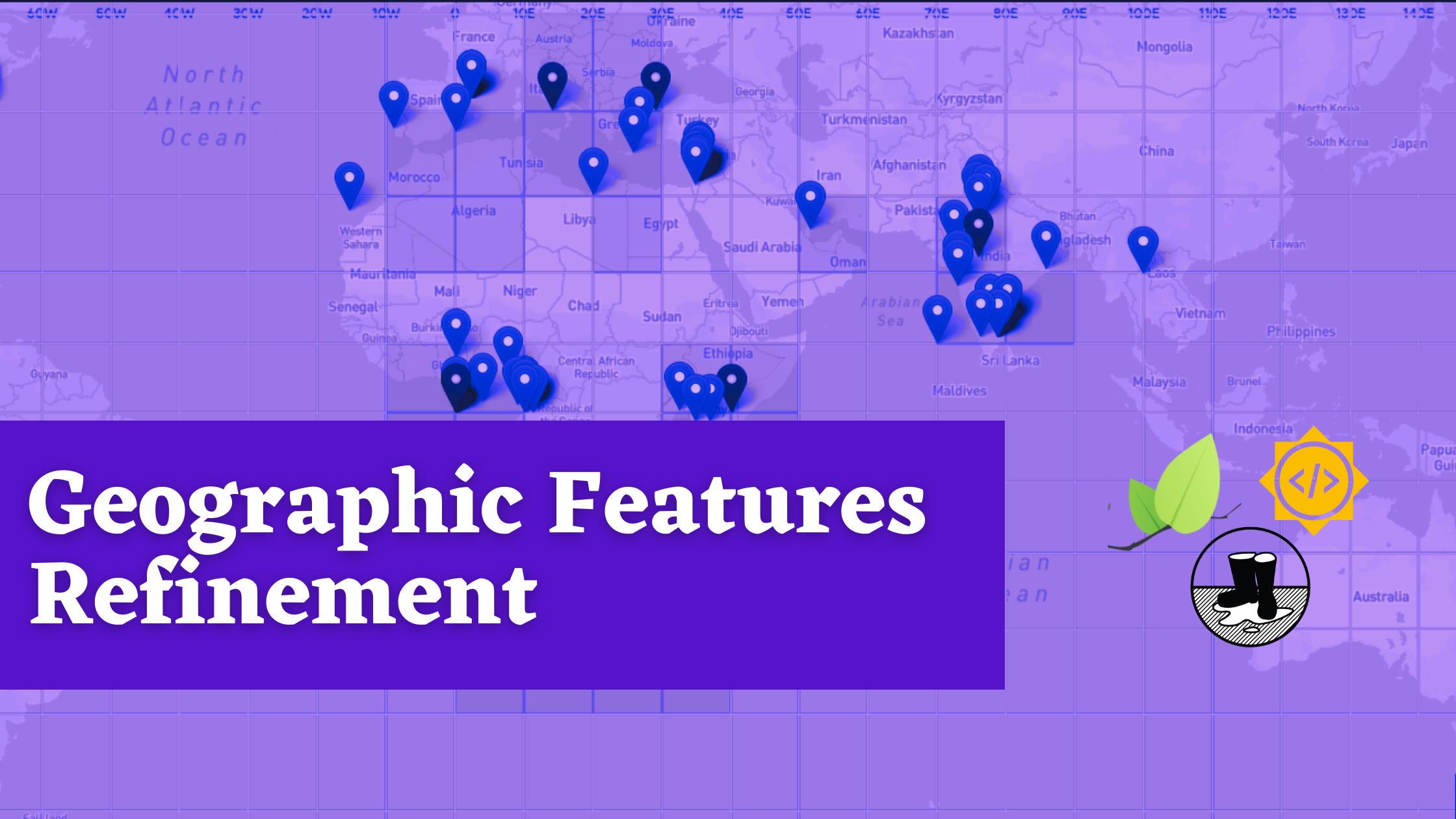
Public Lab has a robust geographic metadata system, and the Public Lab community members are increasingly sharing geographic context while sharing on the website. I worked this summer to improve, add, smoothen and expand the geographic features. Here's the link to my proposal for this project.
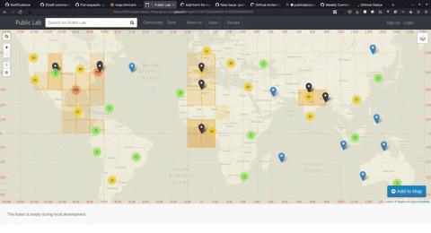
The end goal here was to increase content and improve experience on the 'map' endpoint. Here's the how it looked at the start of the project

There are a few ways we can increase the content:
- Add more interactive layers to play around with
- Optimize current data endpoints to return more data
- Fix elements that are not working as intended
Link to the planning issue which has links to all relevant contributions and discussions.
Standardize Adding New Layers
As I pointed out, one of the ways to increase content was to add more layers. So it's important we have a standardized process to add more layers.
But before we start standardizing the process, I realized there would be a lot of structural changes and refactoring of the code-base involved before we could achieve that feat. I was overwhelmed with things I could do. I talked to my mentor Jeff, he helped me understand things, explained how should I organize and prioritize things and finally to not be overwhelmed and take one step at a time.

So I proceeded with required structural changes, which required mostly changing source of truth of various layers to a JSON file. Then made a magic script which added the required data to the JSON files which then generated the layer.
The source of data for these layers are google spreadsheets, hence these are called spreadsheet based layers.
An example spreadsheet for reference,

We already had an awesome utility which could generate a spreadsheet based layers provided the configuration. I created an abstraction of it and then the entire standardized process. Here's a flowchart depicting the final workflow,

Don't worry if this look too complicated, here's Vince McMahon reacting to the actual process 😜
Go to https://daemon1024.github.io/leaflet-environmental-layers/example/form.html and fill the form

Press the Go button, Copy the generated data and proceed to GitHub template.

Paste contents into the GitHub Issue, submit it and wait for the magic to happen

The magical code is added in the form of Pull Request, You wait for someone with access to verify the magic and merge it.

When everything is verified and finally lands into the repository. You can test it out at https://publiclab.github.io/leaflet-environmental-layers/example/

That summarizes the process of adding new spreadsheet based layers to the codebase and also marks one of the major milestones of my project 😎
Here's link to relevant pull requests
Research and Optimization of API endpoints
The key data on the map endpoint are people, posts, and pages on PublicLab.org. These are facilitated by two API endpoints, /api/srch/taglocations and /api/srch/nearbyPeople
These endpoints were as slow as taking 30 seconds to return data. Which is a really really long time.
Learned a lot in the process of researching this. Things like eager loading, n+1 problem, various types of caching, debouncing and this list goes on....
SkyLight.io, browser devtools and hoppscotch.io helped tremendously in finding out problematic parts of the code and benchmarking things.
Shoutout to @17sushmita for solving the problematic part of code which made the response times more than 10 times faster while capable of returning much more amount of data.
We also introduced some client side optimizations like Debouncing and Map Clustering[WIP], which reduced server loads and smoothened the interactivity respectively.
Here's how the map looks now,

Rather lively compared to the one we initially had 💫
We are still monitoring the server load before changing the amount of data the API returns.
Sneak Peek into the map once clustering is implemented,
We are still brainstorming on some other strategies to improve and optimize the experience. We tried a couple of strategies but are yet to finalize the path forward.
Links to relevant issues and pull requests,
- https://github.com/publiclab/plots2/issues/7556
- https://github.com/publiclab/plots2/issues/9946
- https://github.com/publiclab/plots2/pull/10059
Other fixes
You might have noticed some highlighted boxes on the map interface in the previous screenshots, these provide interface to show "blurred" or low-resolution location of folks on PublicLab, to preserve privacy.
The popups weren't working as intended, they spawned irrespective of if folks are present in the grid or not.

We moved to limiting the popups to only if folks were present in the grid but were followed up by couple of problems but it's all fixed now 😄and here's how it looks now,

Fixing this was a rather interesting experience, the changes were spanned across 3 repositories. We had to make changes, publish to npm, bump package versions across repos and then test out stuff again. I got increasingly familiar with publication and release cycle.
Links to Pull Requests for this fix:
- plots2 - https://github.com/publiclab/plots2/pulls?q=is%3Apr+leaflet-environmental-layers+created%3A>2021-06-01
- leaflet-environmental-layers - https://github.com/publiclab/leaflet-environmental-layers/pulls?q=is%3Apr+LBLD+created%3A>2021-06-01+
- leaflet-blurred-location-display - https://github.com/publiclab/leaflet-blurred-location-display/pulls?q=is%3Apr+popup+merged%3A>2021-06-01+
Challenges I ran into
- There were broken tests in the leaflet-environmental-layers repository, which prevented a lot of my initial code to be merged into the repository. The reason of them breaking is we were checking for specific items on the map which are not really predictable. So we moved on to generalizing the tests. Here's the relevant PR
- While researching on the slow response times, it was a problem which was due to large production database so it was difficult to debug it in local environment. So we had to push to unstable branch to test out our changes and debug there. We were later provided with a copy of production database with sensitive information removed ( thank you @icarito ), which helped a lot in the debugging process.
- Google Deprecated Sheet API v3 on August 2, and I realized this just a week before my project completion date. Our utility was dependent on this and it essentially broke the entire spreadsheet based process. We found an alternative for this and here's the relevant issue.
What's left and what's next
We were able to refine a lot of things during the past 10 weeks, but there's still endless possibilities of things we can do. Highlighting a few key next steps here:
- We have currently provided minimal configurability in the standardized process of adding new spreadsheet based layer. So need to expand that to provide much more options like custom markers and custom popup based on column data.
- We were able to bring down response time to quite a smaller number but it's still sub optimal, so we need to debug and research more on that.
- Finalize on the caching process and proceed working on that.
Also 🔍 ...
I am a great detective 🕵️😎
Thank You 😇
Thank you mentors and the PublicLab community for providing me with this opportunity and continuous support during the program. Special thanks to Jeff ( @warren ) for helping me sort out things, continuously helping out and encouraging me throughout my journey with PublicLab even before the program started 😄
Looking forward to continue being a part of and keep on contributing to this amazing community! ✌️🤩
4 Comments
What a great result from the GSoC 2021. Thanks to all involved.
Reply to this comment...
Log in to comment
Excellent work and very well written report🤩🥳🥳
Reply to this comment...
Log in to comment
Hi @barun1024 I wanted to share my feedback here as well!
Much appreciation for your meme-filled final report as well. I echo the reactions!!!!!! 😂
Reply to this comment...
Log in to comment
The reaction gifs really helped me follow along with your journey :) Thanks for your great work here. Wishing you all the best, please stay in touch!
Reply to this comment...
Log in to comment
Login to comment.