About Me:
Name: Disha Lamba
Email: dldisha929@gmail.com
Location: Haryana, India
Timezone: GMT + 5:30
Github: dldisha
Twitter: dldisha
Affiliation: Guru Gobind Singh Indraprastha University
Project Description:
Public Labs New Dashboard Implementation using Bootstrap4 and Rails
Abstract/Summary(<20 words):
Code new dashboard design and implement it on the Public Lab site
Problem:
Public Lab has various features well divided into different pages. There are some pages that need improvement in their design so as to increase user interaction and make them use the website to the fullest.
This project aims to achieve that by using Bootstrap 4 components, and other re-usable UI patterns from the style guide woven together into a new page alongside the existing Dashboard, plugging into Ruby on Rails website.
Implementation:
Part 1: Dashboard
A well-designed dashboard provides on-demand access to all of your most important metrics and has enhanced visibility which leads to better decision making.
The current Public Lab dashboard list different notes like:
- Research notes
- Questions
- Wiki notes
- Trending topics
- Comments
- Events, all shown in the order of how recently they were posted.
Additionally, it supports features like:
- Add location so as to see work near you
- Sharing your work
- And asking questions
But the problem with the current dashboard is that it's
- Uneven card sizes hence inconsistency
- Not easy to differentiate which post represents what type of notes
- A lot of scrolling
- The Topics section is the present UI is very much cluttered
- The dashboard needs to be personalized for each user since all of the updates are not relevant to every user
To solve the above problems, what we can do is that instead of overloading the user with different notes, information and updates we can make the dashboard more personalized for every user by updating each user's dashboard with the topics to which they have subscribed too.
CHANGES:
Broadly discussing we can divide the dashboard into two halves.
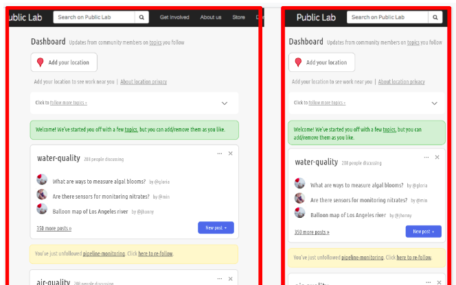
- The personalized dashboard i.e. the activity section we will have updates from each topic to which the user has subscribed to in the form of topic cards in decreasing order and not displaying updates from different notes like the previous dashboard did which got a little clumsy and not appealing.
- The right sidebar will have an option to share your work, a map containing user current location, below which, activity related to that place is mentioned(Nearby activity).
- The new dashboard will feature and focus more on the subscribed topics of each user and highlight those.
- It will recommend trending tags, topics, and the latest updates from the following so as to generate interest and active participation from the users.
- It will also recommend the other topics which might interest the user other than the subscribed topics.
COMPLETE VIEW:

FEATURES:
- In the recent activity section, the user will be updated with topic cards that the user has followed in a decreasing order fashion
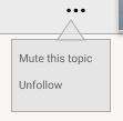
- Each topic card will have an option to unfollow it, mute its updates.
- Each topic card will have a button to add a new post for that particular topic.
- Topic card contents hide on clicking the "X"
- Flash message notifying the pages the users have followed/unfollowed.
- In the right sidebar, i.e. "Nearby activity"; a current location map of a user and updates regarding activity in that area and other users nearby which are matters of concern to a particular user.
- Displaying recommending & trending topics based upon the maximum number
of likes, views, comments, or followers to each user.

Users can follow any of the trending tags and topics.
- In the right sidebar, the featured topic section will also have a search
bar to search for desired topics
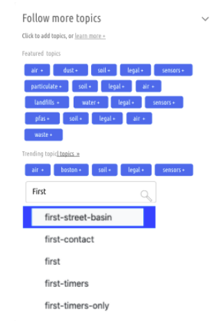
Enabling the use of autocomplete on the topics search at the sidebar.
- The sidebar will also have "Other topics" suggestions based upon user history.
- For new users "other topics" will display all other topics which are not on trending.
The designing part will be done while keeping the responsiveness of the page into account.
Part 2: Location Button
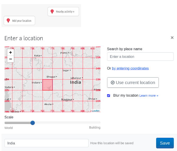
In the dashboard, the add location button displays a popup with options for users to pin their location as shown below.
FEATURES:
- The page will reload when saving.
- It will display a current location map of a user and updates regarding activity in that area and other users nearby which are matters of concern to a particular user.
- Using Ajax we can implement the following tags based upon user location
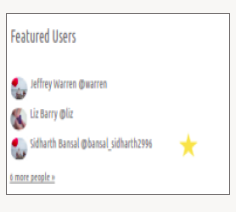
- It will also display "Featured Users" and will have the most active users displayed. And the users who share location with the current The user should be marked with a star.
Part 3: All Post / Research Page
Since the new dashboard design will display a list of topics, not posts, and some users will need a new place to see the full list of all posts once we get rid of the previous dashboard design.
COMPLETE VIEW:
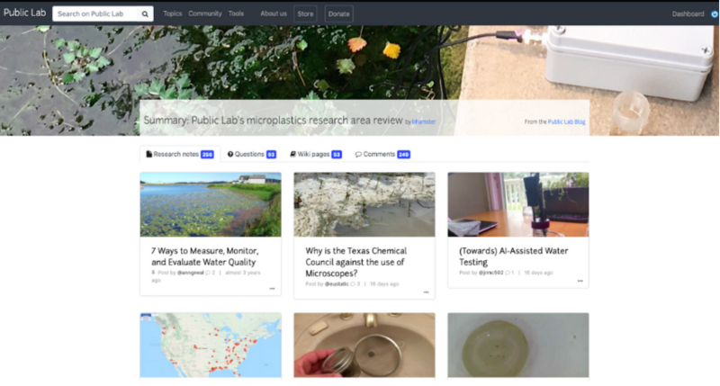
Image source: source
We can link the all post page on the URL '/dashboard/all'. I would suggest that the "all post" tab should be highlighted in the navbar next to the search bar.
FEATURES:
- To make the whole application standard we can design the "all post" page based upon the current dashboard /tag/design.
- In the all post section, all posts will be displayed divided among different notes respectively and posts will be sorted in decreasing order.
- Having sort by functionality - update, likes, views, comments
- Replacing people tab with comments tab
EACH POST CARD DESIGN :
- Each post card will show the number of likes, comments, views and updates it has. User can also bookmark any post

- Users can mute the note, author, and follow/unfollow any card update.
Part 4: Comments Card
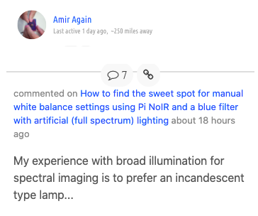
For the new dashboard, we need to improve the comments card as the current comments card is too plain and simple.
We can modify the comment card to make it more understandable and appealing by adding a profile picture, and a description of when the commentator was active.
CARD VIEW:
Timeline:
Common to all phases:
All phases begin with:
- The development of the use-case diagram
- The mentor(s) and the related developers would be given an update and suggestions from them would be accepted and considered.
- A blog post documenting what is to be done in this phase
- Opening at least 2 FTOs issues every week
All phases end with:
- Development of basic test suite
- Verifying if all the tests have passes
- Were any planned modules of that phase not completed? If yes, can it be done at the end
- A blog post documenting the progress, and all the issues faced and suggestions to improve
I have decided on the time period between December 1, 2020, and April 1, 2021, into four major phases.
Phase 1: Dashboard Page
| Time period | Work |
|---|---|
| December 1 - December 2 | Dashboard Page |
| December 3 - December 14 | Sidebar: |
- Recommending & trending topics and latest updates from the following
- Display list of "more topics to follow", excluding those already subscribed to
- Search bar for topics
| Time Period | Work |
|---|---|
| December 15 - December 24 | Sidebar: |
- Connect "add location" button to work similarly to adding the location in the tags input of profile pages
- "Nearby activity" - User's location, using which, we display featured projects in that area.
- "Featured Users" will have the most active users displayed. |
| Time Period | Work |
|---|---|
| December 26 - January 4, 2021 | Personalized dashboard/Recent Activity: |
The dashboard features and focuses more on the subscribed topics of each user and highlights those.
- List of topic cards that the user has followed
- Each topic card will have an option to unfollow it, mute its updates, add a new post. |
| Time Period | Work |
|---|---|
| January 5 - January 7 | Developing test suite and testing |
| January 8 - January 10 | FTOs, Documentation, Blog |
Phase 2: All Post / Research Page
| Time Period | Work |
|---|---|
| January 11 - January 13 | Research Page |
| January 14 - January 17 | Creating all post URL, model |
| January 18 - January 21 | Improving the card design to mute updates, follow/unfollow |
| January 22 - January 24 | Developing test suite and testing |
| January 25 - January 28 | FTOs, Documentation, Blog |
Phase 3: Comments card
| Time Period | Work |
|---|---|
| January 28 - January 30 | Comments Card |
| January 31 - February 3 | Implementing the comments card mockup |
| February 4 - February 7 | Link comments card with “All post” page |
| February 8 - February 10 | FTOs, Documentation, Blog |
Phase 4: Other issues and linking
| Time Period | Work |
|---|---|
| February 11 - February 14 | Resolving uneven card sizes |
| February 15 - February 19 | Implement mobile responsiveness on the dashboard page. |
| February 20 - February 23 | Implementing blog subscriptions using email by adding a button or an option after the ellipses on the left is clicked. |
| February 24 - February 27 | Connect topics search to autocomplete dropdown |
| February 28 - March 2 | Fetch data and displaying in the front end |
| March 3 - March 5 | Display a list of topics subscribed to on the dashboard |
Phase 5: Wrapping up
| Time Period | Work |
|---|---|
| March 6 - March 9 | Integrating Tests and minor debugging |
| March 10 - March 14 | Finishing incomplete PRs and refinement |
| March 15 - March 18 | FTOs, Final Documentation, Blog, Reviewing PRs |
| March 18 - March 19 | Final report compilation |
*This is a roughly estimated time. With consideration to time, it may take more or less time to understand existing codes, resolve issues and bugs, and work on feedback from reviews.
Needs:
I would need the guidance and help of my mentors and community members in reviewing my work and finishing the project.
Contributions to Public Lab:
- I have contributed to Public Lab repository - Plots2 for both frontend in HTML/CSS and JavaScript and backend in Ruby.
- As a contributor, I have worked on solving bugs starting with FTO issues.
- Moving forward I fixed some functionalities and reported some bugs.
Here are my merged PRs:
https://github.com/publiclab/plots2/pulls/dldisha
Experience :
I'm well-versed with Ruby on Rails and now it's been 2 years and counting that I have been working with RoR. I learned RoR at Coding Ninjas (https://codingninjas.in/courses/classroom-web-development-course) from scratch under the guidance of great teachers and mentors who have had excellent past experience with RoR and motivated me too to make great RoR projects like
1.Developed a fully functional E-Commerce website with RoR which revolves around selling and purchasing of electronic products.
Github: https://github.com/dldisha/Ecommerce
- It included features like selling a product, advanced search, talk to seller using conversation and messages models and migrations, and add to cart features.
2.Developed a Twitter Clone with RoR with Create-Read-Update-Delete functionality for tweets: following and followers feature was also added.
Github: https://github.com/dldisha/Twitter_clone
3.Apart from personal projects I have also done a Software Developer Internship at inDDev where I developed a dynamic Content Management System(CMS) for Product Management using Ruby on Rails wherein modifications made by admin at the server site are rendered through HTML, JavaScript, and Ruby at the client site.
Blog: https://dev.to/dldisha/platypus-a-rails-cms-48io
Github: https://github.com/dldisha/CMS
- It included features like Versioning, Ancestry, Assigning task, WYSIWYG Editor, Search filters, and many more.
Apart from this, at the front end, I have worked with and are confident in React, HTML, CSS, JavaScript, Bootstrap, and Bulma.
Additionally, I have been a Web developer mentor at the Internity Foundation for a period of 3 months where I mentored students to develop various skills for web development - HTML/CSS, Bootstrap, JavaScript. And reviewed various GitHub pull requests and helped students with their projects.
Teamwork :
My open-source journey started from Hacktoberfest 2018 from where I got a Kickstarter by contributing to various repositories and learning how to make a good pull request. However, the best feeling was when my first ever PR got merged which motivated and excited me about open source contributions. I felt so motivated when my peers helped me in merging my PRs. Heading forward, I also participated in GirlScript Summer of Code 2019 which is a 3 month-long open source program during summers conducted by GirlScript Foundation, India, where I was one of the top contributors.
I get self-motivated whenever a bug is resolved and when I move towards the completion of any assigned task. However, the best feeling is still when one of my PRs gets merged. I feel confident about the fact that something I coded is being used and seen somewhere.
Passion :
India is home to some of the world's most polluted cities. And sadly every year the AQI stats have been touching new heights which have left us nothing but worried about our and the future generation health issues.
And thus I was motivated and inspired by the motive of Public Labs to provide a better and cleaner world to live in and if I can be a small part of this change it would definitely mean something.
Implementing the new dashboard for Public Labs would encourage better participation and promote a wonderful community to unite and discuss problems and make a change to this world.
Audience :
The primary goal of any business is to increase its sales and to increase the growth of the business. With users having lots of choices and alternatives for the products and/ or services you are offering them, the span of time you get to grab the attention of your users is quite less and you have to hit the bullseye in this short span of time and thus UI/UX plays an essential role in achieving this goal.
As this project is all about UI, the target audience is the entire user base who uses Public Lab. And since this community is a perfect example of technology meets nature and science, a good user interface is required, to improve user experience, so that users are able to use the site to its best purpose.
Commitment :
I have no other commitments during the Outreachy internship period and I am ready to fully dedicate and commit to this project and do my best. I am very excited about creating something new and useful and would be more than happy to work on it!

6 Comments
@warren @cess @lekhidugtal kindly review my draft for Outreachy's proposal. Any feedback is appreciated!
Reply to this comment...
Log in to comment
There is a lot of resemblance between your proposal, @stace and @shreeti_019 proposals. @dldisha, I request to find some clarity and then apply for this proposal.
Hi @dldisha I saw that the image of the all posts page seems to be similar to the image from this proposal: https://publiclab.org/notes/ruthnwaiganjo/10-26-2020/outreachy-winter-proposal-new-dashboard-implementation-project
Where did the image come from? If you are using an image from another proposal, please attribute where it came from to give proper credit. My apologies in advance if I'm mistaken. Thank you!
Is this a question? Click here to post it to the Questions page.
@warren yup, I have used that for reference. Have given the credit. Apologizes from my side should have taken care of that.
Reply to this comment...
Log in to comment
Hi, @dldisha - thanks for your proposal. I appreciate the extra UI design you've imagined and added in here and there. We do want to be sticking to the Bootstrap card design as in the style guide, so please bear that in mind!
https://publiclab.org/notes/warren/05-07-2019/introducing-a-draft-style-guide-for-public-lab
Also, many thanks for your contributions to date - it's great to see you on the codebase in GitHub. Thanks again!
Thank you so much for the review. I'll make the changes according to the given mockups then.
Reply to this comment...
Log in to comment
Login to comment.