Smartphone App for Residential Testing of Formaldehyde (SmART-Form)
The SmART-Form project seeks to develop free IOS and Android apps that can quantify atmospheric formaldehyde concentrations by taking pictures of a badge that changes color at a known rate when it comes into contact with formaldehyde. Colorimetric badges, as these chemically treated strips are known, are extremely lightweight, which allows them to be shipped at a minimal cost (unlike our heavy and bulky original prototype). With extremely low shipping costs and the colorimetric computation happening on an already purchased device (a smartphone), community members using this technique will have access to formaldehyde testing at around a twentieth of the cost of existing methods and does not require the badges to be sent back to the lab for analysis.
This method makes formaldehyde testing economically accessible to those that have normally been priced out (and who face a disproportionate burden of exposure), but the process of collecting the data can be tricky. Creating a user interface that is intuitive to the broad range of people concerned about the quality of their indoor air (inhabitants of high-end green homes or 250-square-foot trailers)is critical to making sure our promise of increased access is realized.
Currently we have several kinds of data that need to be captured by community scientists in order to get a valid result.
- Exposure A pre-exposure photo of the badge, followed by a post exposure photo of the same badge 72 hours later. ( a 72 hour timer should be automatically started once the first photo is taken)
- Conditions Environmental data about the temperature and humidity.
- Metadata A title for the test (date information should be automatically recorded based upon the time the first picture was taken, this will help differentiate tests taken in the same location across time).
Although not absolutely necessary for the successful use of the app, there are two important additional ways that participants can input valuable data, but both of these are currently a bit tricky because they force users outside the app and into a HIPAA-compliant survey platform (Qualtrics). A unique non-identifiable ID number is automatically copied to your phone's clipboard when you leave the app and can be pasted into the ID field in the survey, this allows multiple data uploads or health survey entries to be tied together without any identifying information. Here are the two surveys:
- Uploading your formaldehyde data to a collective public repository. There is a serious paucity of public data on domestic air spaces because they are unregulated and understudied. Contributing data to this database can help researchers and the public get a better understanding of the aggregate problem of domestic formaldehyde, and to inform interventions should they be necessary.
- Documenting how the quality of your health may be related airborne exposures in your home and understanding other possible sources of chemical exposure. This information, as I understand it, is not to be made public and is only for researchers. I wonder if there is a responsible way to make aggregate data public in real time, and also if this would be helpful for affected communities.


Our Initial user interface, consisted of essentially two interactive pages and additional informational pages for information about 1) formaldehyde, health issues and potential mitiation techniques and 2)the app and the project.
Beta Testing + the need for a new UI
In beta testing the first version of the app with community scientists across the country and in a partnering EJ community in southern Georgia, we found that many people needed a more strictly delineated path through the app. Some of the shortcomings of the beta test had to do with the need to take a picture of a dummy badge on a computer screen. There were many routes through the various options on the two main interactive screens and without breaking those processes down and more clearly choreographing one's movement through the app, they were getting lost. You can read some of user issues that we aggregated here. At first, we attempted to make small technical tweaks before coming to the realization that we might need a paradigm shift.
Aware of his role in creating the UI for EDGI's website change tracker (GitHub), we asked Kevin Nguyen if he could provide a UI consultation.
Kevin wrote a quick set of notes detailing his refinements to the user experience of this app in addition to a new set of wireframes.
- Tasks
a) Business: -Collect info from surveys -Present contact info for legal reasons -Give helpful info
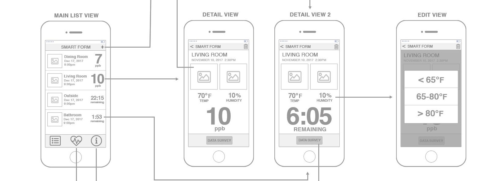
b) User: -Use test to get formaldehyde -Learn more about app, help project -Learn more about health issues, formaldehyde - Design: - 3 main categories represented by menu along bottom. Uses icons, but can use text.
a) TESTS (list icon)
b) HEALTH INFO (heart icon) - about formaldehyde, health survey
c) APP/PROJECT INFO (info icon) - about the app, contact info, user survey (temp) - Tests:
-New tests should take user directly to camera to take picture of badge.
Camera use should be consistent. Right now Android is weird because during the capture phase, the SAVE button doesn't do anything, until they take a snapshot. Then it saves it. Should not present an option that doesn't work until we need to.
Users should take a snapshot, then confirm or retake it. Once confirmed they'll be taken to details page.
Details -
Title should be clicked on to edit. Android uses an edit button which is unintuitive.
Date/Time should be filled in automatically once picture is taken.
Before and After exposures should actually show the pictures. These may be used in place of 'location' picture to remind user. If disagree or location picture mandatory, add a location image as well. But I think the before/after exposures may be enough.
Temp and humidity shouldn't be scroll wheels because of possibility of accidentally editing them. A modal to edit is suggested.
Because info about result or when result will be ready is most important for a user, that should be prominent. Recommend displaying it boldly. Also an automatic stopwatch feature would be great.
'Upload Data' is a misnomer because it's really a survey and takes people out of the app. Should be named as such and taken to 'Go to survey' screen. More notes about that screen below.
After done, going back to Main List View saves record, same as the app works currently.
Main List View - pretty straight-forward, again emphasis added for displaying results or timer until after exposure should be taken. This gets rid of 'finished' checkbox, which isn't really helpful.
- HEALTH INFO - Simple list view. Takes user either to a screen with the pertinent information on it or the survey screen
Go to Survey - Because surveys are dependent on leaving app and is jarring, suggest an information screen to handle it. Be honest here. We should explain what's about to happen, how long the survey will take, how many times they can/should take, etc. Also place the UUID here so they can grab before they go, then BYE!
Info screen - just text of whatever needs to be said here
- APP INFO - All the same interactions as the HEALTH INFO screen

UI redesign by Kevin Nguyen. Phone Outlines by Arun.
Further Refinements
A .psd file Kevin's redesign is available here should anyone else like to further iterate on his design. Some initial refinements that might be necessary in the final stage of programming this app are as follows:
- Make the function of the "+" in the upper right hand corner more explicit by naming it "new test"
- In the redesigned workflow, starting a new test takes the user directly to a camera view to take the "before" picture of the badge. The picture of the testing location, a part of the initial UI, has been removed in the redesign. The image that is shown as a thumbnail in the main list view of the app is not the location image but the before image of the badge, under the assumption that there is enough contextual information in that photo around the badge for it to be valuable for jogging the mind about that specific test. I think we might want to revisit this and maybe the location test photo should be should be where the user is taken when they click "new test" and then from that screen they are taken to the "before" photo. Or, alternatively, we could cut the thumbnail in the main list view all together and keep the workflow the same as is proposed in the redesign.
- In the redesign we do not clearly indicate when the health survey should be taken. Assuming that we would want this survey to be administered in the 72 hours between the before and the after photo (ie. before they can be biased by the test results)we may want to lead them to the
- Do we want the users to enter temp and humidity twice (once for each photo), as both can fluctuate considerably in 72 hours, and the quantification of formaldehyde would be calculated from an average of the two?
This material is based upon work supported by the National Science Foundation under Grant No.1645090 "EAGER: Collaborative Research: SmartPhone App for Residential Testing of Formaldehyde (SmART-Form)." Any opinions, findings, and conclusions or recommendations expressed in this material are those of the author(s) and do not necessarily reflect the views of the National Science Foundation.
5 Comments
hi @warren! how do i upload Kevin's .psd to PL.org and link to there so that he can not worry about accidentally breaking the link to his drive in the future? thank you!
Is this a question? Click here to post it to the Questions page.
Reply to this comment...
Log in to comment
Hi, how big is the file? We can host it on one of our servers; can you share the drive link for now?
Is this a question? Click here to post it to the Questions page.
Reply to this comment...
Log in to comment
its pretty small. the file is linked in the text, here's the link https://drive.google.com/file/d/1SbZog5bou9gsCbv5kqFMKwvD6QCCG_Kl/view
Thank you!
Reply to this comment...
Log in to comment
Smart-Forms_wireframes-cropped.psd
I guess PSDs don't upload correctly in the rich editor but they work in comments-- good for now, i guess?
Is this a question? Click here to post it to the Questions page.
Reply to this comment...
Log in to comment
Just another note here that could be helpful -- this has a collection of reusable UI design patterns they call "blocks" that I thought were really great. Not for every possible use (Bootstrap has a good set of very recognizable and familiar UI elements already for forms, for example) but nice and viewable on both web and phones.
https://www.froala.com/design-blocks
Reply to this comment...
Log in to comment
Login to comment.