What I want to do
I was inspired by Jeff Walker's kayak deployment of the Riffle-ito (Riffle + GPS shield) back in early August and wanted to do something with the data collected from it.
At MIT, I recently took a data visualization workshop in which we were asked to find a data set, identify a story, and visualize the data in a way that facilitated telling the story. Jeff was kind enough to send me the data (see GitHub) so I could try some stuff out. The final slides from my presentation are here if you're interested in seeing them.
My attempt and results
Story finding
During the kayak deployment, Jeff noted that he thought the water temperature by the outfall might be different than the rest of the river. As it happens, there was no significant change in temperature, as the data show. In this sense, the data itself are not that compelling -- but this is important, and I'll get to that later on in this write-up.
Jeff brilliantly rendered an R markup of his original data set and produced this map and this chart, which plots the GPS data and the temperature over time:


Photos: Jeff Walker, publiclab.org
Mapping the fourth dimension
I was fascinated by the spatial mapping of the data, but the R markups were relatively static (though gorgeous). So, I thought it might be fun to highlight the movement of Jeff's kayak as it moved through on river through time by plotting the same data on CartoDB and animating it:
Further renderings
Then I wondered what the data might look like if broken down by the minute. Using Tableau, I made a simple bar graph:

While looking at the bar graph, I tried to think of other way to represent the data. The bars reminded me of piano keys, which then prompted the thought: what if you could "play" data like you play a musical score?
If you imagine the individual bar charts as "notes" and the height of the bar chart as a proxy for "pitch" or "tone," you could almost map out a musical "scale" across the graph. This is an awesome interactive music project out NYU. While watching and listening to a person play the piano, you can use keys on your computer keyboard to play along. Your computer keys are programmed to play within the same scale as the musician, so you end up augmenting their performance with your own interpretive one.
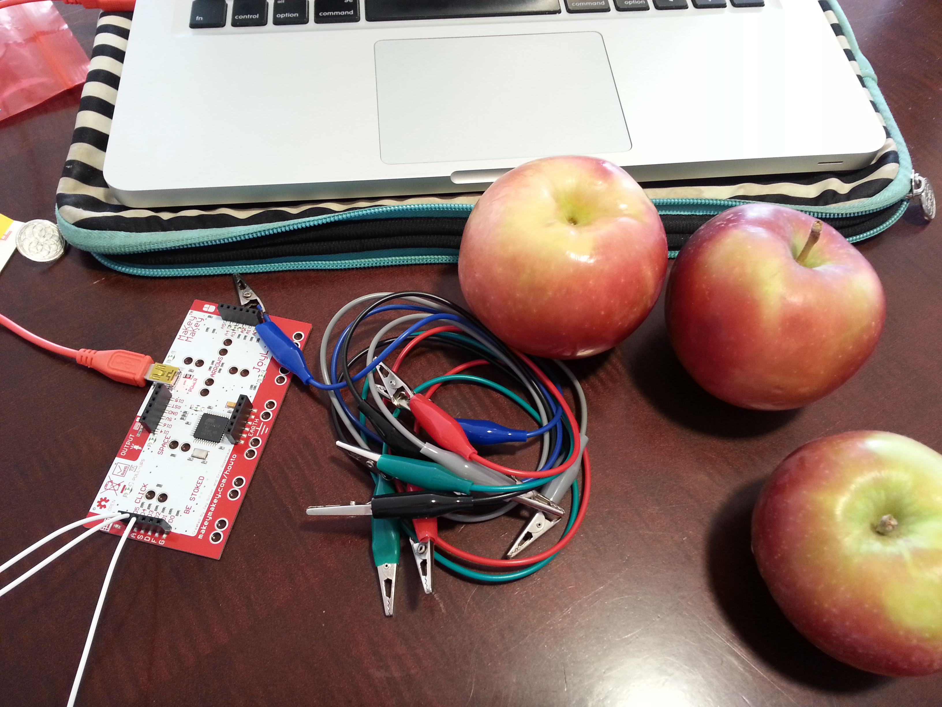
Taking a MakeyMakey, which is an Arduino-based board that lets you create on/off buttons out of pretty much anything that conducts electricity (i.e. pencil lead-based drawings, bananas, cups filled with water, etc.), I mapped my computer keyboard to the board, then the board to some apples. Thus, instead of playing my computer keys, I could then use the apples as an interface to the piano sounds. (This is the Sparkfun tutorial I followed.)
MakeyMakey with Riffle-ito data
(Apologies for the audio in this video not being very loud, ironically. I was in a public space, and there was a meeting happening a few seats over.)
Voila!
Why I'm interested
Data legibility Most of the time, representations of data are ocularcentric-- that is, very focused on image and spectacle. I'm interested in other ways to represent and experience data through other senses. Check out the Coqui water sensor for a great example of how conductivity -- a reciprocal of resistance -- can be output as audio.
Data as interpretive The ability to "play" the data as music leaves the interpretation up to the person viewing it. This backgrounds the fact that data itself is something that is interpreted and not fixed or purely objective.
Data as interactive This was a way to demonstrate how data can be interactive. Not only that, we can experience data through different interfaces. The MakeyMakey enables us to [re]connect immaterial data sets to the the actual material world.
Data as maybe-not-that-interesting Let's admit it. Data aren't always that interesting, and there's a lot of mundane data out there. Often, when we talk about things like "data-driven storytelling," we can overemphasize results over process or anything else. This project was a way to curtail that bias toward "conclusive" data and sort of an ode to the mundane data that permeates our everyday lives.
Questions I have
As I’m exploring the range of projects that span sensor journalism, I am thinking about what “journalism” itself means and entails. At the moment, my concept of journalism is deliberately liberal, for the reason that the field is constantly being recast in different ways with the advent of new technologies. For the purposes of looking at sensor journalism, I define “journalism” as a process of documenting the world.
- What forms of documentation qualify or disqualify as sensor journalism?
- What should the standards or expectations be for documenting the process of gathering and representing the data in various forms?
- Tools for visualizing/representing historical data are increasingly accessible online; what kinds of tools might be helpful to develop for representing sensor-based data (historical and realtime)?
Funny story that goes along with this
I was sitting in the MIT Media Lab during lunch, frantically trying to compile the MakeyMakey code for class. I kept coming up with an error and had no idea how to fix it. It dawned on me that the MakeyMakey was invented at the Media Lab, so I ran to the Lifelong Kindergarten group office to ask for help. There's a man and a woman there, and the man very nicely helps me out. I thanked him and got ready to leave but realized I hadn't introduced myself. He introduced himself. Turns out that it was none other than David Mellis, one of the creators of Arduino.
0 Comments
Login to comment.