I have just designed a basic structure of footer that incorporates everything as in the present footer.
I have tried to make the background color and the text color of the Header and the footer lookalike. Also, apart from that, I have added social weblinks as icons and changed the language section
I would love your suggestion and feedback here.
6 Comments
Hi @divyabaid16 I really liked the #222. Even, I had been incorporating some idea regarding this color.
I like watching people design, so great to see another work !!!!!!
It will be long comment maybe. The discussion mode is ON. 😃
I'm very curious and had questions -
And can we decrease the size of social font-icons? Maybe smaller.
The RSS seem to go out of alignment I guess. But this is basic structure , So not an issue.
Btw This is just one of my opinion,
How about letting the four column remain in footer, and do some other changes.
As it's easier to distinguish between contents maybe 😕
Work on color, typography, display of content 🤔
One more thing, how would your design will reflect in responsiveness ?
The links in first row and two column below that. How would we show it in mobile interface. 🤔
Maybe we can work on it from interactive purpose.
And and and
Maybe you forgot this -
Help sustain this resource & community: the Public Lab non-profit works to maintain this space for community knowledge and dialogue. Contribute to help support it!
Hey, Glad to see your work. I hope to have some conversation and debate in design and technology if you're interested 😃
Is this a question? Click here to post it to the Questions page.
@lekhidugtal thank you so much for your response!!! I'm really glad that you looked at it.
Yes, they are absolute links. But I was figuring out a way to arrange them. I went through many websites and I found arranging it this way the best and the most compactable one. I'm a learner in design and I'm on a learning process. Please correct me whenever I get wrong.
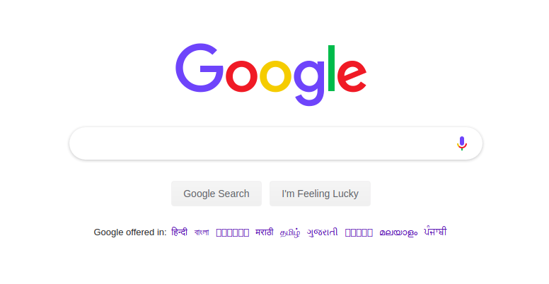
In this case, we can either add the dropdown menu or if there are less number of languages available, then we can just arrange it within a line (similar to Google)
And regarding the 4 column thing, the UI was looking a bit messy and there was a huge height difference between the columns making it look uneven, the way it is looking now. And also, another reason was that, there are big lines in the footer so if divided into 4 columns the lines would spread out to 3-4 lines which would (I guess) won't look very good.
I would love some more detailed suggestions here.
And I have tried to incorporate all the changes suggested by you.
Thank you so much!!!
Is this a question? Click here to post it to the Questions page.
Hi Divya
Footers can be large if we want and it's not necessary to compact the footer.
Currently in your design the footer looks cluttered with lots of data.
And we aren't able to differentiated between the contents
How about we do some thinking regarding this . You know.
What I want to say is ,
How about looking through the footers given below -
* wikipedia
* amazon
* flipcart
An opensource project called open-event of Fossasia? it has huge height difference.
The social icons looks very large in footer. And maybe we can work out again regarding the position of links ..
And
For language, google shows it in its main content rather than the footer. Maybe we can work out in this too. !!!

These are some of my opinions but we can have feedback from other to get better results and ideas.
It will be great if experienced person can provide reviews to be honest.
cc : @warren
Thank youuuu !!!
Is this a question? Click here to post it to the Questions page.
Reply to this comment...
Log in to comment
Great designing @divyabaid16 . I agree with @lekhidugtal , that the footer looks a bit cluttered. Adding long sentences in the footer creates a lot of problem on small screens. I think we can keep it to 2-3 words max. The footer examples given by @lekhidugtal are great. To add to that, I really like the footer of if-me website. https://www.if-me.org/ (Problem in uploading the screenshot)
Thanks!!
Reply to this comment...
Log in to comment
Yes, @gautami_gg and @lekhidugtal I had the same view. But the original footer had such long sentences and in order to accommodate this, I found this the possible way. Maybe we could think of adding some new content in the footer that is smaller in words and does not take a lot of space. We could reconsider the contents placed on the footer.
And regarding the fossasia open event project, the footer with height difference is not looking so good, according to me.
Hi @divyabaid16
Fossasia has five column , so there is much less space but we have four column. How bout thinking like that.
🤔
Regarding the contents in footer, I think they are good. Though its just my opinion. 🤔
But it would be better for others to advice.
Great work though. Thanks !!!
Reply to this comment...
Log in to comment
Login to comment.