About me
Name: Getty Orawo
Affiliation (Podii Software academy and Consultancy)
Location: (Kisumu, Kenya)
Project description
Abstract/summary (<20 words):
UI design enhancement of publiclab.org
Problem
Publiclab.org being a functional and well informative site needs a few touches on it's UI displays to bring out the best in it's presentation to first timers visiting the site and even day-to-day users. There are various pages that need UI attention taking that they aren't as presentable as they could ultimately be.
Timeline/milestones
Having No solid professional background in design or graphics. I will maximize my time on the implementation using the many good looking ready-made wire frames from the UI designers. This will involve breaking down the milestones into smaller manageable chunks so as to cover much ground with maximum understanding of the concepts used.
Milestone 1) Profile Page
The profile page currently looks like this fro a new user:

The wire frame we could use for the design revamp is:

Timeline (Profile Page)
For the highlighted period below; The following milestones can be accomplished on this page:
| Time Allocation | Tasks | |
|---|---|---|
| May 20th | Brainstorm on techniques and approaches to use during the week and fully setup to kick off | |
| May 21st - May 23rd | Replace Activity Bar with subheads as a list, each adjacent to the count of how often it has been worked on | |
| May 24rd - May 26th | Add ‘Most Active Topics’ section on the page. This will contain the most discussed topics together with the relevant tags. There should be an ‘unsubscribe’ button on each topic in case the user does not want to follow the topic anymore | |
| May 28th - May 30th | Put up tags for ‘followed topics’ and ‘most active topics’ each with a ‘more…’ link to toggle the other hidden tags | |
| May 31st - June 3rd | Add layout tests for the added features and fix up overall styling while test driving the page for any bugs or missing features. | |
| |
|
Milestone 2 (Dashboard Page)
The dashboard page is the default first encounter when a user logs into the site. It should be good enough to keep the users interested in what Publiclab.org has to offer. This is how the Dashboard looks as at now:
_
_


The Dashboard appears too crowded by the tags,
The activity section is quite informative but also cluttered and not as presentable.
The social media section is a bit hidden.
Here is the wire frame we could use to style the dashboard and make it look amazing.

Timeline (Dashboard Page)
For the highlighted period below; The following milestones can be accomplished on this page:
| Time Allocation | Tasks | |
|---|---|---|
| June 4th | Find the perfect image to use for the hero background section at the top with abit of opacity and overlay text as shown in the mockup. | |
| June 5th - June 7th | Add the ‘Ask a question’ section and below them, 4 of the recent topics in a card like display that a user can click on and be redirected to each of the topic’s page. | |
| June 8th - June 10th | Research on the most appropriate way to place the three pillars, ‘The Problem, The Collaboration , The Solution’ , also with relevant images and a brief description that brings out the meaning of each of them | |
| June 11th- June 14th | Address the Recent Activities section. Here we could put activities into a card like HTML display. Also we could paginate for efficiency since the list scrolls up to the bottom of the page. | |
| June 15th | Read on new UI hacks and tips that may better my Ui approaches | |
| June 17th -June 18th | Add layout tests for the added features and fix up overall styling while test driving the page for any bugs or missing features. Also add FTO issues that may be first timer friendly. |
Milestone 3(Questions Page)
It is cluttered with tags at first view
The question text box is too small and may discourage longer questions
The display of the questions is detailed but the look can be made better.
Here is how the questions page looks now:

For the Questions page, her's the UI wire frame that we could use:

Timeline (Questions Page)
For the highlighted period below; The following milestones can be accomplished on this page:
| Weekly Time Allocation | Tasks | |
|---|---|---|
| June 19th - June 25th | Design the top most part of the page. Should have an avatar on the left and a brief description on the right of the avatar. Below these will be a text box to enter your question and the ability to post it by pressing a button. | |
| June 25th - June 28th | Have a section for featured questions that give a preview of the questions in cards. The card display should be responsive on smaller screens and vary in how many featured questions to be displayed in what screens. | |
| June 28th - July 5th | Do Mobile design. Introduce service workers and AMP(Accelerated Mobile Pages) to cater for the PWA part for responsiveness and variety of screen sizes |
|
| July 6th- July 7th | Test drive the site and see if there are any bugs or missing features. | |
| July 8th - July 10th | Create FTO issues from any missing features that could be first-timer friendly. | |
| |
Milestone 4(peoples page)
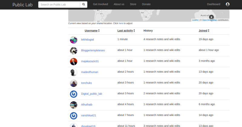
As at now, this is how the people's page looks:

_
_
This page could be better displayed using cards rather than rows.
Timeline (Peoples Page)
For the highlighted period below; The following milestones can be accomplished on this page:
| Weekly Time Allocation | Tasks | |
|---|---|---|
| July 11th - July 18th | Configue the page design to look like the provided UI. This will include using cards to display people rather than rows of data | |
| July 19th - July 22nd | Create FTO issues on any remaining bugs and add layout testing. | |
| July 22nd - July 23rd | Read more on UI design and new approaches to take when thinking about a User Interface. | |
| July 23rd - July 26th | Write blogs on the various new things I have learnt and share with others the things I would have accomplished so far |
Milestone 5 (Subscription stats Page)
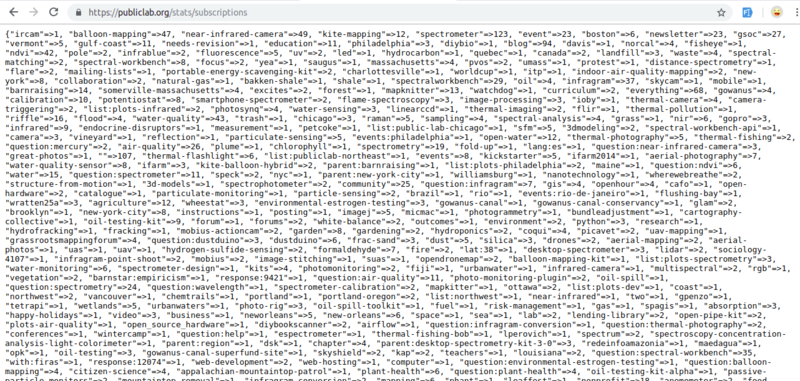
I worked on the backend functionality of grouping the subscription stats(that were in JSON format) into common subscriber count. This is how the page looked.
 _
_
_
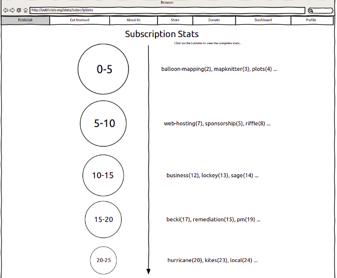
It's to be grouped and fixed into this layout:

Timeline (Subscription Stats page)
For the highlighted period below; The following milestones can be accomplished on this page:
| Weekly Time Allocation | Tasks | |
|---|---|---|
| July 27th - Aug 2nd | Research and settle on a 2D javascript Engine that will help in displaying the subscription stats with 2D shapes as expressed in the mockup. This will involve a series of deep research in order to get a hold of the Javascript Engine. | |
| Aug 3rd - Aug 9th | Implement the design using the Javascript Engine. This will involve creating objects, mapping them to the given values. Displaying subscriber count for each tag and on clicking the circles, a pop up with the related tags | |
| Aug 10th - Aug 13th | Blog about the Javascript Engine I will have used. | |
| Aug 13th - Aug 20th (onwards) |
Finalize on my Outreachy internship. Creating FTO issues and blogging on the various things I learn plus my experience as an intern. Thank my mentors and continue contributing to publiclab.org |
Needs
I would need all the assistance and guidance I can get from my mentors in everything I do. _
I would also ask for resources on UI design so that I can better my design approach
Would love guidance with what 2D javascript engine best works for the final milestone
First-time contribution
closed PR: https://github.com/publiclab/plots2/pull/5224
open Issue: https://github.com/publiclab/plots2/issues/5229
Experience
While starting school I learn HTML and CSS with a side of JavaScript but it wasn't my cup of tea back then. In 2016 I was an intern at a coding boot camp where I started learning Ruby on Rails; After the boot camp I drifted from coding once again due to impostor Syndrome. I was getting really discouraged by how much people around me know that I don't. Beginning 2017 I began the journey once again and swore not to quit no matter the circumstances. I went back to coding in Ruby which is the prettiest language ever laid my eyes on. I do Javascript and love to play around with Jquery animations. Earlier this year I began learning a functional paradigm called 'Elixir on Phoenix' alongside Ruby and the experience is fantastic. _
Github profile: github.com/gettyorawo
Gitlab Profile: gitlab.com/gettyorawo
Teamwork
Mozilla Community
Podii community
Agile Ventures Community
Passion
Public lab projects are amazing to work on since they are not just bound to one strategy of doing things. The personnel is welcoming to new ideas and they are very inspiring when it comes to collaboration. I'm passionate about graphics and motion, no wonder my attraction to JavaScript and Jquery libraries.
Audience
There are millions of people who visit the public lab website on a daily. I want them to feel the welcoming Ora whenever they visit the site. It's to reach out to people with impostor Syndrome like I used to have, those who don't feel they could achieve much but have so much potential. They need to know that they can actually be part of a community like public lab that welcomes everyone with open arms. This will be a stepping stone for them as it is fro me since they get to learn so much while having fun too.
Commitment
From reviews and alumni blogs, I understand that joining Outreachy takes one's full commitment to the project's contribution and collaboration. I am a tonne excited to be part of this journey since I have seen other people grow so much from this, and I'm also excited to grow both skill wise and social wise.

14 Comments
Nice proposal Getty! I liked that you included creating FTOs in your timeline. We would love if you try to open some FTOs now for newcomers, and help them in completing them too.
Regarding the testing part and re-organizing the timeline, you can refer to https://publiclab.org/notes/lekhidugtal/03-23-2019/soc-proposal-enhancing-the-ui-of-publiclab-and-relevant-changes-to-server#c23398
Although, changing the timeline is necessary.
Thanks!
Reply to this comment...
Log in to comment
sure @guaravano! I'll get to creating some FTO issues. Thank you.
Reply to this comment...
Log in to comment
Hey @Getty, I read your proposal and found it pretty interesting. Great job! Can you please use headline for First time contributions? Rest looks great :)
Is this a question? Click here to post it to the Questions page.
hello @divyabaid16 . oh yes! I missed that. Thank you.
Reply to this comment...
Log in to comment
Hi @Getty! This looks pretty neat and the
statsrevamp is really amazing! I'd love to use this feature on the website as soon as possible! 😃Quoting myself from @gautami_gg's proposal,
Quoting myself from @tonchuks's proposal,
Thank you for sharing your proposal with us! This is fantastic! 🎉
Is this a question? Click here to post it to the Questions page.
Hey @rexagog thank you. And yes I could try make it a little more convincing. For the first question at what point do I express this?
Is this a question? Click here to post it to the Questions page.
Reply to this comment...
Log in to comment
Hey @Getty! Nothing specific, just wanted to get to know how exactly would your proposal, in your opinion, once implemented (as a whole) into effect, would help attract newer members and keep them engaged? What do you have in mind?
Thanks!
Is this a question? Click here to post it to the Questions page.
A better UI and UX is key to anyone visiting the site. Most of what is in my proposal is to better the sites UI in general that first timers or even already existent users can have a better interaction with the site. It's good to give a welcoming feel as the implementations above will. Also for the FTO issues, first timers should have an easy time starting to contribute to the project. I aim at making the Open Source experience worth it too.
Reply to this comment...
Log in to comment
Hi @Getty nice proposal though. The small little optimisations you have used in your proposal is really good like the increasing of the size of the input bar of the question.
Just wanted to tell, can you just explain the changes you are doing in people page a little bit more. That would be really convincing for those who see your proposal.
Thank you!!
yes of course. Let me make that more clear. Thanks fro your review.
Reply to this comment...
Log in to comment
😃 Did you notice your page is live? https://publiclab.org/stats/subscriptions
I like how you're thinking ahead to the whole experience, especially page load times. I haven't used AMP in a Rails project before, and would be curious to learn more about how to do it! For the screen sizes and responsiveness, the Bootstrap library which we use is really great -- http://getbootstrap.com and we are upgrading quite soon to v4!
I truly appreciate that you are factoring this in. It's so easy to forget once we learn something, to show others and lend a helping hand with our new skills!
Finally i wanted to say, I think I've pointed this to you before but given your interest in graphics and motion, this is a really cool platform for making interactive JavaScript visualizations: http://p5js.org
I think you'll enjoy it!
Thanks for your proposal!
Is this a question? Click here to post it to the Questions page.
Thank you @jywarren . Yes it's been a passion for quite some time and would love to explore more on the p5js library. Thanks much!
Reply to this comment...
Log in to comment
Hi, Getty! I wanted to reach out to say that we really appreciated your work and your proposal. You're doing great work, and we'd love it if you'd consider applying with us again in the future. If you're interested in continuing to work with us, please know that is welcome!
Thank you so much Warren. It was such an awesome experience though. I sure will try again next time!
Reply to this comment...
Log in to comment
Login to comment.