What we want to do
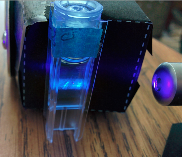
Me and @Warren are trying to replicate the heavy to light sorting of oils, as seen in "Laser Remote Sensing at Sea, A Quantitative Approach" byT. Hengstermann and R. Reuter and a bunch of other people's work.
Specifically, we're looking in a shift in the color of spectra emitted by fluorescing oils from red (heavy oil) to blue (lighter oil). look at Figures 1, 4a & b from Hengstermann & Reuter:


Our attempt and results
I tried to replicate this in spectral workbench, first on one spectrometer and then again with a bunch of spectrometers with different cameras in them. @warren has been working with the data and re-working spectral workbench to do cool things with the data. We've been talking on the phone too.
@warren tried smoothing the graphs, equalizing area, and equalizing height. The most legible and compelling, is to split the area of the graph and mark the exact middle. When that is performed, the progression of oil grades from light to dark (blue to red) is nice and clear.
OK, I added a couple more features -- one which bisects a graph with a vertical line where the area of the graph is equally divided -- what's that actually called? Anyhow I've just labelled it "Find graph 'centers'":

I also made a "Crop view" feature so you can zoom in a bit. It kind of sucks so maybe I'll add a real zoom feature and let people scroll back and forth. But it's too late tonight. But this makes it much easier to see the sequence of heavy/light oils:
https://spectralworkbench.org/sets/show/1482, of the SYBA cam:

https://spectralworkbench.org/sets/show/1484, of the filterless Infragram Webcam:

And https://spectralworkbench.org/sets/show/1481, of the filterless Infragram Webcam:

Questions and next steps
The order of oil grades is similar between the two different spectrometers. But each camera still produces different centers.
To make these spectra comparable between cameras, it looks like some sort of calibration samples will be needed. There are a lot of moving parts in these measurements such as concentration, or the path of the laser. We're still using a variable light path-- moving the laser around-- to give us spectra that aren't blown out.

Blowouts are a big problem we both noticed, and we're thinking some blowout warning in Spectral workbench might be useful. It might aso be possible to just watch one color channel:
Why do we want to do this?
we're looking to make an inexpensive means of identifying oil in the field that works between different cameras and devices.
22 Comments
Looks promising. Maybe these are obvious but... - Pick 3-5 oils, or oil mixtures, as a reference test set -- low to high density -- then use them for every test. - Prepare the samples in exactly the same way -- to eliminate another variable - Pick one oil as a reference (mineral?) and adjust the laser setup for a specific signal peak (non clipped -- and that will also likely prevent clipping with other oil signatures) -- then change only the sample ... to eliminate another variable. - It looks like the curve shapes you measured are similar, in general, to those in the paper -- and, they are all relatively "smooth" curves. You might use this to your advantage: - Try acquiring a set of values for each curve -- say the signal average for a 20nm width for every 25nm from 400-600nm -- 9 values. Then normalize the data sets (from 3-5 oils) to a common peak value as you'd only be interested in matching curve shapes not intensities. - If each data set has repeatable ratios (between values within a set for separate measurements of the same oil) then you'd have enough stability and an easy way to match test data with "known" samples by a simple: SUM(ABS(Refs-Meas)) ~= 0 for a match. - Admittedly, this is assuming there is a strong correlation between curve shape and oil density. - If different oil types, but with the same density, have subtle curve differences, then that might be approached with an additional observation of some limited part of the spectrum -- though that could be more difficult due to the apparent signal noise. Cheers, Dave
Is this a question? Click here to post it to the Questions page.
Reply to this comment...
Log in to comment
Good work here. I like the blowout warning idea. Experimenting with the oil density is def. another good step, but I agree that the distinct variation in spectra is important to define first on SWB. The density issue might be solvable with really good sampling methods if we are finding that is a problem. Something perhaps like you run 3 samples of the same substance at different concentrations and average the line?
Can you explain the vertical lines a little more?
Is this a question? Click here to post it to the Questions page.
Reply to this comment...
Log in to comment
I don't know the word for this kind of thing, but maybe @btbonval does :-)
The line divides the graph into two equal areas:
Reply to this comment...
Log in to comment
@stoft Dave, we're getting similar brightnesses between our readings of different oils by varying the concentration and/or light path, which seem to change the brighness without effecting the emissions curve. With the crude oil its actually hard to get a dim enough spectra-- with olive oil we have the opposite problem.
It seems you'd prefer we keep the light path consistent and only vary the sample-- but dialing in the concentration to get the right emissions is going to burn through sample preparations/cuvettes. Do you think we could use neutral density filters to knock the brightness down instead? I started to use a polarized filter for this purpose and it looked effective.
With just a filter change, then we could keep the lightpath the same, keep sample prep and concentration of oil the same, and just switch out a filter.
Is this a question? Click here to post it to the Questions page.
Reply to this comment...
Log in to comment
@stevie running three samples and averaging them is a great idea. You can see in the labels that I started running 3-5 tests per sample to go for bright, medium, and dim readings. When those curves were normalized they matched eachother in shape pretty well (as long as there were no blowouts). I think we could include that in the method-- I don't think much would have to be added to spectral workbench-- just looking to see if the dividing lines were close would work.
As for the vertical lines--I'm not sure what it is supposed to be called, but essentially we're integrating the area underneath the graph and then dividing it so exactly 50% on one side and 50% on the other side of the line.
Reply to this comment...
Log in to comment
@warren The line that you describe would be the weighted mean of the dataset (integral divided by two, aka area under the curve divided by two as @mathew noted). This would be super easy to find assuming the plot was a histogram. Unfortunately the data plotted from the frequncy vs amplitude is not a histogram as such, because we don't have those little balls used to create the histogram curve. We only have the one curve itself. So we have to integrate the whole thing, find what half the integral is, and then find /where/ half the integral occurs.
You might also be talking about linear discriminant analysis if the left side balls are quantitatively different from the right side balls. LDA is a clustering algorithm to separate classes of data. Again, since we don't have access to the balls, this is probably irrelevant.
Reply to this comment...
Log in to comment
I think the term you are looking for is the "centroid" -- think of it as the point where the shape/volume/whatever would be physically balanced -- though I don't know if your algorithm actually finds the centroid.
Ok, good, the curve shape is oil type dependent but not concentration dependent. This is easier.
Ah, so there is is large dynamic range dependent for florescence based on oil type - makes sense. Yes, the simplest way to compensate is to set the laser intensity for a high (but not clipped) signal with olive oil and then attenuate for all other types. I suspect that the ratio between florescence intensity and laser exposure is roughly linear so you could probably attenuate either the laser or the observed signal at the camera side. However, attenuating a spot source will be harder than attenuating the light from florescence glow over a larger area. Since you don't need to be very precise about the attenuation (you will normalize the curves anyway) you just need to maintain a healthy SNR. So, ink-jet printed filters should be good enough. (The trick is to use .tif (not jpg) image files and print high resolution using dithering. I've built 'snap-in' attenuators for the cell-phone spectrometer housing this way. Also remember that the printed dot density is not perfectly linear with the image dot density since the printer is an approximation due to it's own dot-pitch.) You could print a 'film-strip' attenuator with continuous patch areas of increasing attenuation and then just slide the strip 'till you get the best intensity. Cheers, Dave
Reply to this comment...
Log in to comment
What @stoft described in the first message is usually accomplished using a matched filter in DSP. http://en.wikipedia.org/wiki/Matched_filter
Reply to this comment...
Log in to comment
@stoft the centroid would be a point (x,y), not a line (x=B for all y). sorry to nitpick verbiage. I got all mathy in this post, figured I'd keep up with the mathy jargon.
Reply to this comment...
Log in to comment
btbonval - true. I was just suggesting a fast integer approximation as a simple means to test and get a 1-number result. The existing work in pattern matching for PLAB spectra might be enhanced for DSP of this application as well. Cheers, Dave
Reply to this comment...
Log in to comment
btbonval - point taken, centriod is for 2D; their line just represents the 'center of distribution'
Reply to this comment...
Log in to comment
Here's a dirty and slow way to determine the 50% mark:
Firstly, normalize your data by dividing the integral (area under the curve). The area under the curve may be approximated using Riemann sums, trapezoidal rule, or any integral estimation algorithm.
Riemann sums are easy to implement: Left sum = y0 * (x1 - x0) + y1 * (x2 - x1) + ... + yN-1 * (xN - xN-1). right sum = y1 * (x1 - x0) + y2 * (x2 - x1) + ... + yN * (xN - xN-1). Use one (arbitrarily chosen), or use both and average them together.
Take your y data and divide each y-value by the integral to "normalize" it. Now your y-data sums to 1. 50% of 1 is 0.5.
Add up your normalized y values until the total is >= 0.5. In this pseudo code, I'm normalizing and accumulating at the same time:
    integral = approximate_integral_method(y, x)
    accumulator=0
    for i in range 1..N-1:
        accumulator += y[i]/integral * (x[i+1]-x[i]) # accumulate the left reimann sum
        if accumulator >= 0.5, return x[i]
Minimizing the redundant math out of the for-loop:
    integral = approximate_integral_method(y, x)
    accumulator=0
    target = 0.5 * integral
    for i in range 1..N-1:
        accumulator += y[i] * (x[i+1] - x[i])
        if accumulator >= target, return x[i]
I'm not seeing any obvious or easy way to find that 50% point otherwise, but I imagine there must be some way that is better.
Reply to this comment...
Log in to comment
If you have access to matrix math, I can vectorize the previous algorithm to speed it up. If you're in client javascript, I'm unaware of any good vectorization libraries (libraries which support intelligent matrix operations and comparisons). If you're running Node or Python on a backend, we might be able to do it.
Reply to this comment...
Log in to comment
Hi bryan - my code is here: https://spectralworkbench.org/macro/warren/centroidish -- I wonder if you did an implementation how different the line positions would be?
Is this a question? Click here to post it to the Questions page.
Reply to this comment...
Log in to comment
In numpy, it'd be fairly easy.
    # establish that x and y are 1d vectors
    xdata = data[0,:]
    ydata = data[1,:]
    # perform cumulative scalar integration over left riemann sum
    accumintegral = numpy.diff(xdata).prod(ydata[:-1]).cumsum()
    # the last value in accumintegral is the full area under the curve.
    target = accumintegral[-1]/2.0
    # find the first x-value for which the accumulated integration exceeds half the total integral
    return xdata[accumintegral >= target][0]
Reply to this comment...
Log in to comment
@warren You aren't taking integrals, you're accumulating y-values.
This might be equivalent if and only if the difference between x-value samples are equal. So like, if your sample interval along x-axis is always 50 Hz (50, 100, 150, 200) ... then your implementation is fine.
If the sampling interval is ever a little off (50, 110, 130, 156 Hz), then your algorithm will not yield good values.
Reply to this comment...
Log in to comment
The interval is from pixel width on the sensor, so I think it's a safe assumption?
Is this a question? Click here to post it to the Questions page.
Reply to this comment...
Log in to comment
On the plots, it looks like you have linearly sampled x-data, around 300 nm to 700 nm. The question is whether each x-value is equally spaced. If the difference of one pixel width on the sensor yields the same nm difference between each measured point, then you have uniform sampling and you can ignore integrals.
The best way to tell is look at your x-values for the rawest data you can look at which is still measured in nanometers. Is the difference from one x-value to the next always the same? If so, you don't need to integrate, you can simply accumulate. The area under the curve is preserved, relatively (mathematically every integral, no matter where along the x-axis, will be off by a factor of the sampling width aka difference in x-values). The half-way comparison is also relative, so you wouldn't need proper integration.
Is this a question? Click here to post it to the Questions page.
Reply to this comment...
Log in to comment
@stoft I just sent off a group of fades on acetate to the photo printer we use for our slits. We'll try it out soon.
Reply to this comment...
Log in to comment
gradient_print.pdf
@stoft just got these back. The silver nitrate emulsion is line-screened at 300dpi, and goes from 100% black to 100% clear. The dimensions are arbietrary, I figured I'd probably cut them down later.
I'm excited to try this little laser level control.
Reply to this comment...
Log in to comment
They look good in the pic. It is difficult to get a ideal gradients with actual dots or lines. You might try attenuating the florescence light vs laser source and look for any differences related to print resolution. Ink jet dithered dots did quite well in front of the slit. Hope they work.
Reply to this comment...
Log in to comment
@phil3D awards a barnstar to mathew for their awesome contribution!
Reply to this comment...
Log in to comment
Login to comment.