Idealab Blog

Timeline of a Public Labs map project
cross-posted from PBS's IdeaLab. How We Got Here: The Road to Public Lab's Map Project
Last week, Public Laboratory announced that public domain maps are now starting to show up on Google Earth and Google Maps. But how did the projects get there? Here's a timeline of a Public Laboratory map project.
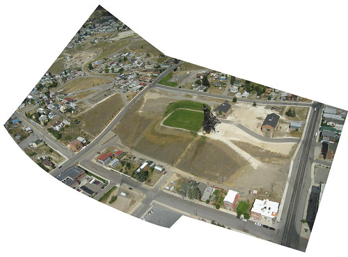
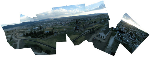
MAKING A MAP Public Laboratory projects take a community-based approach to making maps that differs depending on where you are and the reason you want to create a map. People map areas for a number of reasons, including because there's a need to monitor an area of environmental concern, a dynamic event is happening that there's a desire to capture, or you cannot find adequate aerial image data. Before going out to map, preparing for fieldwork starts with the Public Lab map tools page, where you can discover what type of equipment to use and how to safely use it. Multiple research notes on how to do things such as setting up a dual camera rig and stabilizing the camera with a picavet can help with specific problems, but there are also hundreds of people in the online Public Lab community of mapmakers, sharing tips and experiences on the site.
UPON RETURN After the mapping flight, the map making begins with backing up the images and sorting through the set, making a subset for map production. Depending on the time in the air, there will be hundreds and sometimes thousands of individual images. Depending on the area of interest, you can hone in on which images will be used in creating the map. Assuming the flight was at a steady altitude, the images that you want to select are the sharpest ones that are vertically oriented. If you have many images for the same area, pick the best one, but also pick overlapping images so that there is plenty of overlap among the different images in the next step.

Images can be sorted locally or online. Public Laboratory created an online tool where a group can do collaborative selection. MapMill.org is a web-based image sorting and ranking tool where multiple users can sort through a large dataset simultaneously.
MAP PRODUCTION With a smaller set of the best images on hand, the images can be dynamically placed on the map in a process known as georectification. After all the images have been added to the map, the project is exported. The MapKnitter export tool does all of the geographic information systems crunching behind the scenes with the geospatial data abstraction library (gdal.org) and produces a GeoTIFF map file. The GeoTIFF format is a public domain metadata standard that embeds geographic information into the image TIFF file. At this point, the map is now in an interchangeable format that can be easily distributed.

PUBLIC LABORATORY MAP ARCHIVE Public Lab hosts its own map data archive for storing and sharing finished map projects. Each map in the archive has a "map details page" that hosts details such as: title, date, place, location, resolution, field map maker, field notes, cartographer, ground images, oblique images from the flight, and comments from website users. The map participants choose whether to publish the map as Public Domain, Creative Commons Attribution ShareAlike, Creative Commons Attribution, or Creative Commons Attribution Non-Commercial.

Maps are viewable on the archive itself, and you can subscribe to it as an RSS feed. However, it's also a place for distribution of the data. As we announced last week, Google Earth has started licensing our public domain maps. Google Earth plans to continue to publish public domain maps from the Public Lab Archive a few times a year.
It's quite exciting to see these Public Labs maps go online with a ubiquitous data provider such as Google. We look forward to more people participating in this activity, and more publishing of public domain data.

Follow related tags:
balloon-mapping near-infrared-camera kite-mapping idealab

Why Collaborative Development Works in a Proprietary World
This was re-posted from PBS's IdeaLab blog
Public Laboratory is made up of a diverse group of contributors, some working from their homes or garages, some from their workplaces or even university labs. What brings us together is the idea that open-source, collaborative development can result in inexpensive and accessible environmental sensing.
But to many, the way our community operates can be disorienting. We've approached these unique challenges in several ways.
Most people are familiar with collaborative development of textual works, such as co-authorship, or even mass co-authorship in projects such as Wikipedia. Software development is textual as well, and such communities are made possible by carefully tailored open-source licenses, which effectively stop any individual or organization from controlling the whole project.
By contributing to these works -- say, an open-source web browser or an article on gumdrops -- authors are assured attribution but cannot stop others from building upon their work, improving or adapting it for new uses. This works in part because each time programmers or Wikipedians contribute, their name is explicitly entered in a registry of sorts. By publishing their contributions, they give up a certain amount of control -- of course, they'd almost certainly built upon the prior contributions of others who made the same choice.
Now imagine applying that system to non-textual works, such as a new kind of camera or a tool for detecting air pollution. The way Public Laboratory works, these designs are developed, tested and improved slowly through dozens of meet-ups, workshops, field events, and brainstorming sessions. At each meeting, participants agree to share their contributions in an open-source manner -- but there is typically no explicit record of every contribution.
To compound this, journalists (not to mention partners and even funders) prefer hierarchical organizations so they can say things like "developed at MIT," and they really love citing individuals, not nebulous groups of "contributors." We've often had to insist on group attribution in the media, and developing a so-called "attribution infrastructure" is a major focus on our website.
Design for attribution
We recently launched a small set of new features on our website, PublicLaboratory.org, to address these challenges. While many people make use of our tools, as a community we'd like to highlight those who contribute improvements and share their knowledge with others. With that in mind, we've come up with some ways to track when Public Laboratory contributors actually post about their work on the PLOTS website.

Taking a cue from socially oriented open-source website Github.com, we've posted small graphs of the amount of activity on a given project over the past year. A quick look at these graphs shows how much activity they've seen in recent weeks, and gives visitors a sense of how dynamic a research community is involved in a particular project.
 This box is shown on every Public Laboratory tool page or place page.
Above that graph, we've listed contributors and the number of posts they've made (which are tagged with the tool, i.e. "thermal-photography". The intent here is not to make things competitive (though that wouldn't necessarily be a bad thing) but to give people a sense of satisfaction that they've been a part of a communal effort, and a glimpse (to outsiders) of the number of people who have made the project happen.
By placing emphasis on the posting of content, we hope to highlight attribution for those who do good documentation and share it in a public venue -- though anyone is welcome to use, adapt, repurpose, and improve upon Public Laboratory projects.
In order to be an active participant in our grassroots research efforts, you've got to reach out to others and share your work. This may not be natural for many people; contributors from many backgrounds are often accustomed to sole authorship credit, while others wonder who will care whether they publish or not. In a collaborative effort such as ours, however, success is gauged by how many others are able to leverage your work and reproduce or improve upon a set of tools you have contributed to. In an open-source context, seeing someone else replicate or adapt your work is a gratifying affirmation that your documentation and development work have resulted in legibility and accessibility for a potential collaborator, not an instance of plagiarism or infringement.
 A network graph for the OpenStreetMap project shows the complex web of distributed contributions to a typical open-source project.
ShareAlike and Free Hardware
"Open source" means different things to different people, and with the above challenges in mind, it's important to make some distinctions. Strictly speaking, open source just means that you publish the source files of your work -- and in the case of hardware, the associated design files. A good open-source project will provide legible documentation and support for others who wish to read and understand those files. If you've heard of "free software" (we'll invoke the refrain "free as in freedom, not as in beer" here), you might be familiar with its more stringent requirement that users have the right to "run, copy, distribute, study, change and improve" the software. This is the basis of our approach to open source, public, civic science -- and it underlies our community's aversion to proprietary non-free (in both senses of the word) software such as Photoshop or Google Earth.
The noted lack of such freedoms in the area of scientific equipment and instrumentation -- and the barriers that creates for a more legible and participatory approach to science -- is a major motivation for our work.
Finally (for now) there is the idea of requiring anyone who takes advantage of these freedoms (by downloading, adapting, modifying and improving) to share their work in turn, under the same license. This requirement, known variously as a "sharealike" or "copyleft" clause, can be controversial, as it explicitly requires people (and companies) to become producers, and not just users, of open-source works. With some exceptions for datasets and privacy considerations, we have adopted sharealike licenses across all Public Laboratory content, and are in the process of releasing even our hardware designs under a sharealike license, the CERN Open Hardware License.
While these ideas may be unfamiliar for many, they make it possible for diverse communities such as ours to develop complex technical systems in a way which attributes and protects contributors' work, and ensures that these shared efforts remain public, accountable, and open to newcomers. They allow anyone to use PLOTS tools and techniques without needing to seek permission, while encouraging newcomers to contribute just as they benefit. They offer a public and grassroots alternative to closed, expensive, and proprietary systems of technology production which have resulted in a science that serves powerful and wealthy corporations above local communities and the underprivileged.
Such considerations are an important part of the PLOTS approach to building participatory environmental science collaborations. Ideally, our community's works will inspire readers or viewers to apply civic science ideas to their own lives -- adapting tools to local issues -- and with luck, they will become active participants in our research community by sharing their work publicly. In time, some may go on to organize local civic science groups, further the development of PLOTS' open-source tools, innovate new technologies or approaches to environmental monitoring, and challenge and refigure the very structure of participation.
Follow related tags:
collaboration licensing idealab blog

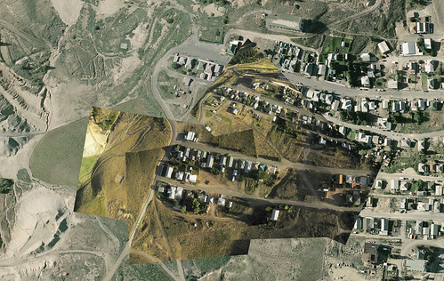
Georectifying in the Wetlands
cross-posted from PBS's IdeaLab. Making maps from balloon and kite flights in the dynamic coastal wetlands areas.
Using aerial mapping techniques, residents and volunteers of the Gulf Coast region began field mapping trips in 2010 to document the impact of the BP oil spill. Between May 2010 and April 2011, tens of thousands of images were collected and 50 regional maps created. Between May and October 2011, Public Laboratory partnered with Dr. Alex Kolker, from the Louisiana Universities Marine Consortium to begin a bi-monthly monitoring of select oil impacted and non-impacted sites in the Barataria Bay region. The intent of this phase of wetlands mapping was to monitor change over time with high resolution aerial and ground imagery.

MAKING MAPS WITH GEORECTIFICATION The fieldwork that goes into collecting images is the first step in creating maps. On the back end, the next step involves georectification -- the process where balloon and kite aerial images are "published" into geographic data. Simply, it is the alignment of an aerial image with a map or other spatial data of the same area. This part of the process is where images become maps and are associated with geographic standardized formats so that other users and programs can exchange and experience them in the same context.
Public Laboratory map production has used some specific techniques in creating wetlands maps. The maps are made through a georectification process by which adjacent images from the flights are merged in overlay as they are aligned to existing mapping information. Different "base" data can be used in these types of projects. In this case, we're georectifying the imagery through examination of the new images with existing imagery.

Distortion correction is applied to the new images, and they're moved around so that the same features of the base map are in perfect overlay with the new image on top. In the bayou setting where lots of change is occurring on the outer coastlines, features such as vegetation composition and interior waterways are used to match each overlay. Although waterways in marshland may shift quite rapidly, the center of a 3-way intersection is quite stable, as a rule.
Matching the imagery based on the interior features has proven effective in this simple map-making technique. While the outer coastline in our new images has changed since the time of the base data, the process of fitting the imagery with all of the interior ground control features allows us to discover where the coastline is with some measure of confidence. Or to put it differently -- when the alignment happens with the historic data in most of the image, then the new areas can be extrapolated with regularity.

Visit the Public Lab site for guides and discussion about the process and to view image sets and maps that have already been published in the map archive. The archive is a home and distribution channel for published open-source maps.
Visit MapKnitter.org to learn about our map-stitching tools and to view maps that are being created by people who are using aerial mapping techniques in new ways to document and monitor sites and events that are of importance to their community.
Follow related tags:
wetlands idealab barataria rectifying

Grassroots Mapping in Butte Goes Analog
This article was co-written by Olivia Everett, Butte site coordinator for Public Laboratory. It was re-posted from the original at PBS's IdeaLab blog.

As a newcomer to Butte, Mont., and as a grassroots mapper, I've learned a lot about a neighborhood's memories of itself, and the role that mapping can play in reasserting a human-scale sense of place. My experience here has since led to a collaboration between Public Laboratory for Open Technology and Science, of which I'm a founding member, and the National Affordable Housing Network, which is engaged in redevelopment in Centerville.
While mining still occurs in Butte, it's no longer central to the city's economic life. But it is, and will remain, the process that has most shaped the landscape. The future of this landscape has generated a conflict in identity between history and toxicity, cleanup and preservation. Butte has less than half the population it had during its boom years, but the population has stabilized, and more than 30,000 people still call it home. Very often, their memories of how people lived and worked with the landscape are often dwarfed by post-mining battles over controlling, preserving or changing the physical shape of Butte and involve local, state and federal agencies with overlapping concerns.
The human element in these battles is often lost through the desire for institutionally measurable quantitative outcomes that can be evaluated at a distance. A community's desired outcomes aren't easily measured, and get sidelined during bureaucratic processes because they will not lead to measurable institutional outcomes comparable with other sites.
Centerville
The built environment of Butte is a result of workers arriving to inhabit temporary camps which later became neighborhoods around expanding mine sites on Butte's North hill. Many of the city's ethnic neighborhoods such as Meaderville and Mcqueen were consumed in the process of mining the hill, but the Centerville neighborhood has prevailed. Centerville, which is 6,000-feet up and within miles of the continental divide, looks out across Butte, Summit Valley, and the Rockies. Mountains 30 miles away are visible on a clear day.
Historically, buildings in Centerville were built on skids so they could be moved around the expanding mineworks. Most of these mobile structures are now 75-125 years old, haven't been moved since the end of WWII, and most have foundations. Yet until residents successfully lobbied the city to change the zoning, Centerville was "trailer park" zoning, and ineligible for Housing and Urban Development funding.
The Public Laboratory for Open Technology and Science has been supporting a grassroots campaign of redevelopment in Centerville that now involves coordinated efforts from HUD (U.S. Department of Housing and Urban Development), the USDA (U.S. Department of Agriculture) self-help program, Habitat for Humanity, and the National Affordable Housing Network through mapping.

Meeting Centervillians
I came to Butte with a few intentions: to see how a community-situated mapping project could help in housing and redevelopment, to refine my bamboo, Tyvek, and tape techniques for kite building, and to lower the cost of aerial mapping. Gene Wohlman noticed our early attempts to get kites in the air, and our frequent cursing of the wind. Gene runs an NOAA (National Oceanic and Atmospheric Administration) weather station, and kindly taught us when to expect wind in Butte.
At the time, I didn't know that Mary Carol Wohlman, Gene's wife, was one of the leading Centervillians campaigning to change Centerville's zoning. Mary Carol grew up in Centerville and has lived there most of her life.
Mary Carol remembers a livelier Centerville with younger residents, and has sought to recreate an environment where more people can safely be out on the street, especially children. She points to several things that have led to a collapse in neighborly communication: People no longer walk to work at the mines -- they drive out of Centerville; work has diversified, and there's no longer the camaraderie of sharing an industrial occupation. (Gene is keen to point out that mining is harsh and should not be romanticized.) The neighborhood grocery store closed during the '80s, and residents lost not only a food store but also a gathering place that was essential for support, especially through the brutal strikes of the '70's. Neighborhood parochial schools can no longer be filled with Centerville's kids, and in an ironic twist, rushed parents dropping off their children make the roads unsafe for local kids walking to school.
And then there's the technology. Mary Carol has noticed that children's friend groups have changed from being neighborhood-centered to dispersed, because of the possibilities of always-on text messaging and shared indoor activities of television and networked games. Employment, services, and communication have all become non-local, and a sense of the neighborhood has fallen with a loss of shared local necessity. Centerville has faced depopulation, aging, a difficult zoning category that has encouraged official neglect, and a growth in absentee landlords as people leave Butte but hold onto their houses in hopes of returning. Unsafe structures, debris, and fire damage are common.
Tackling the problems
The community's prescriptions are practical -- increase chances for home ownership by changing the zoning so HUD and USDA Self-Help loan programs are available for fixing and purchasing existing homes, as well as allow for single-family housing infill on vacant lots. Hold the city accountable for fixing the sidewalks. Make sure the Environmental Protection Agency's reclamation process turns the old mine yards into parks with common spaces for local residents.
However, keeping Centerville residents in control of these processes is not easy. The layers of bureaucratic control and intimidating technocratic processes in the overlap between the United States' largest Superfund site and its largest Historic Landmark District are legion. In a politically tense environment, it's sometimes important to formulate complete thoughts in private, before encountering the politics of the larger system. Neighborhood starts with neighbors, not announcements to the world.
In July, with the help of Stephen Foreman from the Butte-Silver Bow GIS office, we made a 32"x48" map of just Centerville, from the most recent high-res airplane imagery (2004), and placed it in the Centerville volunteer fire department, and we provided colored stickers and sticky notes. Between neighborhood meetings at the VFW, Centerville residents marked abandoned buildings, unstable structures, fire damage, and debris around the neighborhood. By early September, these maps were used to coordinate dumpster locations with the city, and work days for debris removal for the residents.
Defining a notion of place
Beyond these measurable outcomes, the maps had a galvanizing effect on residents. As author and cartographer Denis Wood has pointed out, maps allow for a sort of political self portraiture, defining a notion of place within Cartesian space.
Centervillians had never had a neighborhood-specific map before, and multiple copies were requested for private spaces. Unlike our digital maps, Centerville's annotated paper maps aren't in our online archive. They don't reach beyond their location and remain semi-private to the neighborhood, on view at the volunteer fire department and the subject of discussion within Centerville. I myself haven't been particularly involved in data interpretation or coordination, as the maps are the community's tool. While residents are excited to see the new images we've collected of their neighborhood changes, they want paper copies. Their annotations will be similarly private, allowing them to develop their strategies for redevelopment among themselves.
If we had better digital records of this work in Centerville, it would be easier for our organization to quantitatively evaluate the outcomes of our investment, but community empowerment is not quantitative, and not all processes must be comparable between sites. Openness and digital connectivity have their place, and can bring a nourishing outside perspective, but we "digital natives" should never underestimate the power of a rooted community, real, physical community spaces, notebooks and sticky notes, and privacy.
There's still lot of untapped value on the analog side of the digital divide, and low-tech, situated processes with community at the center can trump new technology and the place-less data access of the Internet.
Follow related tags:
annotated-maps idealab land-use zoning

PBS post on Brooklyn mapping projects and recent imagery
Liz Barry just posted this great overview of recent Brooklyn maps on the PBS Mediashift IdeaLab blog:
"With Public Lab, a Camera Flies in Brooklyn to Monitor Pollution"
In the worst-polluted spots, 4.5 percent by weight of the sediments at the bottom of Brooklyn's Gowanus Canal are polyaromatic hydrocarbons (PAH), oily residues from manufactured gas works and oil refineries. Many other heavy industries, including coal yards, cement makers, soap makers, tanneries, paint and ink factories, machine shops, and chemical plants, left a wide range of other toxic chemicals. The former tidal inlet surrounded by wetlands was bulkheaded in the 1860s, resulting in dead-end channels so stagnant a massive tunnel was engineered to move water from the East river underneath downtown Brooklyn to "flush" the toxic waters out to the harbor.
Clearly, the official surveys indicate a lack of environmental information here. Using Public Laboratory tools and methods, grassroots investigators have documented not only active pipes missed in the official survey but also flows where no pipes are visible. Georeferenced aerial imagery stitched in January of this year by the Gowanus Arctic Explorers captured evidence of additional unknown flows melting the ice next to a filled-in basin where Vechte's Brook and its original spring are buried -- or perhaps it is merely evidence of illegal industrial dumping of liquids with a lower freezing point than water.
Follow related tags:
idealab

Steps towards DIY Spectrometry
Reposted from PBS IdeaLab
Several Public Laboratory groups have emerged around the development of new tools for measuring contamination and quantifying ecologic issues. Among them is the informal spectrometry working group, a loose group attempting to create an inexpensive spectrometer. Such an instrument offers the possibility of detecting and even quantifying contaminants such as polycyclic aromatic hydrocarbons, or PAHs -- exactly the kind of toxic residue which has resulted from the BP oil spill, and identified in concentrations of up to 4.5% at the bottom of the Gowanus Canal in Brooklyn. While this is an ambitious and even speculative project, the idea that citizens could have access to affordable contaminant detection, and to perform their own investigations of risks to health and the environment, is attractive and powerful. I'd like to recount a bit about this process of development, in order to offer a glimpse of how Public Laboratory approaches civic science.
Spectrometry is a subject which I knew next to nothing about six months ago. Look on Google Shopping or Amazon for "spectrometer" and you'll see why this is true for the average member of the public - prices for even the most basic instruments start around $2,500. Spectrometry books are esoteric and publicly-available research on the topic is hard to come by (the struggle for open access to research is an interesting movement both for research publications and raw data). However, a blog post by students at the Inter-University Center for Astronomy and Astrophysics at Pune, India, showed a simple spectrometer constructed from a cardboard pizza box and a fragment of a DVD. By holding a camera up to the instrument, very high resolution spectra can be photographed.
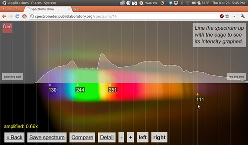
Spectrometry is a common tool for chemists attempting to identify an unknown material. They work by measuring the light which shines through a sample, splitting the light up into a rainbow of colors, and picking out the precise colors of light which have been absorbed. Molecules vibrate at distinct frequencies which interfere with light, and these unique absorption "fingerprints" can be used to match samples against a library of known spectra. The Mars rovers Spirit and Opportunity each have a spectrometer onboard (albeit a different kind than ours), as does the Mars Express orbital probe (which is actually very similar to ours). These tools help them in the search for water, while here on Earth spectrometry has been used -- even in the field -- to detect contaminants, assess crops, and identify vegetation. While the spectrometers we build are not yet good enough to detect anything but water vapor or colored dyes, we are slowly getting better at building and using them.
 (Spectrometers at Escuelab)
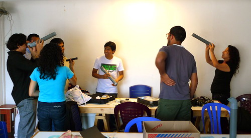
How do we hope to improve these instruments, and to make them accessible and affordable? The first step is to build a lot of spectrometers, which we have done in a series of open-ended public workshops. Our first attempt was at an art/technology/society space called Escuelab, in Lima Peru. With Nadya Peek of the MIT Center for Bits and Atoms and a small group of interested hacker-activists, we constructed a number of tube-shaped spectrometers for under $5 each, and took photos of spectra of items such as leaves, slices of pineapple, and flowers of varying colors. The design was refined and tested at later public workshops in cities around the US, including a large "class" at the Whitney Museum in New York City, part of the barter-for-learning program organized by a group called Trade School.
 Spectrum of a pineapple slice.)
Recent versions of the spectrometer use USB webcams, which are optimized for dimly-lit dorm rooms or internet cafes, and due to economies of scale, are cheaper than point-and-shoot digital cameras at $5-20 each. These allow for analysis in real-time, and a connected laptop displays a continuously shifting graph of wavelength intensities. This spectrometry setup looks vaguely like a microscope, but it is made out of cardboard and hot glue.
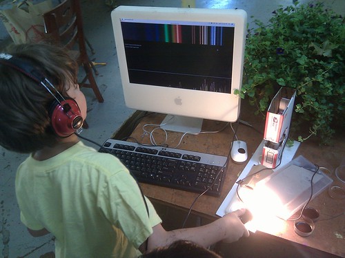 (A webcam-based video spectrometer)
Katie Gradowski and Will Macfarlane from the Somerville, MA-based DIY summer camp Parts & Crafts were so interested in the simple spectrometer design that they improved upon it and distributed a "PLOTS Spectrometer" kit to dozens of kids, including an illustrated guide and introduction to spectroscopy. Concerned that younger kids would not be interested, they designed their spectrometer to double as a kaleidoscope. The idea that scientific instruments could have an alternative use for entertainment is a powerful one, and it inspired us to create a "spectral turntable" in a subsequent workshop with Parts & Crafts campers. This used a spinning clear disc placed on an actual record player -- stylus swapped for a spectrometer, so that "samples" (pun intended) placed on the disc would be read cyclically as the turntable rotated. The readings were converted into an audible "beat", but more importantly, the use of the turntable to generate music hones the same skills which will be important to identifying materials -- sample preparation, calibration, and comparison of the results.
We are slowly getting better at each part of the process -- doing our best to share and invite others to collaborate, and to continue looping back to the original problem of identifying contaminants. The Parts and Crafts workshop was an excellent opportunity to build expertise in sample preparation, and we soon hope to set up publicly-accessible spectrometers in sites around the Gowanus Canal and to organize a group sample-collection and analysis session to begin to identify PAHs. We may not succeed at first, and we can use all the help we can get -- join the Public Laboratory site/mailing list, or contact us at team@publiclaboratory.org to get involved!
Follow related tags:
lima spectrometer peru boston