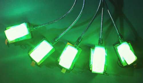
In the #simple-air-sensor's default settings, we chose to show a rough sense (think qualitative, for comparison) of the PM2.5 dust sensor readings as a colored light, in part because without calibration or accounting for humidity/temperature, it's hard to know exactly how accurate the readings are. (the Simple Air Sensor includes a single #Plantower PM sensor, while two come in each #purple-air device)

Also, this opens up a lot of possibilities for using the sensor to do group projects. It was very useful in talking as a group about how sensitive they are -- using a candle, for example, with 30 people, we had one person hold a sensor a few meters from a candle, with another right next to it. The whole group was able to see how one responded sooner, and there was a lot of other useful things we could do with it.
That said, the scale is currently set from green to yellow to red, and the color choices are worth some discussion -- i'd love to hear your thoughts and input. And as with any design question, we may not find there's one clear solution.
One problem is that red and green are the most difficult colors to distinguish for people who can't see colors as well.
A second issue is that they overlap with the colors used in the US AQI system (read more here), so could be confused with a direct indication of "safe" or "not safe" - which is not what the sensor is telling us, exactly.
How it's set up now
The actual code we're using is here: (gist link and Arduino Create link) and is as follows:
    int minVal = 0;
    int maxVal = 20; // arbitrary
    // map values to a portion of the 360 degree color wheel
    int hue = max(0, min(359, map(data.pm25_standard, minVal, maxVal, 140, 0)));
    setLedColorHSV(hue, 1, 1);
So, as marked, we can choose the top and bottom of the range.
Basically, the value of 20 µg/m3 for PM2.5 is mapped to an angle of 0 on the color wheel, and a value of 0 µg/m3 is mapped to the angle 140, which is roughly green:

What now?
Ok, so one thing that could address the red/green issue above would be to map from blue to red.
Another could be to use blue and green, although it's becoming less clear to a majority of people what is "more".
Other options could be to use a numerical display, or multiple LEDs. Or a blinking light. Or a sound (annoying?). But it'll depend on the use case, and I'm interested in how we can make a single, simple, colored light as useful as possible.
I would love to hear input; and keep in mind, we can try a few out and see how they work, so we can discuss this a bit -- and people may opt for different solutions. Thanks!
Some say "partial color blindness" actually has more color intelligence than normal people you can see here: frontiersin
Reply to this comment...
Log in to comment
https://mapknitter.org/maps/solar shows an image like this, using a color mapping which is often used in thermal photography:
Reply to this comment...
Log in to comment
During a quick chat with @mimiss, we discussed how a clicking sound speeding up or slowing down is used by Geiger counters. Using a blinking light whose speed varies to show concentration could make the SAS a bit more accessible for some, but I'm not sure
Would most people find it easier to infer a high or low concentration from a color along a spectrum, or the speed of blinking? I think blinking could potentially show a wider range of values, and you could count them while watching a clock to get a numeric value from it. It might also work better in different lighting conditions.
Is this a question? Click here to post it to the Questions page.
The cost would be a bit more, but what about a small strip of LED lights and the number of lights that turn on correlate to the concentration? Similar to the way that rechargeable batteries have a row of lights that indicate battery level, like this image below which has 3/4 lights on.
Is this a question? Click here to post it to the Questions page.
Moving to something that isn't color based might also help to clear up AQI confusion
true! might it be harder to read a bunch of sensors near each other? depends how theyre positioned i guess...
Is this a question? Click here to post it to the Questions page.
We could have more than one of those larger LED's that we're currently using, but it might be bulky. One bulb on could be green, two bulbs on could be yellow, three bulbs on could be red?
However I'm not sure how easily detectible the increase in number of bulbs on/light level would be so it might not be a viable suggestion, we'd have to test it out. Would we be able to video it, convert the video to grayscale and see if it is noticeable?
Is this a question? Click here to post it to the Questions page.
Reply to this comment...
Log in to comment