About me
Name: Simran Chaurasia
Email: simransia07@gmail.com
LinkedIn: https://www.linkedin.com/in/simran-chaurasia-003
GitHub: https://github.com/simransia
Affiliation: Indira Gandhi National Open University
Timezone: Indian Standard Time (UTC + 05:30)
Location: India
Project description:
Infragram is a project designed by Public Labs which helps in analyzing plant health using infrared photography technique.
Nasa uses specialized infrared cameras to observe the hidden life of plants, usually by mounting expensive sensors on airplanes and satellites. And infragram is the handheld version of this fascinating photographic technique. It is an online tool which is simple to use and works just like a normal camera.
Its working is based on the process in which plants constantly convert sunlight into sugars. Plants absorb red and blue light to produce sugar but not infrared light. So by comparing the infrared with the visible light one can analyze the productivity of the plants' cells, and depending upon the obtained results one can take decisions like better soil management, reducing fertilizer, soil treatments, etc.
According to me, the creation of infragram is a big step taken in the field of agriculture, which will bring revolutionary change by bringing technology and power to the common people. It's a do-it-yourself version of scientific equipment, using which almost anyone can analyze the plants' health and from anywhere. From gardners to organic farmers, wetland activists or anyone planting trees in backyard gardens, fields, parks etc can analyze their plants' health just by taking pictures!
Abstract/summary:
The Infragram project is a "do it yourself" scientific equipment which is making plant health comparisons possible with infrared photography.
Problem:
Infragram is very useful platform which is technically very good but there are many issues in its frontend part which needs to be fixed in order to give its users a nice experience of using the platform. Some of the issues are listed below:
1) Responsiveness:
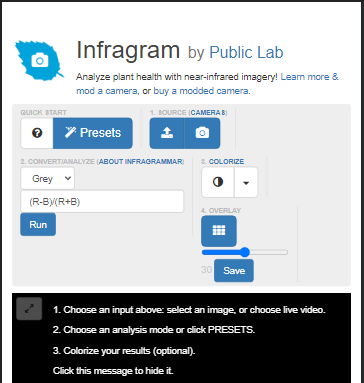
The infragram's web page is not responsive on small screen devices. All the elements get misplaced and do not look good when we start going below the 1119px screen size.
| |
User interface on mobile screen |
|---|---|
 |
2) Header & footer:
The website is not having a proper navigation bar and a footer, which is needed to give the website a proper structure. The navigation bar will also help in displaying all the important links at one place through which users could easily navigate. Same thing goes with the footer also.
Present header: 
Present Footer:

3) Alignment:
The image uploading section is not aligned with the top panel which is containing all the buttons for converting image.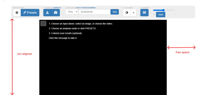
4) Drag and Drop Feature:
At present, the website is lacking drag and drop feature for uploading images and videos. This feature is very much important as most of the users prefer to simply drag and drop the images and videos instead of browsing them.
5) A popup modal guide:
A person who comes to infragram's page for the first time will have no idea about its working, features and functions. So a popup modal guide is very much needed which will guide the new comers about every section and functions of Infragram.
Project goals and implementations :
As Infragram has to be redesigned using bootstrap 4, I have created few mockup designs for its user interface which could be easily implemented using Bootstrap 4.
I have divided the whole UI into 4 parts (sections) in order to describe each part separately in detail. I have also done labeling of most of the components of the mockup designs and have explained about their functionalities so that everything could be properly understood by everybody.
Section (I) : UI design for the Navbar and Image Editing section
- I have designed a navbar which is containing the logo of Infragram and the short msg aligned to the right. Navbar is also containing 3 links which are aligned to the left. These links are also having their related icons attached to them. We can easily make use of "Font awesome icons" for implementing this.
- Bootstrap 4 provides various templates for making the "Navigation bars" and we could easily make the navbar similar to the one shown in the image below by making few changes into those templates.
- The whole image editing section will be inside the container-fluid class of bootstrap-4 by which it will cover the full width of the page. And then we will further divide this section into rows and columns using bootstrap's Grid system for designing the inner parts.
I have explained about the responsiveness of this design into another mockup design which you will find at the end of the section (IV).
All the other functionalities of the buttons and links could be easily understood through the image below:
Note: I have also made a few alternative designs for the UI of image and video editing section based on the feedback given by mentor @warren here. These alternative designs can be found at the end of all sections, just after the popup modal guide explanation.
Further explanation of the drag and drop section with the help of code snippets and gif:
- I have written the code for the implementation of the drag and drop design, and the gives the output as shown in the gif below.
- When the user will drag an image or video then the written text "Drag and Drop Image or Video to Upload" will get changed to "Release to Upload File". Also, all the buttons and text will fade out slightly and the border will get changed from dashed to solid.
- When the user drop the image then the image will occupy full screen of the window.

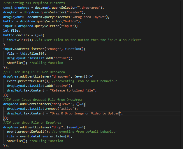
Code written for the Drag & Drop section:

Javascript code for making the drag and drop section functional:
Code for the showfile function which will get drop the file:
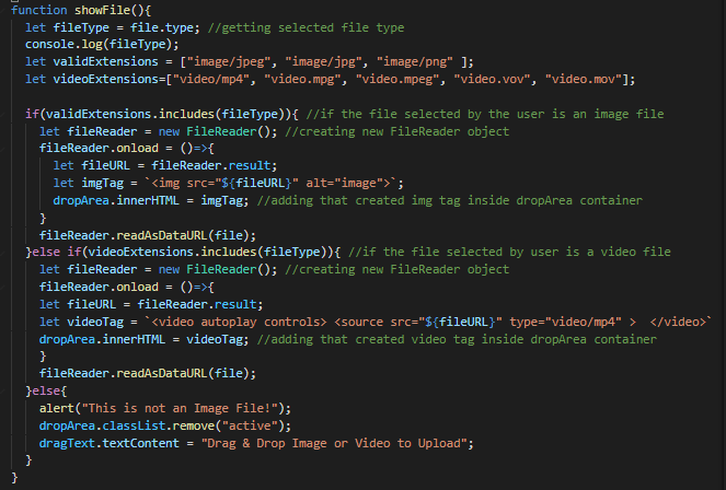
When the user will try to drag the image, the active class will get added in the drag-area-layout, and on drag leave this class will get removed. And the code for styling the uploaded image and video is written below the active class:

Section (II): UI design for displaying Infragram's important features:
I have found the three most important features of infragram. First is: It is providing great help for analyzing the plants' health. Second: It is a do-it-yourself version of scientific equipment which anybody could use easily. Third is: Ingragram's cameras are very affordable so that anyone can have it.
- So, would like to display these "features" in a concise manner using the "JUMBOTRON" of bootstrap 4 . And that jumbotron will contain 3 "CARDS". Inside each cards we can display one-one feature.
- Each feature will have a "learn more" button attached to it, by clicking on which, users could navigate to other pages in order to read more.

Section (III) : UI design for displaying testimonials.
While I was going through various links of infragram and public lab pages, I had found a feedback given by an infragram's user. Then I thought of displaying all the feedbacks on the infragram's page using the "Carousel Component of Bootstrap 4".
- Each slide will contain a different feedback and in future, if we get more feedbacks then they can be easily added by increasing the number of slides just by copy pasting the code of previous slide.
- These slides could be easily animated using various bootstrap classes present inside the carousel component.

Section (IV) : UI design for the footer of infragram
- The footer will contain the Infragram's big logo. Below the logo I have tried describing about the public labs in a creative way, it is also making the footer looks good.
- The footer will be divided into four sections 1) Links 2) Support and troubleshooting 3) Getting help & 4)Get involved. Each section will contain related links. You can read about the sections in the image below.
- The footer is also containing all the links to social profiles.

Few explanations about the responsiveness of the User Interface:
- Bootstrap provides great help in making the web pages highly responsive, we can use its "Powerful Grid System" to build layouts of all shapes and sizes. We will divide our image editing section into 3 rows. First row will be divided into two columns. On small devices these columns will break into two different lines, depending on the classes we have used for columns. For example: If we use col-md class then our columns will break at the screen size equal to or greater than 720px.
- We could try making the drag and drop section using the "Flex" utility of bootstrap-4. We could use justify-content-center and align-items-center classes in the parent element for aligning the drag and drop section to center both vertically and horizontally. We could also use nested flex-boxes for aligning the children of drag and drop section as well.
- We could use relative length units for font sizes in order to make our fonts responsive on small devices.
| For example: |
|
|---|---|
| “rem” |
for making the font-size relative to font-size of the root element |
| “vw” |
for making the font-size relative to 1% of the width of the viewport |
| “vh” |
for making the font-size relative to 1% of the height of the viewport |
- After all of this, If we still stuck somewhere in making few things responsive, then we can always take the help of media queries.
Pictorial explanation of the responsiveness of the user interface:

Pictorial explanation of the user interface On Mobile Screen:

Mockup design for the ☞ Popup Modal Guide For Infragram's Users:
This is the most interesting part of the proposal. I had a lot of fun as well as got to learn many things while creating a mockup for "popup modal guide" for infragram.
I have also written code for the first popup modal which will appear as soon as the user will land on the infragram's page. I have also created a short lovely video that will play inside the popup modal. And it is really looking great.
Preview of the modal on the desktop:

->
<-
| Preview of the modal on the small screen. |
|
|---|---|
 |
Here is the code which I have written for creating the first popup modal:
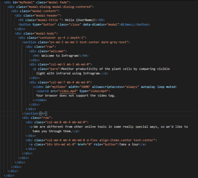 **
**
Code inside the script tag for showing modal:
Below is the image explaining about each section of the modal:

- When the user will click on the "Take a tour" button then a new popup will appear which will explain about the drop and down section. And in the same way, users will have to click on the next button present in the popup to move further the explanation guide. In this way, the popup guide will explain the users about every feature and function of the infragram.

- This guide is based on this tutorial: Link. I have also added some extra points for making the explanation more better.
- I have tried explaining the functions of each section in detail and in most of the cases I have also tried explaining with the help of images.
- All the popups are also containing related links which users could visit in order to learn more. These links include wiki documentation, information about camera, and a lot more.
I have also created a prototype for this infragram guide. You can view all my explanations by playing the prototype yourself at your convenience. I have not added the images of the popup's here because that will make the length of the proposal too long. As there are total 10 images of different popups which I have created. Below is the link of the prototype by playing which all the images can be easily viewed.
Please view all of the popups and explanation about each section of the Infragram by using this Prototype Link of Popup Modal Guide: 👉Prototype Link|Please Click Here👈
Instructions for playing the prototype:
After opening the link, you have to click on the "Take a Tour" button for moving forward the presentation. After that, you have to click on the "next" button present on the popup to move to the next popup. And if you want to view the presentation on full screen then you can hover over on the top of the screen then some options will appear on the navbar. You have to click on the 'options' and then on 'fit to screen' option for viewing properly and also you can make it a full screen by clicking on the last option available on the top-right corner.
Short Gif showing the demo playing the prototype:

Few alternative mockup designs for infragram's editing section which can be considered:
(a) For mobile screen:
This is the alternative design of editing section which can be considered for mobile screens. In this design all the icons are present at the bottom and when the user will click on a particular button then the related editing panel of the button will appear just above the icons.
| When user will click on the “Analysis” | When user will click on the “Slider” |
|---|---|
| |
|
| When user will click on the “Colorize” | When user will click on “Done” |
|---|---|
| |
|
(b) For desktop screen:
This is the alternative design of the image editing section for desktop screens, it is related to the above mockup designs on mobile screens. The editing section will work on a desktop just the same like it works on mobile. When the user will click on the different icons present on the left-hand side (like analysis, slider, colorize. etc) then its related panel will open up at the bottom for editing.
- In the below image analysis section panel is being opened. Similarly, when the user will click on the slider button then a slider will appear at the bottom for editing, presets button will open up a modal, and so on.
- The popup modal guide will work fine here also, we just have to change the positions of popups.
- An eye icon is also given which is present at the bottom left corner of the below design. Users can again watch the popup modal or video tutorial by clicking on that.
- The "Done" button will open up save, export, download, and other options just like shown in the above mobile screen.
Any changes could be implemented anytime on any of the sections depending upon the need of the project and suggestions of the mentors.
Timeline/milestones:
Week 1 :
May 30 - June 5
- Get more familiar with the community and discuss the goals, implementations, and new ideas for the project with the mentors.
- After brainstorming the ideas and understanding the needs of the new user interface, I will finalize a list of things and feature which needs to be implemented. and depending upon that list, I will start creating separate wireframes for each feature and take feedback from the community users on the same.
- Dive deeper into the codebase and understand the UI flow and various different use cases.
Week 2 :
June 6 - June 12
- Make changes in the created wireframes based on the feedback given by community users.
- Create the rest of the wireframes for other features. Iterate with user feedback.
Week 3 :
June 13 - June 19
- Start implementing the navigation bar design using bootstrap-4 by creating a separate index2.html file.
- Make changes based on the feedback of the mentors and collaborators.
- Make a pull request.
Week 4 :
June 20 -June 26
- Start implementing the design of the editing panel for images and videos using bootstrap 4.
- Make the panel responsive on small screens.
- Take user feedback and make required changes.
- Make a pull request.
Week 5 :
June 27 - July 3
- Start making the image editing panel functional with the help of javascript by collaborating with fellow GSoC interns.
- Make sure that every button and each section of the panel is functional and gives the required outputs.
- Make a pull request.
Week 6 :
July 4 - July 10
- Work on the implementations of the drag and drop feature.
- Take feedback from the mentors and fellow collaborators and make required changes.
- Make a pull request.
Week 7 :
July 11 - July 17
- Start implementing other required features.
- Make changes based on the feedback of the mentors and collaborators.
- Make sure that all other features and functions still work fine.
Week 8 :
July 18 - July 24
- Start working on the footer section.
- Make the footer responsive on the small screens.
- Make a pull request.
- Write documentation about all the changes and newly added features.
Week 9 :
July 25 - July 31
- Start creating a popup modal guide using bootstrap.
- Design all the popups for every feature.
- Make the popup design responsive on the small screens.
Week 10 :
Aug 1 - Aug 7
- Write javascript code for making the popups functional by collaborating with fellow gsoc interns.
- Make changes based on the feedback of the mentors and collaborators.
- Make a pull request
Week 11 :
Aug 8 - Aug 14
- Create wireframes for designing a new colorize popup modal window to describe each colormap and offering thumbnails.
- Discuss the design and implementations of this feature and take feedback from community users and mentors.
- Make further changes depending on the feedback.
Week 12 :
Aug 15- Aug 21
- Work on the implementation of the colorized popup modal window and thumbnails.
- Make it responsive on the small screens.
- Make changes based on the feedback of the mentors and collaborators.
- Make a pull request.
Week 13 :
Aug 22 - Aug 26
- Buffer week completed any pending task.
Needs:
I will need the feedback of my work like wireframes, pull requests, etc from the mentors and also from community users. I also need the availability of mentors _to guide and discuss about the needs and goals of the new user interface.
First-time contribution
Open FTO issues:
I have opened 3 FTO issues, for the people who are new to open source or who have never contributed to Public Labs' codebase, to make their first pull request.
| Issues |
Status |
Description |
|---|---|---|
| #11006 |
Open |
I had opened this issue for new commers. This issue is for updating the indentation from tabs to double spaces as well as for improving the alignment of the code written in the _range.html.erb file. |
| #11023 |
Close |
This issue had been opened for fixing the indentation of the code written within the script tag in the _users.html.erb file. |
| #11074 |
Open | This issue is open for replacing the hard-coded strings with the translation function as well as for adding the new strings in en.yml file. |
| #11109 | Open | This issue is again related to the translation project of Public Labs. It is for replacing the hard-coded strings present in the dashboard.html.erb file and adding new strings in the en.yml file |
Other issues:
| Issue |
Status | Description |
|---|---|---|
| #319 | Open | I had opened this issue for discussion related to the UI design of Infragram. I shared various mockup designs along with their detailed explanations. |
| #11049 |
Open | This issue had been opened for fixing the nav-links present on the navigation bar of public lab’s website. The links are not properly align. Also, both of the buttons present on the navbar do not have equal width. |
| #384 | Open | I have opened this issue for further discussion related to the design of the new features of infragram, especially for the popup modal. |
Pull Request:
| Request | Status | Description |
|---|---|---|
| #11053 | Approved | This pull request is for fixing the navigation bar links. I have made following changes: 1) Made the margin-left of About us link equal to the margin-left of its sibling elements. 2) Changed the string present in the en.yml file from “About us” to “About Us”. 3) I have used media queries to prevent these links from breaking on small screens. 4) Made the widths of the “Store” and “Donate” buttons widths equal to each other. 5) Made the store and donate button visible on screen size from 576px to 768px, 6) Have also given margin-bottom to the buttons so that they can have space between them on small screens, which they were lacking earlier. |
| |
|
Experience
I started learning web development out of curiosity and interest. Since I am from pure science educational background, I did not get any opportunity in college or school to get exposure of the computer science field and coding. Although I like science but I also had a huge interest in learning web development and graphic designing. So, I started gaining knowledge from various online resources, and I am really grateful for all guidance which is available online. I consider the combination of internet and education an incredible opportunity for those who are ready to go extra mile, in scaling themselves up.
I had put all efforts in making myself a better developer. And with the increase in my knowledge and learning, my love for programming has also increased. I have made various projects in order to improve my skills. Few of them are as follows:
(A) Front-end projects:
1) Musing app-
- Live link: https://simransia.github.io/Musing/
- Git repo: https://github.com/simransia/Musing
- Tech stack: HTML, CSS & Javascript
Description: It is a beautiful app that can be used for meditation purpose. It has 4 different themes containing different soothing sounds of nature like the sound of birds, the sound of rain and the sound of sea waves, which I have combined with the calming music of piano & flute.!_
2) Drum Kit-
- Live link: https://simransia.github.io/Drum-Kit/
- Git repo: https://github.com/simransia/Drum-Kit
- Tech stack: HTML5, CSS3 & Vanilla Javascript
Description: This is a music player website, where you can play various drum sounds by pressing the corresponding keyboard keys!
3) Image gallery-
- Live link: http://simransia.github.io/image-gallery/
- Git repo: https://github.com/simransia/image-gallery
- Tech stack: HTML5, CSS3 & Vanilla Javascript
Description: This project is designed using of flex boxes . There are various flex-boxes nested inside each other in it . There are 5 panels and when you click on any panel, that panel get extended and shows a nice quote. And on clicking again, the panels get contracted back.
(B} Full Stack projects:
1) iNotebook:
- Live link: http://notebook-three.vercel.app/
- Git repo: https://github.com/simransia/iNotebook
- Tech stack: React Js, Express Js, MongoDB, Mongoose, bcryptjs
Description: iNotebook is a full-stack application. It helps you to store your notes securely on cloud. It also gives you the functionality to edit and delete your previously written notes. You can also attach related tag with your notes.
5) Disney Clone:
- Live link: I will soon make the app live.
- Git repo: https://github.com/simransia/disney-clone
- Tech stack: React, Redux, Firebase
Description: This is the most amazing project I have build till now. It is a clone of disney plus. I have learned so much while making it.
Teamwork
I had joined an NGO named Robin Hood Army as a volunteer during my college days. The main aim of this NGO is to "eliminate hunger and illiteracy". Here I interacted with many team members. We worked together to plan various strategies to increase the online presence of the ngo. I had provided many innovative ideas and solutions and implemented them as well.
I love to participate in various programs and coordinate with people to exchange ideas, since my school days.
Also, I have a wonderful experience working with the people of public labs during my contribution period. I really appreciate the way everybody works together collaboratively.
Passion
I really like all the work which Public Labs community is doing.
And, the vision which Public Lab is having of bringing the technology to every people by making the do-it-yourself affordable scientific equipment and that too for creating environmental impact, is very inspiring and praiseworthy!
I also really appreciate the way Public Labs community welcomes newcomers and helps the people who are new to open source to make their first contribution.
I am myself a person who loves to spend time in nature amidst trees, rivers, mountains and most importantly fresh air! Being a nature lover, I am concerned with all the increasing environmental issues So, I would love to work with a community that is working towards the same.
Audience
This project will benefit a vast number of people from scientific experts, organic farmers, and wetland activists to common people growing plants in their houses. And this is what makes this project very interesting and unique!
Users will be able to easily analyze the health of the plants of gardens, fields, river banks, homes, and anywhere.
Commitment
I have no other commitments on my schedule, so I am ready to work full-time during the internship. I will ll be working 40 - 45 hours per week.

6 Comments
Hello @mathildaudufo and @warren . Please review this proposal. Although it is not completed yet but I would be happy if you provide me some feedback on sections which have been completed.
Reply to this comment...
Log in to comment
Hi @simransia07, I like your mock-ups: I like that you included the columns sizes. I like the in-depth explanations you gave in your solutions, the code snippets and the explanations on your mock-ups is really great and helpful ❤️ I love your "project description" I liked that you explained the project in your own words and understanding ❤️ ❤️ . Your proposal is so clear and detailed, really great proposal 🎉 🎉
One thing to think about is the shade of blue used in the footer, I think it might too bright to be used as a bg-color on the places you have used it ..what do you think?. I do not expect you to edit the images just something to think/discuss on.
Thanks for posting
Is this a question? Click here to post it to the Questions page.
Hello @cess. I am very happy to know that you liked the proposal!! Thank You soo much for all the appreciation. 😊❤️
Yes, I admit that the shade of blue is too dark to be used as a bg color, and in other sections as well. Since I have made these designs using Figma so there were few options available to play with colors. But we could easily apply any shade of colors when we will implement the designs using bootstrap and amazing features of CSS like background-blend-mode, rgb values of color, mix-blend-mode and a lot more.
Thank you so much for providing valuable feedback 💖
Reply to this comment...
Log in to comment
Hello @cess, I would really appreciate it if you give any feedback on my welcome popup modal guide also. As I have worked really hard on that thing.
I have also opened an issue here in which I have shared all my designs of Popup Modals a long time ago. And there I had also asked for the feedback from mentors @mathildaudufo and @warren . But as the mentors were really busy, I did not get any feedback there . Then I created this proposal and due to tags issue it got published on this page very late. So despite of creating all the designs very earlier, I left behind from getting proper feedbacks from all the mentors.
I have also not got any feedback here also 😢
I really don't know, if writing this comment now is right or wrong. Please pardon me for disturbing all of you again. I am just eagerly waiting for the feedbacks, especially on the popup modal part from a long long time, that is why I am writing this.
I totally understand you all have other commitments and are really busy with other stuff. But I will be really grateful if you give some feedbacks after viewing my designs of popups and explanations by playing this prototype: https://www.figma.com/proto/NKGSrf2EPgg6wRq1OajGFm/Infragram-UI?node-id=214%3A9&scaling=contain&page-id=0%3A1&starting-point-node-id=214%3A9
Thank you so much.
Is this a question? Click here to post it to the Questions page.
Hello @simransia07, thank you for all the work you've put in here. Due to the very high number of applications, we have sought to provide feedback as evenly as possible, that is, ensuring as many people get /some/ feedback on their proposals as we can. This has sometimes meant that we haven't had time to provide multiple rounds of feedback for some proposals, such as yours at https://github.com/publiclab/infragram/issues/319. However, please know that we do read over everything as we make our decisions, and if we aren't writing back to each new idea it's not because we aren't seeing them or taking them into consideration in our choices. Thank you so much for your in-depth work on the designs and proposals here, and for your patience as we make our way through all the proposals.
Reply to this comment...
Log in to comment
Thank you @warren for replying back. I understand the time constraints you all have due to the high number of applicants and I know that you have tried to provide feedback as evenly as possible to every applicant. Forgive me if I have shown impatience.
Much obliged. 😇
Reply to this comment...
Log in to comment
Login to comment.