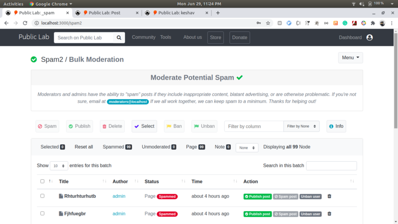
This week(coding period week 4) I worked on a few filters on the Spam management dashboard and improved UI as well.
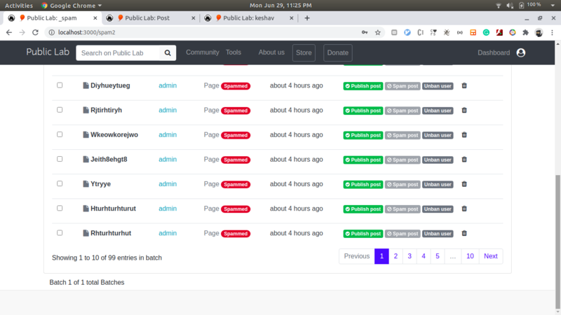
I have added a will_pagination gem on all the pages of the spam management dashboard for faster load. I have divided all the nodes into batches of 100 where a moderator can moderate 100 nodes at a time. This will reduce useless loading and improve moderation experience.

You can find this in following PR https://github.com/publiclab/plots2/pull/8063
Here You can find some new UI changes as well.
This week I also worked on Digest settings where moderators can choose digest timings from the notification settings page.
https://github.com/publiclab/plots2/pull/8058


Next week I am planning to work on Queue and Flag posts. I will also work on some tests and UI for digests as well.
The following are the Screenshots of the Latest version of Spam management Dashboard


You can find my overall progress at https://github.com/publiclab/plots2/issues/7885
and list of my major PRs at https://github.com/publiclab/plots2/issues/7885#issuecomment-651213285
Thanks for reading.

2 Comments
Thank you @keshav_sethi0004 , this is incredible progress and it's great to see! I shared the link to /spam2 with the moderators group a few days ago, and here's what we heard back from @stevie
Hi neat! Lots of good work here. It took a bit for it to load for me, so I found myself guessing what each button did before I had a chance to interact with it. I found myself wanting to know if some were filters and others actions. I did figure this out once I was able to interact with it, but it might be good to label them as such on the page so people don't have to click things to find out.
Between the two button lines - top radio buttons on actions and second line, there's a lot. I might recommend we consider reducing these. Here are some thoughts I had on them
Top bar: - what does "delete" do? I can't imagine we want to delete from the page, just mark spam and publish. I could imagine if we have both, we could end up with different practices if some people delete posts and others just mark as spam. - I'm not sure of the usefulness of "select" - what purpose does it serve? - I'm also not sure I know the difference between "spam" and "ban." I thought they did the same thing in our system right now?
Second bar: - I'd move the "reset all" button to the far right of this row since there are filter functions after it. It's a little confusing in the middle. - The "unmoderated" button is new and probably helpful. - What are the "page" and "note" ones? is that research notes vs wiki pages? I'm wondering if this would be a more useful identifier in the table itself rather than as a button filter feature. I might move those two buttons to be part of one of the dropdowns rather than filters that stand out on their own.
Dropdowns: - There seem to be a lot of filter functions, some in the bar itself, and two spaces to sort by in dropdowns. I would probably pick between the two drop down menus - The one in the top bar or the one in the bottom. - I'm not sure how the sort by "title" and "author" one would be helpful, just because we'll have so many, I see those being more useful under the search function rather than in the sort by function.
Table: - Same questions with the usefulness of sort by title or author. Since we have so many, it's not useful to us without support of something like an alphabet to sort from. I think a good search feature for those could get rid of the need for this feature, unless it's made more useful by something like an alphabet.
Lots of good work here! No need to answer everything I asked, just food for thought. Thank you!
Is this a question? Click here to post it to the Questions page.
Thanks @liz and @stevie for your reviews.
Hi neat! Lots of good work here. It took a bit for it to load for me, so I found myself guessing what each button did before I had a chance to interact with it. I found myself wanting to know if some were filters and others actions. I did figure this out once I was able to interact with it, but it might be good to label them as such on the page so people don't have to click things to find out.Between the two button lines - top radio buttons on actions and second line, there's a lot. I might recommend we consider reducing these. Here are some thoughts I had on themI have removed page and note filter as it is not of much use as a separate wiki page is already there. I have also removed the hide column and specific search feature as it is similar to another search in that page feature.
Top bar: - what does "delete" do? I can't imagine we want to delete from the page, just mark spam and publish. I could imagine if we have both, we could end up with different practices if some people delete posts and others just mark as spam. - I'm not sure of the usefulness of "select" - what purpose does it serve? - I'm also not sure I know the difference between "spam" and "ban." I thought they did the same thing in our system right now?SPAM means marking node status as spam i.e 0 and banning that user. spam nodes will be in the database and can be restored in the future. BAN means just banning that user but keeping his posts. SELECT It means selecting all the items on that page. DELETE it justs delete that node. It will not ban that user. That node will be removed from database and can't be restored in the future.
Second bar: - I'd move the "reset all" button to the far right of this row since there are filter functions after it. It's a little confusing in the middle. - The "unmoderated" button is new and probably helpful. - What are the "page" and "note" ones? is that research notes vs wiki pages? I'm wondering if this would be a more useful identifier in the table itself rather than as a button filter feature. I might move those two buttons to be part of one of the dropdowns rather than filters that stand out on their own.I have removed Note and page filter as mentioned above.
Dropdowns: - There seem to be a lot of filter functions, some in the bar itself, and two spaces to sort by in dropdowns. I would probably pick between the two drop down menus - The one in the top bar or the one in the bottom. - I'm not sure how the sort by "title" and "author" one would be helpful, just because we'll have so many, I see those being more useful under the search function rather than in the sort by function.Sort and search are useful as per page items can be increased to 150. I am working on a global search as well. I will make a PR for this soon.
Thanks, @liz and @stevie for your review. They are really helpful.
NOTE I working on a detailed document about the working of the dashboard.
Is this a question? Click here to post it to the Questions page.
Reply to this comment...
Log in to comment
Login to comment.