About me
My name is Rohaid Bakheet and I am an Outreachy applicant.
Affiliation: Outreachy
Location: South East United States
Project description
To redesign the UI of Infragram, the site needs to be split up and contained to relevant topics.
Problem
The issue being solved is making the Infragram site easier to navigate and understand for new and returning users.
Timeline/milestones
- Week 1: Getting familiar with the code base and UI, as well as working with the community to take in feedback and any comments. This week will also be spent refining this plan and talking to mentors.
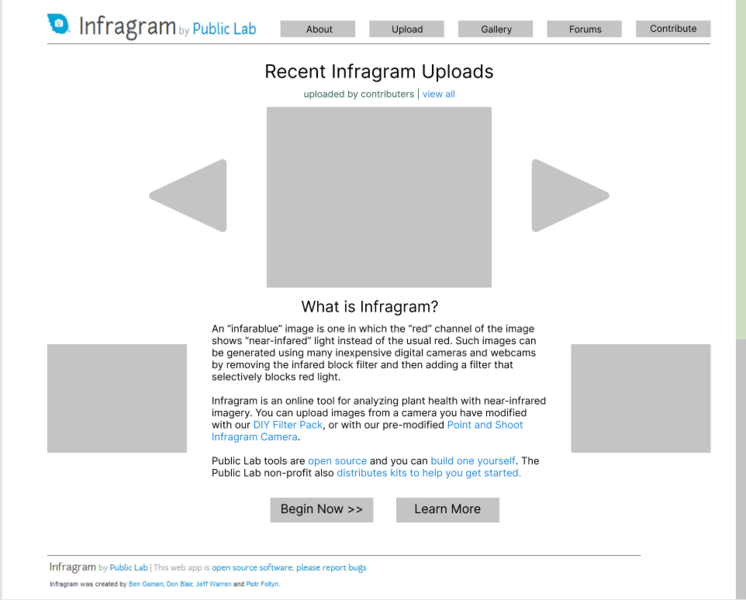
- Week 2: Adding a main bar for the key sections of information that a new user would want. Also, the main page would be reformatted to include a blurb on what Infragram is and what the site is for, moving the two pictures of an example Infragram photo lower on the page, and placing two buttons that directs the user to the Upload page and to the About page.
- The reason the main page needs to be reformatted is that the main page is cluttered with a lot of links and images with no clear focus on where a user can start. By cutting down the information on the main page to only recent uploads and a summary, it's less distracting.
- The header bar of buttons also neatly partitions the site, while also allowing users to go to different sections of the website without having to go back to the main page.
- Also, since getting familiar with the code base would require some time, I feel that this workload is appropriate for the second week.

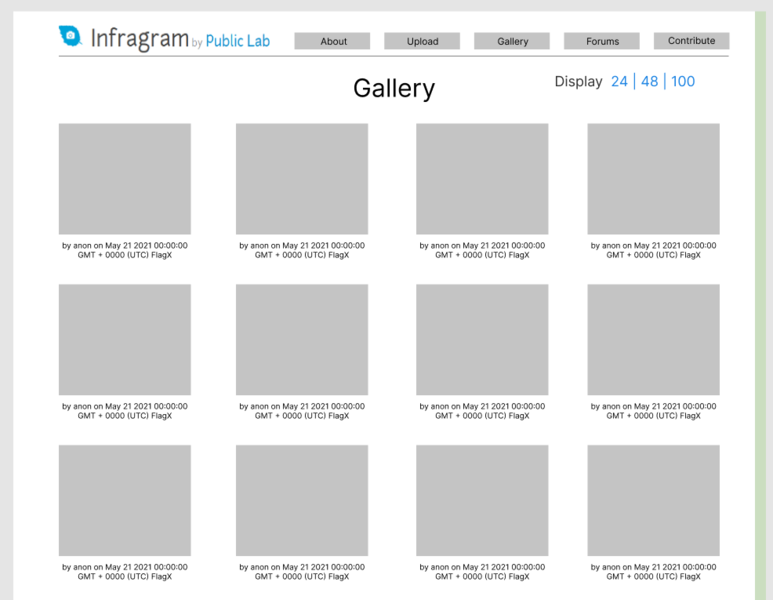
- Week 3:The main page will have a slideshow feature to see recent Infragram uploads and the gallery page will now include all the images that have been uploaded.


- As the gallery isn't so much of a new feature as it is moving the gallery section from the main page to a new one, the original code can be re-used. Also, setting the display count per page is a quality of life feature that users would appreciate.
- Week 4: This week will be spent on getting feedback from the community and tweaking according to the commentary.
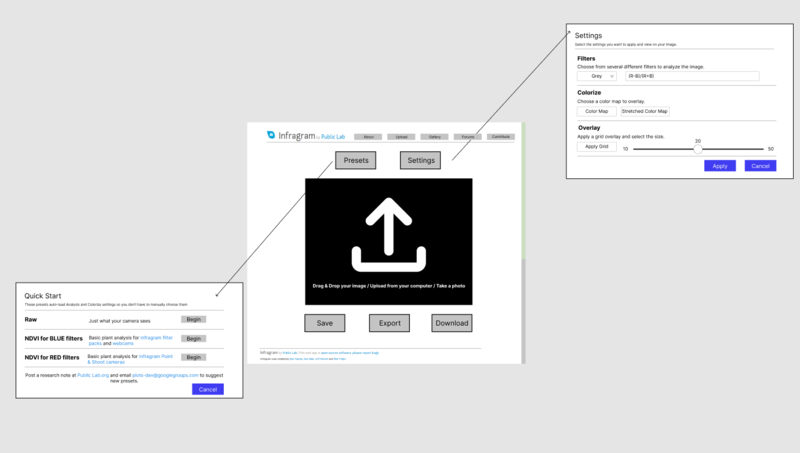
- Week 5: The upload page will be reformatted to include a drag and drop window, as well as re-arranging the control settings. The Quick Start modal will add a cancel button as the link is too small and easily looked over. The gallery section will also be removed as it already has it's own page.


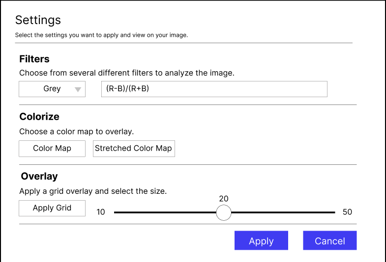
- Week 6: The settings button will have a settings modal open when it's clicked. This will compact all the settings on the usual Infragram page, as well as adding labels and descriptions. After this change is pushed, the rest of the week will be spent getting community feedback and tweaking changes.

- Weeks 7 and 8: Moving the FAQ section to it's own page, adding a New Post button and a short description. As the FAQ section leads to the Public Labs page, it might take extra time to trouble shoot and implement the necessary changes.
- With the time remaining left on Week 8, the image page will be reworked, and the menu bar will be formatted to match the style of the rest of the site.


- Weeks 9 & 10: There will be a description box added to allow for submitter's to include details regarding where the picture was taken, when, and any other information they see fit. This description will show up on the image page.
- I think this addition will aid users and specifically climate scientists, as currently the information given for each image is only the upload date, time, username and the photo itself. Providing the context of the photo itself could lead to wider community discussion.
- This addition is given 2 weeks as this will require working with the backend of the website to allow for additional information, and this addition is placed at the very end of the project incase of possible delays and is not necessary overall. This addition would also require community feedback and remove.
- Weeks 11 & 12: Filling out / planning the About page as well as the Contribute page. As the Learn More button on the Infragram page currently points to a page on Public Lab, I feel that it would be more cohesive to move that information to the actual site, as well as organizing it. Unfortunately, I'm not sure how to approach this so I'd appreciate any feedback from community and members.
- The Contribute page would be helpful for anyone who wants to contribute to Infragram, whether through Outreachy, GSOC, or working solo in open source. I wasn't aware of Infragram or Public Lab before applying, and those who post to Infragram may not be aware that they can contribute to the project as well. Having a page dedicated to giving contributers a guide to making a difference can increase involvement and improve the site as well.
- Weeks 13: Taking in community feedback, implementing changes, as well as finishing up documentation.
Needs
Since this project is big and my first internship/open source project, I'd like to receive guidance from mentors. I'd also need documentation regarding the site, how it's built, and how the backend works.
First-time contribution
- Comments, to show overall community involvement (like helping others): I don't have a link for this, but I contribute and talk frequently in the https://gitter.im/publiclab/publiclab chat.
- Closed PRs:https://github.com/publiclab/plots2/pull/10969
Experience
I have a Bachelor's in Computer Science. In university, I learned Javascript, C#, CSS, and HTML. I've worked on 2 different websites, all with Javascript, CSS, and HTML.
I worked on a team of four with a client to build a website that allowed professor's to upload games for their students. I made a demo game out of JS, CSS, HTML as well as Mozilla Together.js. The Github link for this project can be found here.
I also worked on setting up an online database to keep track of my and my coworker's skills for potential clients at my university. I worked with 2 other coworkers and I visually represented the data, implemented a search bar, and allowed for screen reader accessibility. The link for this project can be found here.
Teamwork
Outside of the projects I listed in Experience, I've worked on 6 demo games. On all of them, I worked in teams of 4 or larger. All of the code is open source, and 4 out of 6 of the projects are hosted on my Github. Outside of programming, for 5 of the projects, I was in charge of planning, communicating with team members, and making sure we adjusted for any setbacks. I find it important that all team members are on the same page and conflicts are resolved immediately as progress will be held back otherwise.
Passion
I applied for this project specifically because it dealt with the environment. As climate change is increasingly devastating the environment, I find it imperative to lend my skills where I can. I also wanted to work on Infragram because it is relatively free and easily accessible to the general public and I want to be a part of projects like this.
Audience
I want my work to help out anyone who wants to learn more about the environment and climate change. By simplifying and making the main website easier to navigate, it makes the website friendlier to new users and will lead to an increase of awareness in climate change.
Commitment
Yes, I am aware that this will be a full-time job. I plan to work a 36 hour work week, and will spend 6 hours/ 6 days a week. I choose to spread it out over the entire week as I don't have other obligations, and I believe 6 hours is good for work-life balance.

4 Comments
Hi @rohaidb, I really like the mock-ups ❤️ ❤️ I like the structure of your proposal, I like the way you have explained the tasks and solutions on the weeks, It feels like a discussion, which I really enjoyed reading. On the weeks(e.g
Week 1) maybe bold them or add some white spaces between the weeks for an easier find. You could also add a lsome description of the Infragram project and how its relation/effects of this project on the "Project description" section. Great proposal and thanks for postingReply to this comment...
Log in to comment
@cess Thank you for the feedback and taking the time to read my proposal! I'll take your advice and make the page easier to read, and add more information in the Project Description section. I had kept it to less than 20 words because that is what the proposal template said to do but I'll do that now.
Reply to this comment...
Log in to comment
Hi @rohaidb, thank you for your proposal! Just a few notes and questions:
For the front page, your analysis is right on. I do want to note though that since all the images are stored actually on PublicLab.org, we are a little limited in how we can display them -- they're in an iframe of this URL: https://publiclab.org/embed/grid/notes:grid:infragram-upload
So perhaps we could set up a new route to fetch the images from PublicLab.org in JSON or CSV format, and display them using JavaScript... but it's a question whether it's worth it for the "image carousel" you have on your front page design. Maybe we could just show a featured image of our choice and then the same iframe below? I'm interested in your ideas on this, I'm not committed to any particular choice yet.
Likewise, the pagination shown on the gallery page would be tough given we're working with an iframe. That's why we link to "View all" because the destination page has pagination. It's not perfect but it's also not terrible, you know?
I'm curious about what you think of the potential for a responsive layout for the image analysis page which has a toolbar with buttons like Presets, Run, Save, etc. It's got a lot of content and can be overwhelming to people. How might we design a full-screen, edge-to-edge layout (like https://photopea.com/) which could better organize these tools and also make better use of screen real estate? Do we really need the big white areas to left and right?
I really like your idea to have a link to "open in instagram sandbox" and I wanted to suggest that we could imagine a feature like that as an extension to PublicLab.org, where the images are stored. We might, however, need to think of how we could store the original image as well, because you can't re-run Infragram on the output image, you need to work from the original. That might take some creative thinking!
Lots of good ideas here and some complications to puzzle through. Thanks for your proposal!
Is this a question? Click here to post it to the Questions page.
Hello @warren , thank you for your feedback!
With regards to the slideshow on the main page, I think that feature could be added at the very end of the Outreachy Internship period, as you mention that it would require working with the PublicLab.org code and experimenting. I like the idea of having a featured image, and in fact the image picked could be one that is the most viewed or reacted to by the community as a way to give a spotlight on contributors in the community.
As for gallery pagination, I was under the assumption that the site fetched the images from Public Labs and then was put on the page instead of an Iframe embed. I see that my plan is a bit difficult given those circumstances, but I do still think that the gallery should be moved to it's own page, as the embeds in different sections of the site is distracting. For now, I think it should be embedded on its own page.
I do like the concept of a responsive layout! You are right, the whitespace isn't necessary. However, I don't think that the Infragram photo processor would necessarily benefit from the same design and set up as Photopea. Photopea is set up so that there is enough space for the multitudes of tools and file settings a digital artist will need. Infragram only has 5 major functions a user would use: Upload, Settings, Run, Share, and Download. The upload tool can be represented by the drag and drop window, settings can be compartmentalized in the preset and settings modals or dropdowns, Share (or the save button on Infragram) directs the user to the Public Labs site, Run can be a button, and Download downloads the image to the user's computer, so there's plenty of room on the page to put three or four buttons along with the drag and drop window.
Here is a reworked upload page that takes into account the wider photo size on the page as well as reducing the amount of white space on the page. The modals will still open up when the corresponding button is pressed just like the previous design.
An alternative to that design can be one where instead of modals, there's a dropdown that extends to the right with the correct information/forms or a small window shows up with the respective information/forms. Here is a mockup down below.
Lastly, for the original image and opening it in a sandbox, I think a solution would be to require the user to upload the original image along with the processed one. Another way would be to allow the user to upload or not with the processed image. Definitely something to think through, thanks for bringing that up!
Is this a question? Click here to post it to the Questions page.
Reply to this comment...
Log in to comment
Login to comment.