(This template is for students applying to summer code programs with Public Lab. Use this link to start writing a post: https://publiclab.org/post?n=899&tags=soc,soc-2019,soc-2019-proposals You can delete this line once you've started filling it out.)
About me
Name : Radhika Saini
College : KIET Group of Institutions, Ghaziabad
Course : B.Tech
Location : India, Uttar Pradesh, Hapur
Language : English, Hindi
Email - radz.saini99@gmail.com
I am enthusiastic about learning real-world Open Source projects. It's my first time contributing to an open source project. I genuinely enjoy contributing to open source groups. I am already familiar with (C, Javascript, HTML, CSS,) or I am learning a new technology as I construct the solution. If chosen, I will be able to devote approximately 40 hours per week to the project, however I am willing to put in additional time if the work demands it.
Why Public Labs?
I've been looking for a challenging project to work on, and Outreachy 2022 seems the right fit. Looking through the list of organisations, the public lab infragram: online infrared image analysis in javascript, HTML, and CSS project seemed like a good fit. I've worked with other open-source groups before, but after considering their project ideas, I opted to concentrate on the Public Lab project. After consulting with the public lab community, this conclusion was made. It appears to be an excellent fit for achieving my project's objectives. It is planned to become a part of the Public Lab community not only for Outreach but also in the future. While being highly familiar with the application stack used by Public lab will give me a leg up on the learning curve, it will also allow me to have a more direct impact on the overall mission of the organisation.**
**
Project description
Public Lab is a tiny non-profit that helps communities that are dealing with environmental issues. Our work involves open-source hardware that has been produced jointly by our network of community groups, environmental advocates, scientists, and organisers, and the software we provide helps them collect, analyse, and comprehend environmental challenges. The infragram project brings together a number of distinct initiatives to make infrared photography useful for Do-It-Yourself plant health comparisons.
I'm interested in the project About Infragram.org full-screen UI and video upload, so here's how I'd approach is:-
People using Infragram-modified cameras can send photographs to Infragram.org for analysis and conversion using techniques like NDVI (used in satellite imaging analysis). It can also stream live video from a modified webcam.
Abstract/summary (<20 words):
The goal of this project is to improve the user experience by correcting or adjusting components of the user interface. Because of the reduced item count and UI adjustments, these changes may be beneficial to users who only use a keyboard.
Problem
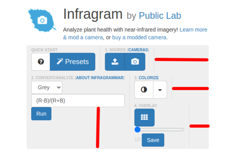
I examined the current UI of the infragram web page and discovered the following issues:
- When someone visits this website for the first time, they will be unsure where to begin because the pieces are not organised well. As a result, we need to create a better user interface that is more organised and pleasing to the eye.
- There is a lot of white space, and the parts are too close together, which makes them look cluttered and confuses the user. The header and all other components must have some space between them so that they do not appear cluttered.
- When a user needs assistance, the Ask a Question and Help buttons should be placed together so that they may simply navigate through it. The use of varied text in a single line and a smaller font size do not seem nice.
- The footer section comprises only two lines and a link. We can easily separate them and group them together.
- In the mobile display
mode, the Quickstart, source, convert/Analyze, colourize, and Overlay elements
are all crammed into a single box, with unnecessary space between them. Between
the buttons and the placeholder, there is no space.


Solution
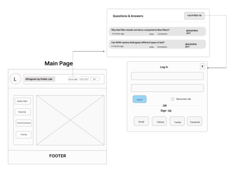
I created a user interface workflow to address the concerns with the current UI -
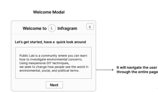
* I've created a welcome modal that will browse through the webpage to provide users a quick guide when they visit an infragram webpage.* The main page has a header with a help and buy button, as well as various popup elements with suitable margin and padding, such as quickstart, sources, convert/analyze, and overlay. There isn't any additional white space.
* I haven't used the cross-browser drag and
drop feature described in the project description yet, but I plan to learn
about it and incorporate it into the project.

Timeline/milestones
May 30 - June 4 (week 1):
Community bonding
Communicate and interact with mentor and/or community members to get a few suggestions and ideas.
Setting of working environment (Bootstrap 4)
June 5 - June 11 (week 2):
Learn about and understand the existing UI first
Understand the UI flow and goals, various different use cases
June 12 - June 18(week 3):
Discuss use case for the updated Mockup
Create Repository for the new UI design
June 19 - June 25 (week 4):
Create a wireframe and solicit feedback
June 26 - July 2 (week 5):
Allow cross-browser drag-and-drop on the entire page instead of just selecting an image
July 3- July 9 (week 6):
move Q&A feature into a Help menu
July 10- July 16 (week 7):
add a popup "Welcome" modal box
July 17- July 23 (week 8):
creating a working "mockup" interface with Bootstrap elements (that is not hooked up to JS yet)
July 24 - July 30(week 9):
Iterate with user feedback
July 31 - August 6 (week 10):
Implement the new interface in HTML/JS begin with an "index2.html" next to the original index.html
August 7- August 13(week 11):
Ensure each feature/function still works
August 14 - August 20(week 12):
Documentation of a working manual for external contributors and end user manual.
August 21-August 26(week 13):
Stretch goal: design a new colorize popup modal window to describe each colormap and offer thumbnails
Final evaluation feedback due.
Needs
For reviewing my work, giving criticism, and collaborating on a project, I'll need a mentor and teammates.
First-time contribution
I have Created the Issue and Found a Bugs at https://publiclab.org/
- Open issue 1: https://github.com/publiclab/plots2/issues/11014
- Open issue 2: https://github.com/publiclab/plots2/issues/11013
Experience
I began my coding career in 11th Standard of School, learning the C++ programming language. I've dabbled in web programming and learnt HTML, CSS, and Javascript, as well as contributing to a variety of projects with my frontend development skills.
Github Link: https://github.com/Radhika-Saini
Teamwork
_As an Intern at
Many Companies, I was able to contribute to a variety of initiatives. They've taught me a lot about cooperation and how to 'code and collaborate,' as well as how to build on community comments._
Passion
We live on a wonderful planet called Earth, which provides everything a living being needs to survive. It is, in my opinion, our responsibility to address environmental issues and maintain our mother nature, the Earth. I admire the Public Lab Community's concept, as well as their care for environmental issues and the remedies they devised. The concept of a project involving plant health, such as analysing plant health with infrared images, fascinates me.
The people in the community are extremely helpful and friendly. They assisted me every time I raised questions in the community channel during my contribution term. I'm really looking forward to working on this project.
Audience
The majority of Asia and Africa rely on staple crops, so it's critical to create a user-friendly design that makes navigation simple for them. I chose a colour scheme that is less taxing on the eyes and typefaces that are bold. The general design is geared on making Infragram a one-stop shop for any newbie looking to take advantage of its features.
Commitment
Yes, I recognise that this is a significant commitment, comparable to a full-time summer work. Other than that, I don't have any commitments. I shall devote all of my working hours to this project.
1 Comments
Hi @radz_saini99, it looks like the design you posted as a solution belongs to another applicant. Please read our guidelines about borrowing ideas:
_Originally Posted by @warren _
Reply to this comment...
Log in to comment
Login to comment.