See part 1 for design considerations. This note is on the function of the templates for Grassroots Mapping Forum.
Grassroots Mapping Forum consists of two one-sided broadsheets roughly 23"x35", folded down to 1/8th size, about the size of a standard letter sheet. The outer page is a black and white wrapper with the mailing info and the text of the Forum. The inner sheet is a full-color map.
The GM Forum templates are designed to allow collaborators with no graphic design experience to negotiate the division of limited page area, add in pictures, titles, and descriptions, and writing articles, then hand over the whole package to be finished for print with minimal effort from our staff.
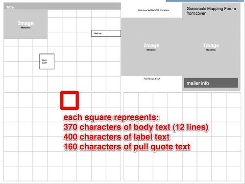
You will go from a drag and drop google docs template like this:
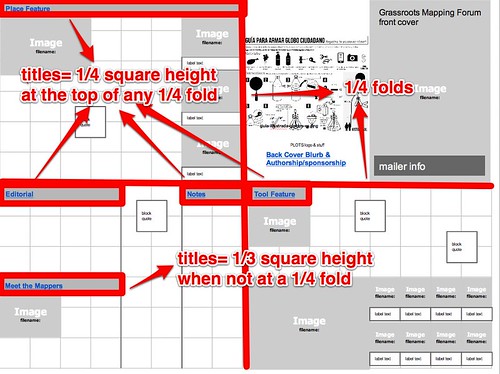
to something like this (grey boxes represent photos):
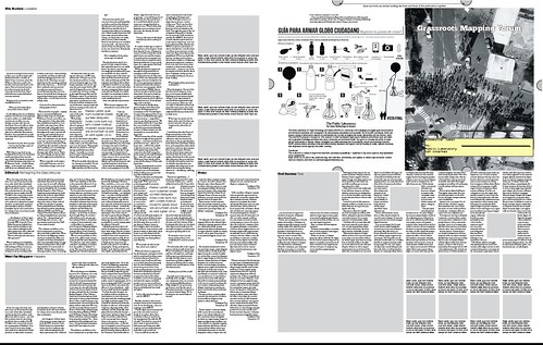
The templates are constructed around a strict grid (details below these instructions) as a Google Docs Presentation. Google docs is entirely incidental, I just chose it because its easy to use for online collaboration. We (the staff) will maintain the production files and compile the final print-ready document out of the templates.
The primary template page represents a full broadsheet, divided into a grid. The grid controls the width of text columns, and each grid square contains a defined amount of text.
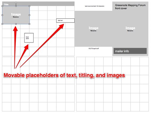
Using the template is simple. Divide up the page with lines for each article, following the grid. Add in titles and images, trying to keep them full squares of the grid. Once the page is divided up, calculate the amount of text that is needed to fill the article.
each square = 370 characters of body text, with spaces (12 lines) each full line break = -33 characters 400 characters of label text, with spaces 160 characters of pull quote text with spaces titles= 1/4 square height at the top of any 1/4 fold, 1/3 square in the middle of page (adding a line break
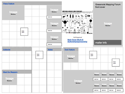
So, for example, in our prototype Forum, the Place Feature can be calculated like this:
Place Feature: How many squares are dedicated to the article? 6x8 + 6x2 = 60 to title space (height x width)? .25*8 = 2 to picture and label space? 2x3 + 5.5x2 = 17 to pull quote text space? 1+1 = 2
Totals: Body text= 39 squares= 14430 characters label text= 1 square x 3= 3 boxes @ 400 each Pull quote text= 2 quotations @ 160 char each
From there, users can create a google doc and check the character limit to make sure they are within the design constraints. When all the writing is completed, it will be trivial for a staff member to compile the print version of GM Forum.
Grid details All measurements in Picas.
Grid: each square = 370 characters of body text, with spaces (12 lines) each full line break = -33 characters
400 characters of label text, with spaces 160 characters of pull quote text, with spaces titles= 1/4 square at the top of the page, 1/3 square at middle of page.
Margins: 3p0 Baseline Grid: 0p10.8 Column Width: 12p4.5 column padding: 0p6 horizontal grid: 12 lines of baseline grid, 1 line of baseline grid padding the center fold.
image frame: 0p6 white pullout quote frame: 0p6 white article dividers: 1pt dotted line: 1pt dot, 3pt space.
Fonts: Body text: OFL Sorts Mill Gaudy TT, regular, 9pt, 10.8pt spacing Label text: Gilliam ADF No 2, regular, 9pt, 10.8pt spacing (-.5pt vertical offset) Title: ChunkFive, Regular, 14pt Subtitle: Raleway, Thin, 13.59pt Pull Out Quotes: Raleway, thin, 13.59pt, 16.8 spacing
Titles: on top of page: 3 lines in page: 4 lines
Paragraph styles: 1st line indent: 0p6 Quote indent: 1p0
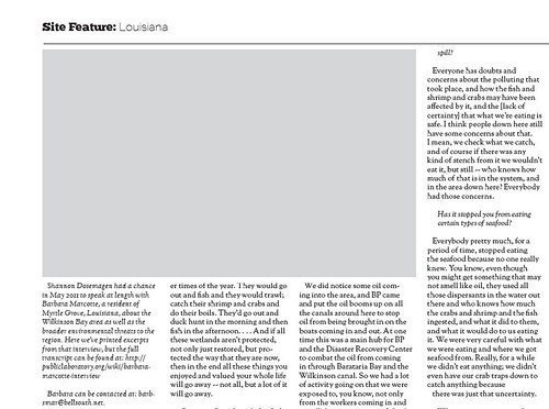
Interview style: interview questions: italic, quote indent, space above and below
FONT NOTES: all fonts are open source. The goal is to use a combination of Gaudy body text and Gil Sans titling. Since there is no complete Gil Sans OS font set, Raleway is used as a substitute for Light, ChunkFive for Black (its essentially Gil Sans with slab serifs), and Gilliam for labeling. These fonts have a few inconsistancies-- some work, some don't. Only Gillius has the proper lower-case g (which matches Gaudy) so the g's are out of place in ChunkFive and Raleway. Raleway has a W where the middle lines cross, like Gaudy, an addition wich is welcome. The fonts have some display issues, addressed simply by re-sizing, etc. I think the overall results are good.

0 Comments
Login to comment.