About me
Personal Details -
Name - Shefali Kanojia
Country - INDIA
E-mail - kanaujiashefali@gmail.com
Contact Number - 9076681077
College - National Institute Of Technology Hamirpur, Himachal Pradesh
Degree - Integrated M-Tech in Electronics and Communication Engineering (Dual Degree Course)
Year Of Graduation - 2024
Linkedin - https://www.linkedin.com/in/shefalik16
GitHub- https://github.com/shefali12-ab
Short Bio -
I'm Shefali Kanojia. I'm currently a third year undergraduate at National Institute Of Technology Hamirpur, H.P, India. I have started my opensource journey in 2021 by partcipating in Hacktoberfest. Uptill now i have contributed to frontend development and documentation related projects . I am still learning and exploring technologies.
Project description
The Infragram project brings together a range of different efforts to make Do-It-Yourself plant health comparisons possible with infrared photography. Infragram.org enables people with Infragram-modified cameras to upload photos for analysis and conversion using techniques like NDVI (used in satellite imaging analysis). It also allows for live streaming from a modified webcam. This project will overhaul the UI of Infragram to be full-screen and create space for new features like multiple resolutions of video, dragging in a recorded video instead of a still image for conversion, and pop up panels with Q&A, tips, tutorials, and more, so that they can feature more helpful guidance text.
Abstract/summary (<20 words):
To design a new or improved user interface for infragram.org which is a fullscreen with a toolbar, solicit and incorporate input from user community and allow cross-browser drag and drop on the entire page.
Problem
I have gone through the current UI of infragram web page , and found following issues with it -
- When the first time someone will visit this page, they will get confuse from where to start as elements are not placed in a good way So, we need to make a better UI which looks more orgainsed and pleasent to eyes.
- There is so much of white space and elements are placed too close that makes them look messy and confuses the user. Header and all other components needs to have some margin between them so that they cannot look messy.
3. Ask a Question and Help button should be place together so, that user can easily navigate through it, when needed a help. Smaller size of font and use of different text in a single line is not looking good.
4. Footer section just contains two lines and a link within it. We can separate them and allinged them in a good way
5. In a mobile view mode Quickstart, source,convert/Analyze , colorize and Overlay elements are just placed any where within a single box and has unnecesary space between them. There is no margin between buttons and placeholder.
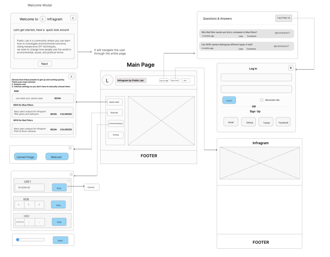
Mockup solution
I have designed a UI workflow which can solve the issues with current UI -
- To give user a quick guide when they visit a infragram webpage, I have included a welcome modal that will navigate through the webpage.
2. The main page contains a header with a ask for help and buy button and other popup element like quickstart,sources,convert/analyze and overlay with proper margin and padding. There is no extra white space.
3. I didn't use cross browser drag and drop feature mentioned in project description before, but i will surely learn about it and implement in the project.
Timeline/milestones
May 30 - June 4 (week 1) -
Interact with mentors and understand the project in depth.
Setting up the working environment .
Design a new interface (using Bootstrap 4; current version is Bootstrap 3) for Infragram.org which is full screen with a toolbar, solicit and incorporate input from user community
June 5 - June 11 (week 2) -
Learn about and understand the existing UI first and understand the UI flow and goals, various different use cases
June 12 - June 18(week 3):
Discuss use case for the updated Mockup.
June 19 - June 25 (week 4):
Create a wireframe and solicit feedback.
June 26 - July 2 (week 5) -
Allow cross-browser drag-and-drop on the entire page instead of just selecting an image.
July 3- July 9 (week 6) -
Move Q&A feature into a Help menu.
July 10- July 16 (week 7) -
Add a popup "Welcome" modal box
July 17- July 23 (week 8) -
Creating a working "mockup" interface with Bootstrap elements (that is not hooked up to JS yet)
August 24 - July 30(week 9):
Iterate with user feedback
July 31 - August 6 (week 10) -
Implement the new interface in HTML/JS (perhaps in cooperation with possible Google Summer of Code intern on corresponding project) - begin with an "index2.html" next to the original index.html
August 7- August 13(week 11) -
Ensure each component function properly.
August 14 - August 20(week 12) -
Create a documentaion of the project , which serves as a guide for new contributors.
August 21-August 26(week 13) -
Stretch goal: design a new colorize popup modal window to describe each colormap and offer thumbnails Final evaluation and feedback from mentors.
Needs
I will need a mentor and teammates for reviewing my work, for giving feedback and to collobarate in a project.
First-time contribution
I have introduced myself on welcoming page and made a request for FTO. I have successfully merged PRs, created FTO issues.
First Time Contribution: https://github.com/publiclab/plots2/pull/10909
FTO issue : https://github.com/publiclab/plots2/issues/11012 (closed)
Weekly Community Check-In : https://github.com/publiclab/plots2/issues/10948 (closed)
Experience
I started my coding journey in second year of college by learning C language and then switching over to C++ Language. In second year I have attended a workshop on Git, Github and version control that has given me a insight about opensource. I have explored web development and learned HTML,CSS,Javascript and used my frontend development knowledge to contribute in various opensource projects.
I have participated in Uplift project 2021 under C++ tech stack and i was one of the top performer under this tech stack.
I have participated in Script Winter of Code 2021 and contributed to three opensource projects related to frontend development.
I am a part of opensource project named Refferal Hub, I have worked as a frontend developer and designed the UI components and worked with a group of peoples.
Teamwork
I have worked with many opensource projects and collaborated with peoples
- The first project that I have worked upon is a website Women-in-Tech, I have designed the inspiration page of this website which uses React Js as a framework.
- The second project that I have worked upon is a website named Git Basics which is a progressive web app. I have created a opensource section which includes details about various opensource program. I have used ruby based Asciidoctor tool in this project.
- The third project that I have worked upon is a Aec Library Website in which I have added a Carousel Card Component for adding question bank and study material .and created a section for thanking people who have donated the books.
Opensource has provided me an opportunity to learn in public and collobarate with peoples which is a blessing for people like me to improve themselves.
checkout my github contributions here : https://github.com/shefali12-ab
Passion
We live on a beautiful planet Earth which has everything for survival of a living being. I believe that it's our responsibility to take care of environmental issues and protect our mother nature Earth. I love the idea of Public Lab Community, there concern about environmental issues and the solutions they came up with. The idea of project that concerns to plant health , anaylzing plant health with infrared imagery fasicinates me.
The community members are very helpfull and kind. During my contribution period they helped me every time, whenever i have asked questions in community channel. I am very excited to work on this project.
Audience
I live in India where agriculture is a primary source of many livelihood. Plant health plays a vital role in agriculture industry. Food , medicines, oxygen we breathe, paper almost everything we get from plants so, plants health is very important for sustainable agriculture and ecosystem.
I think this tool will help farmers, agriculture industry and everyone of us , so to reach wider audience we need to create better UI for this project which is easy to use and understandble.
Commitment
Yes, I understand that this is a serious commitment, equivalent to a full-time summer job. I don't have any other commitents . I will fully devote my working hours to complete this project.
6 Comments
Hi @kanaujiashefali, I am going through your proposal and I will leave another comment once done, It seems the links under Contributions are invalid, could you please check and update. Thanks for posting
Hey @cess Thank you for pointing it out, I have edited it. Now, it's working.
Reply to this comment...
Log in to comment
Hi again @kanaujiashefali , I really like your mockups. I love how you connected all the pages on the main image. The welcome modal looks great too.
On the Q& A I see you changed the design a little but wanted to mention the way we list the questions list is not changeable at the moment. You can leave it as is for now : just a heads up. This quote by Jeff from another review explains why:
It is okay that you kept your milestones precise but it would be great if you made them clearer e.g week 11 "Ensure each component function properly." I believe this includes fixing any bugs introduced so maybe include it too. Thanks for posting
Hey @cess I am going through quotes of jeff that you have shared. I will leave a comment after understanding it. I will include (fixing any bugs introduced ) in it. Also I need to include drag and drop feature in upload section. Can i share the link to my figma design with you here ? so that if you want me too improve my mockups i will include it too. Thank you so much for reviewing :) .
Is this a question? Click here to post it to the Questions page.
Reply to this comment...
Log in to comment
@kanaujiashefali it seems there is a duplicate post for this here. Could you please check. Thanks
Hii @cess yes , I'm deleting it.
Reply to this comment...
Log in to comment
Login to comment.