
About me
Name : Gautami Gupta
Affiliation : Integrated Masters in Computer science at International Institute of Information Technology, Bangalore
Location: Bangalore, India
Github: https://github.com/gautamig54
Email: Gautami.Gupta@iiitb.org
Abstract/summary (<20 words)
Through this project I aim to enhance the User Interface of Public Lab.
Problem
Improve the UI of Public Lab website and implement new designs, focused on the following pages :
Project description / Design Mock-ups
Dashboard
Dashboard is the most important page for a signed in user. It provides various functionalities like asking a question, posting an issue, viewing the comments, posts and questions.
Issue: The dashboard has an image leading to the Public Lab blog page which is a list of all the blog posts published by Public Lab. On the blog page, it is very tough to differentiate between the posts as there is no proper demarcation between the posts.[Reference to: Wireframe 1(a) - 2]
Proposed Solution: A better way is to implement a more user-friendly UI which will have carousel consisting of all the posts. Each tile of the carousel will have a title and a primary image to help the user navigate better. On clicking the particular tile, the user will be redirected to that post.
Issue: The Activity section on dashboard is cluttered as it displays the comments, posts, questions and events, all in one place.[Reference to: Wireframe 1(a) - 3]
Proposed Solution: I will improve the user experience by having a proper division of activities on the dashboard as shown in the wireframe 1(a). Moreover, I will redesign the UI to have two cards in a row as it is neater and more readable.
Issue: The dashboard also contains a different HTML card for comments made by the users. These comments do not provide any reference to the posts on the dashboard until users click on it, resulting in users being unaware of the post. Also, putting a huge number of comments on the dashboard will clutter it. [Reference to: Wireframe 1(a) - 3]
Proposed Solution: Improvement for this will be to remove the comments show card and include it in the research notes/wiki/questions HTML card.
Issue: Currently, the wikis are displayed in the sidebar.[Reference to: Wireframe 1(a) - 3]
Proposed Solution: Placing them with research notes and questions is a better option as it looks more organised.

Wireframe 1(a)
Issue: "Your work" link in the existing UI as shown in the figure below, directs the user to the profile page, whereas it should open the list of all the activities of a user on that very page.[Reference to: Wireframe 1(a) - 6]
Proposed Solution: I will add one more tab for "Your work" on the dashboard which will show a list of all the contributions done by the user.

Issue: The dashboard does not contain user-specific recommendations. [Reference to: Wireframe 1(a) - 5]
Proposed Solution: I will implement a more personalized dashboard with a tab "For you" containing the posts/wikis/questions filtered by the topics a user is interested in. User's interest can be figured out from the pinned topics they have added on their profile page or from the tags which they use the most in their activities.
UI Improvements to the Sidebar:
Issue: In the existing UI, the sidebar is not fixed.[Reference to: Wireframe 1(a) - 4,5]
Proposed Solution: As it contains important activities and information, I suggest fixing the position of the sidebar so that it does not move while scrolling.
Issue: To make the sidebar user-friendly and appealing.[Reference to: Wireframe 1(a) - 1]
Proposed Solution: I will remove the different buttons for creating questions/work done/issue brief and implement a single button for making an activity. Clicking on the "Activity" button will open a dropdown which will display the options of "Ask a question", "Share your work", "Create a new wiki" or "Write a new issue brief".
Issue: Sidebar does not contain a section on Trending topics and New topics.[Reference to: Wireframe 1(a) - 4]
Proposed Solution: Sidebar will also have a section of Trending topics and New topics. These topics will be based on the statistics done from the backend data collected from the users following the website.
Cards on Dashboard:
Issue: Cards have irregular sizes which look cluttered and unorganized.[Reference to: Wireframe 1(a) - 3]
Proposed Solution: Resize all the cards to be of the same size so that it looks organized and symmetric.
Issue: In the present UI, the topics/tags for research notes, questions, events are missing which is important for a user.[Reference to: Wireframe 1(b) - 7]
Proposed Solution: Suggesting to add topics/tags on the cards itself.
Issue: Missing a small description on the posts.[Reference to: Wireframe 1(d) - 9]
Proposed Solution: Adding a title for each post along with one or two lines of description. There will be a 'read more' button which will redirect the user to a separate page of that particular event/question/research note.
Issue: No like or upvote functionality.[Reference to: Wireframe 1(c) - 8]
Proposed Solution: Coming up with a "like" functionality for each card using the "acts_as _votable" gem. Also, a user can star, follow/unfollow, spam/not spam from the card itself, they don't have to go to the actual page for these actions. This will significantly make the website more user-friendly.

Wireframe 1(b)

Wireframe 1(c)

Wireframe 1(d)
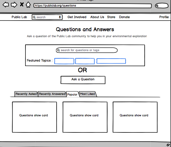
Questions Page
Users use the Questions page to ask a question or find answers, hence the fields related to this page should be given the utmost importance.
Issue: Presently after writing down a question, the user has to press continue which redirects the user to another page.
Proposed Solution: I believe that the experience of the user can be greatly increased if we add a modal on the screen. The user can add a question and its tags in the modal itself without going to another page. To encourage the users to ask questions we will provide a larger box for queries.
The question and answers displayed will follow the same card designs as mentioned in the dashboard design.(Wireframes 1(b), 1(c), 1(d))
Wireframe 2(a)

Wireframe 2(b)
Profile Page
Issue: The current implementation has an activity chart that shows the daily activity of the users. This chart will be very sparse as the users might not make contributions on a daily basis. [Reference to: Wireframe 3(a) - 1]
Proposed Solution: I suggest implementing a monthly or weekly activity graph as it would be more appealing to the user and would be relatively denser than the daily activity charts.
Issue: The sidebar containing user information is not fixed. [Reference to: Wireframe 3(a) - 2]
Proposed Solution: When you scroll down the profile of a user and then wish to follow that user, you will have to come back to the top to do so. It would be better to fix the sidebar so that the user's information is visible on the profile at all times.
Issue: Current profile page has the username after the activity chart. Thus, on scrolling down there is no mention of the username on the page.[Reference to: Wireframe 3(a) - 2]
Proposed Solution: I will add the username below the profile picture on the sidebar, which makes the name visible at all times on the profile.
Issue: As of now, the current profile page shows the live location of the user on a map.[Reference to: Wireframe 3(a) - 3]
Proposed Solution: I suggest that it is more relevant to mention the city and country of the user on the profile page. This makes the profile look cleaner and less crowded.
- Features proposed:
- I will add a feature that allows users to add a short bio so that it will be easy for others to get to know the user.[Reference to: Wireframe 3(a) - 4]
- I will add a category column where users can define the category under which they belong. Eg. SOC applicants, SOC mentors, Environmentalists etc. The category can be decided explicitly by the mentors and can be asked from the users when they sign up. This makes it easier for others to know the domain of the users.[Reference to: Wireframe 3(a) - 5]
- I will also add a "Recents" tab which highlights or displays the recent activities of the user.[Reference to: Wireframe 3(a) - 6]

Wireframe 3(a)
People's Page
Issue: Simultaneous view for contributors list and their map location
Proposed Solution: Redesigning the page into two columns, where on the left-hand side, the web page will have a list of all the members of Public Lab sorted in order of recent activity. While on the right-hand side the web page, it will have a map displaying the location of the users (by default), which is fixed so that a user can have a look at the map while scrolling through the members.
Adding filters on the map for better visualizations based on the following criterion [Reference to: Wireframe 4(a) - 1]:
- By activity: The map (scattered) will display areas of high activity to areas of lower activity. The member list will be sorted in descending order of activities.
- By category: As per the earlier suggestion in the Profile's page to add a category to users. The map (scattered) will display the areas specific to those categories.
Issue: No search availability.[Reference to: Wireframe 4(a) - 2]
Proposed Solution: Enabling it with a search bar which allows users to search on the basis of members name and location.

Wireframe 4(a)
Topics/Tags Page
The following design was given by Public Lab designers. https://github.com/publiclab/plots2/issues/5090
The page contains two columns where the left side has the list of all the topics (in the form of cards) sorted in descending order of its usability and the right side of the page has a "tags graph". Its nodes of the graph specify the topics.
I will implement the following on this page:
Issue: The search bar implemented for searching the topics search the content on the entire website instead of searching through the topics.
Proposed Solution: Fixing it to just search for topics.
Issue: No filter functionality on the graph
Proposed Solution: Below the graph, there are links through which we can modify the graph to have a particular number of tags/topics (nodes). Eg. on selecting 100, a graph with 100 nodes will be displayed.
My contribution in implementing this design can be viewed here as pull requests to the organization GitHub repository https://github.com/publiclab/plots2/pull/5209
- Adding the links below the graph
- Highlighting the active link.

Individual Tags Page
- I will revamp the UI of the Tags page to give the user a better experience.

Wireframe 5(a)
Other improvements and features to be added in the UI :
Issue: On the events page, there is no provision for the location of the event.
Proposed Solution: I intend to implement a map on the right sidebar of the events page, which will have pins pointing to the locations of all the upcoming events.
The calendar on the events page has dates marked for all the events. On clicking a date, a tooltip will open with short information regarding the event. This will happen along with a zoomed in view inside the map showing the location of the event.
On the blog page, it is tough to navigate through the blog posts as one has to scroll down through the whole page to find a particular post, which can be intimidating for the user. Implementing a more user-friendly UI which will have cards for each of the blog posts.
Adding a feature of deactivating/soft delete an user's account for a given time.
Working on translating the webpages into different languages.
All the pages on the website have high loading time. I wish to optimize the backend queries for the website which also enhances the user experience.
Timeline/milestones
May 7 - May 20 (Community Bonding Period)
- Understand Existing Code base.
- Discuss with the mentor about the best way to go about the implementation.
Starting with the questions page, as discussed with the mentors.


Testing:
Since, the project is based on UI improvements, it will require testing more often. I will be testing the implementations after every two weeks in order to proceed clearly to the other set of implementations.
First-time contribution
I have been contributing to Public Lab for a month now. Following are the Pull Requests, Issues and other activities that I have worked on during the month:
Experience
Technology stack : Ruby on Rails, Bootstrap, React js, Python, Javascript,HTML, CSS, Java, C, C++, Shell scripting, Ocaml, Prolog, Mysql, Postgresql
Operating Systems : macOS, Windows, Ubuntu
Other : Git
Courses : Software Development, Programming Languages, Operating Systems, Machine Learning, Networking, Visual Recognition, Automatic Speech Recognition, DBMS, Design and Analysis of Algorithms, Data structures.
Projects :
- Platform for Legal Queries(Ruby on Rails) A bridge between common people and lawyers. This website provides information about a case,e.g. what sections are enforced, what judgments have been passed etc. One can also hire lawyers here
- Abstract text summarizing (Neural Network and Deep Learning). A research project which focuses on abstractive summarization of a transcript using ANN(Artificial Neural network), RNN(Recurrent Neural Network) and LSTM(Long Short Term Memory networks)
- San Francisco Crime Classification (Machine Learning) Predicting the crime in the city according to the time and location using multi class softprob with XGBoost.
- Blog (Ruby on Rails) Implementing functionalities like user authentication, search bar, filtering etc.
- Mini Cab aggregator (Java) GUI and OOPs implementation. Booking a cab depending on the minimum distance of the cab from the pickup point. Pickup and the destination points are set by clicking on the screen.
- BattleShip Game (Python) A multiplayer battleship game with GUI (pygame).
Teamwork
"None of us is as smart as all of us." --Ken Blanchard
I have worked in teams of sizes varying from two to twenty. In my college, I have got be a team member as well as a team manager of the events/projects. I have worked in many academic projects of courses like Programming Languages, Machine Learning, Software engineering etc. which usually have 3-4 members.
I have taken part in many hackathons like FlipKart grid, SIH, AngelHack etc where we had to work in collaboration.
I was the designing head of the TEDxIIITBangalore where I managed a team of 20 people working on different tasks.
I am also a part of Alumni Committee, Internet Committee and the head of Dance Club and Visual Arts Club of my college, IIIT Bangalore.
Passion
I have always been a technophile and an avid learner. I delved into programming at the age of 15. I have developed a lot of interest in open source community. It all began from designing creative web pages, and now I have explored various tools for full stack development. I worked on a range of domains varying from Deep Learning to Web Development. I have always wanted to make a change in the society and I understood that in this era of automation and the extent to which people are dependent on the technical boons, pursuing this field can be my way of making a change. And hence, the idea behind Public Lab is to to mark a change and improve the environmental conditions attracted me to contribute to the project.
Public Lab provides me an opportunity to interact with experienced mentors from different parts of the globe. I always wanted to contribute to live projects and Outreachy provides a platform to be a part of innovative and creative projects.
Audience
Public Lab being an environmental research organisation, the main audience of it would be environmentalists. Other than that, Public Lab also facilitates environmental justice issues by monitoring the environment and advising communities facing any such issue. This invites users from all sectors, be it from a MNC or from a small community. Thus, to facilitate the user experience, one must look from the perspective of all users. We need to make the overall experience very simple for non-technical users, but keeping in mind not to make it too simple for technical users, which otherwise would make them feel the UI is "below their expected standards". My plans for the UI improvements take into account all the users of Public Lab. I plan to simplify and clean the UI so that users find it easy to use and have an overall great experience using the app.
Commitment
I'm confident that with this plan and with the right guidance from the mentors on how to proceed and how they want to implement the above application, I can improve Public Lab and make significant contributions in both Backend and Frontend. I will be fully devoted to the organisation as I do not have any other commitments to work on in the timeframe of Outreachy programme. I shall be devoting 40-45 hours per week.
Public Lab provides a very open and encouraging work culture. Through Public Lab, not only will I gain knowledge but also it will be a delightful experience and a matter of honour to be a part of such a renowned organisation while working on such a noble cause.
11 Comments
Great proposal Gautami! Really liked attention you given to the small details and nice designs.
Question: As per your proposal, the testing time would be at end but don't you think while working on such a project which involves designs and UI, testing should be done after each implementation? Also, see here - https://publiclab.org/notes/lekhidugtal/03-23-2019/soc-proposal-enhancing-the-ui-of-publiclab-and-relevant-changes-to-server#c23398 how we are thinking of taking user feedback.
Also, you work on tag page and other contributions are awesome, but you haven't opened any FTO issues. We really encourage interns to create some FTOs from their project so as to involve new contributors in their project and community.
Thanks!
Is this a question? Click here to post it to the Questions page.
Reply to this comment...
Log in to comment
@gauravano Thanks for your review! I have scheduled testing after each month, but I will change my timeline and include testing after every implementation. Also, I will open FTOs and help the new comers to get started on the codebase. In the meantime, I will look into how to take user feedbacks.
Reply to this comment...
Log in to comment
Oh, I just noticed June 17 - June 23 also has testing time. But, yeah, I believe it would be good to do testing after every 2 weeks or whenever an implementation is completed. Thanks!
Reply to this comment...
Log in to comment
@warren @cess Kindly review my Outreachy proposal. I am still working on ideas and functionalities for better user experience. Thanks!
Reply to this comment...
Log in to comment
@gautami_gg This is exemplary, and very engaging indeed!
Just a question though, how does your model cater to the engaging needs of the newer members of PublicLab, both technical and non-technical?
Thank you for sharing your proposal with us, great work! 👍
Is this a question? Click here to post it to the Questions page.
Reply to this comment...
Log in to comment
The wireframes are really awesome 🎉 . Great work 😃 !
Reply to this comment...
Log in to comment
@rexagod @sagarpreet Thank you so much for your reviews !!
Reply to this comment...
Log in to comment
Hi @gautami_gg, a very detailed and nice proposal. While going through this proposal I have some doubts :
I like the idea of showing the posts in the carousel form but what all posts are you going to show in carousal? Are you going to show some specific post or all the posts?
In a couple of places the references are incorrect I guess can you please correct them?
I think we can have a place where we show trending posts although we are already showing the trending topics, we can have a place where can show these. What do you think?
Cards design on the dashboard is very well thought and completing all the purpose without going to the actual page.
I think as you have moved the ask a question and wiki section to the drop down and to the tab respectively, there is plenty of space left in the sidebar when the drop-down button is not clicked. I think we can use that space too.
Is opening a model there a good idea because we won't be able to show as much data and posts we are showing in https://publiclab.org/questions page like"Recently Asked" and all sections. What do you think?
BTW very nice and well thought-out proposal. 👍 🎉
Thanks!
Is this a question? Click here to post it to the Questions page.
Reply to this comment...
Log in to comment
Hi @gautami_gg -- thank you so much for your proposal!
I like the thorough analysis you've given. Although we have provided some designs to be implemented, you have dug in deeper and found things we forgot, like:
I do encourage you to adopt more of the "look and feel" of the mockups we've provided, but I very much like your critical thinking about the details and usage, and like your wireframes!
If you'd like, you can use the components on this shared mockups file, copying the slides and rearranging things to see what your wireframes might look like in the visual style we're going for: https://docs.google.com/presentation/d/1TCZoTfuhamRVrUak8aDgqJAwSgyhRtZg2Pgacl2_4zc/edit#slide=id.g4e2261b4b2_0_0
I especially liked hearing about the legal queries site you mentioned. In some ways we are doing something similar for environmental problems, though not just consulting formal experts -- also building on knowledge from grassroots projects!
Thanks a lot!
Reply to this comment...
Log in to comment
@namangupta Thank you for your review and suggestions. The answers to your doubts are
I will be displaying the recent/most viewed blogs and not all the blogs. Say recent 6 blogs or something like that which will contribute to the good user experience.
Yes, you are right we can have a place to show trending posts. I can place then on the sidebar which will also help in filling up the extra space on the side bar.
Regarding the modal idea, it will be opened only when the user clicks on "ask a question". A user can visit the questions page for reading other answers or searching for particular answers.
Thank you so much for your feedbacks. I will revise my proposal and try adding more features which can further enhance the user experience.
Reply to this comment...
Log in to comment
@warren Thank you so much for your review. I went through the designs that have been provided by you on the https://publiclab.org/tag/ui-designs page. They were endearing. Should I add those designs as well to my proposal?
Is this a question? Click here to post it to the Questions page.
Reply to this comment...
Log in to comment
Login to comment.