About me:
Name: Somya Singhal
University: National Institute of Technology, Agartala
Course Major: Computer Science and Engineering
Year Of Graduation: 2023
Location: NIT Agartala, Tripura, India
Github: https://github.com/Somya-Singhal
Email: singhalsomya14@gmail.com
Contact: (+91) 9634707333
My name is Somya Singhal. I am a third-year Computer Science undergraduate at NIT Agartala. I am a self-taught developer. During my previous internships, I had explored the field of web development and machine learning but my interest gradually inclined towards web development. I am proficient in C/C++ and Javascript and was also enrolled in the course where I learnt MERN stack. After that I was really excited that I've spent my last few months completely immersed in remote development, building my own small projects starting from a blogging website, to-do list, portfolio and some other mini projects.
I like to collaborate with others and work in a team as the exchange of ideas happens and each idea has some best part in it, which at last when refined and combined, leads to a great step ahead.
I love coding because I love the problem-solving aspect of it, so I code daily. I am always eager to learn from others and from my part, honestly try my best to help others. I also love music, plants and art.
Project description
The Infragram project brings together a range of different efforts to make Do-It-Yourself plant health comparisons possible with infrared photography. Infragram.org enables people with Infragram-modified cameras to upload photos for analysis and conversion using techniques like NDVI (used in satellite imaging analysis). It also allows for live streaming from a modified webcam. This project will overhaul the UI of Infragram to be full-screen and create space for new features like multiple resolutions of video, dragging in a recorded video instead of a still image for conversion, and pop up panels with Q&A, tips, tutorials, and more, so that they can feature more helpful guidance text.
Abstract/summary (<20 words):
Design a new full-screen UI for Infragram.org and creating space for new features.
Problem:
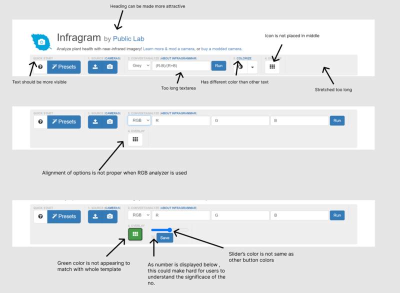
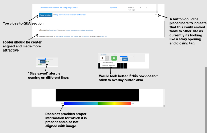
I have listed some issues(along with suggestions) that I noticed while looking through the Infragram website:
1. The main heading of Infragram could be made to look more attractive which would give a nice look at first sight to the user. The text above the options like Quick Start, Source, Convert/Analyze, Overlay are not properly visible and moreover the color of the "Colorize" option is different than Source, Convert/Analyze and Overlay options, so this could be modified. Another problem is that the grid icon is not properly centered in the Overlay button. We could also notice that in the right size the grey box is expanding to cover the area equally but it looks empty which could also be improved. When the user will choose the RGB analyzer, the alignment of all options gets disturbed as the "Overlay" option comes down and the boxes of "RGB" are expanded to cover most of the area, so this can also be taken into care. When we click on "Overlay" button, to highlight instead of green color any other can be used which would match with the whole palette. The number that is displayed to show the current value in the slider can be placed somewhere either just after the slider or can be made to hover when the user will take their cursor over the slider.
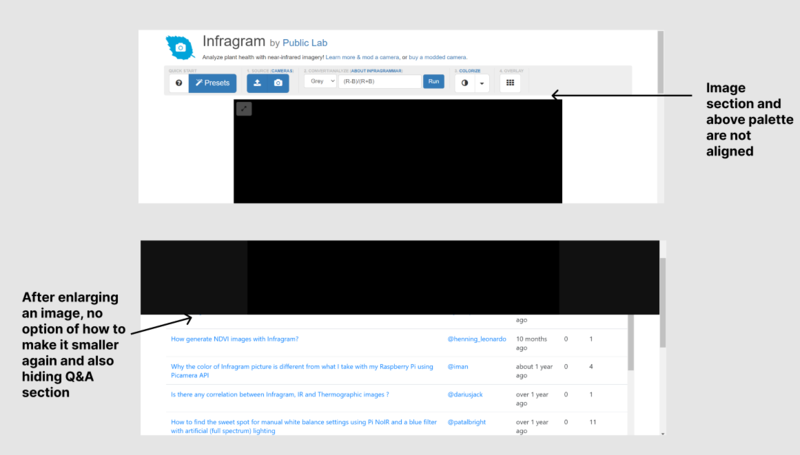
2. The image section where the user will upload the image and the options pallet above it could be made to come in alignment with each other so that the interface will look clean and in proper alignment. Another improvement could be made when the image is enlarged, it is covering the upper part of the Q&A section and also there is no button or any indication as to where to click to get back to normal image size.
3.
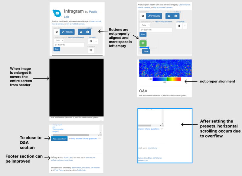
4. Responsive view can also be modified. Here are some issues that I looked at in the responsive view of the page.
Mockup Design:
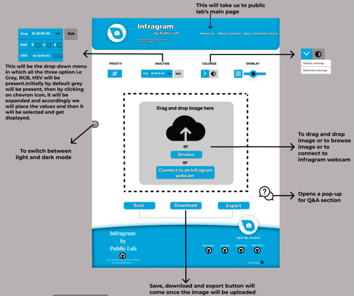
1. The new user interface of "Infragram.org" includes the following features-
- Firstly, I made the header look more attractive. In the header a menu bar will be present which has three options 1)About Us(this will take the user to infragram main page) 2)Mod a camera 3)Buy a moded camera.
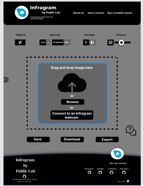
- Then, I made sure that whether the user chooses Grey, RGB or HSV, in all the three options alignment would not get disturbed. I implemented this using a drop-down menu that has all the three options and RGB and HSV also have a text area present where the user can enter the desired value in the provided area. After it's done drop-down will automatically collapse and the chosen option will be selected.
- I added a new feature that is to switch between dark and light theme so that users can switch according to their choice.
- As it was suggested in the idealist to add cross-browser drag-and-drop instead of just selecting an image so I implemented this in mockup design where the user can select between three-option: 1) To drag and drop the image 2) To browse the image 3) Connect to an infragram webcam
- I redesigned the footer section.
Here I have attached a presentation of the Mockup design to give an idea of my design:https://docs.google.com/presentation/d/1dhP-56pkVy440__tZ4rU9MLaS2pMr6fGgE4qabonh6I/edit?usp=sharing
UI of Infragram.org:
 __
__
Dark Mode
2. Next suggested change in the idealist list was to add a welcome model that would guide the user. Below are the step-by-step screenshots which would be exactly how the welcome model will be implemented to help the user. When the pop-up will come for any message, the area to which that message will be pointing(or where the user needs to click) will be visible and rest of the whole background will be blurred to prevent the user from clicking somewhere else.
Welcome pop-up (to ask whether a user wants to take a quick tour or not)

Step-1
Step-2
Step-3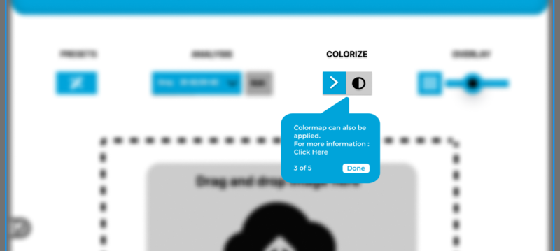
Step-4
Step-5
3. Next suggested change in the idealist was to move Q&A to help menu.I implemented this feature in the mockup design using a bubble which will always be present at the right bottom corner along the page as user scrolls through the page.Whenever user clicks on that icon, a pop-up box will be shown which will help the user to either submit their question or visit the Q&A page by clicking on the URL(provided their in the chatbox itself when conversation started).
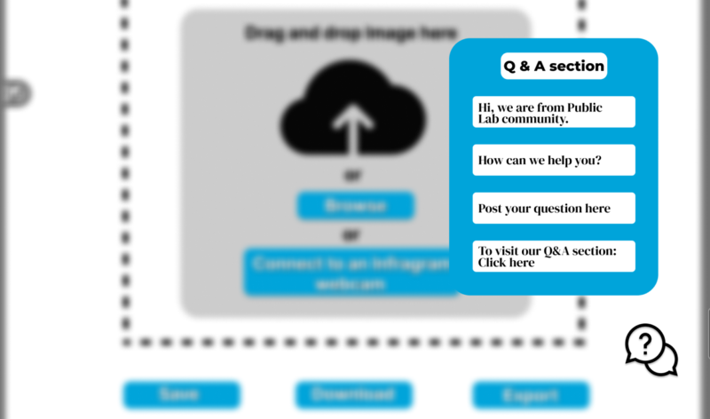
4. This is how the responsive view will look like.
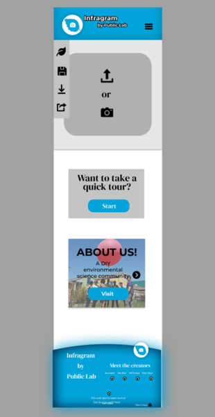
In responsive view the menu bar will be collapsible and here also in addition to the three options that were present in the desktop view an additional option will be present for Q&A section which will take the user to the Q&A page so that either he/she can submit their questions there or browse through previously posted questions.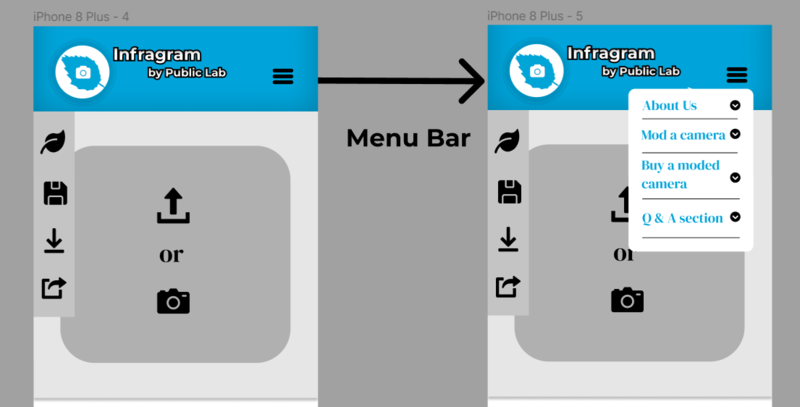
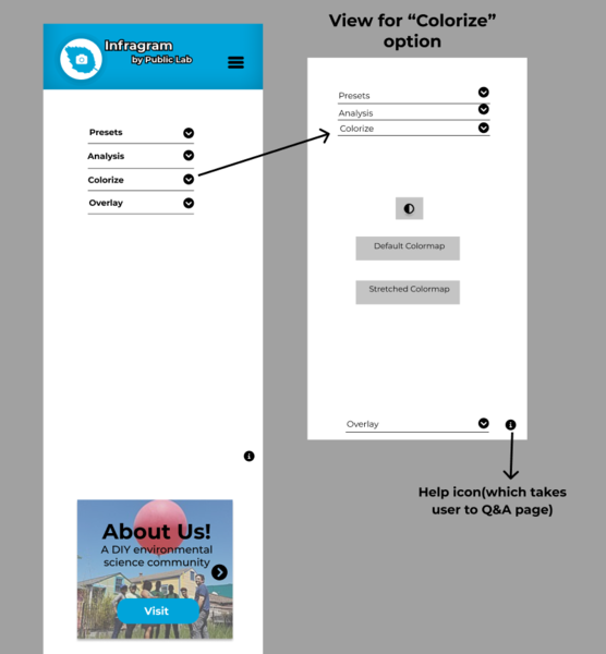
I have added this section which I thought of implementing as a slider(containing links to some useful resources related to infragram.org)

After clicking on the "Presets" option, the drop-down menu will be expanded and all information about presets could be seen. Similarly, for "Analysis", "Colorize" and "Overlay" options.



Timeline/milestones
Week 1(May 30- Jun 4)
- Complete onboarding to Public Lab
- Discuss how communication would be carried throughout the internship period
- Make changes to the internship project based on feedback from mentors
- Create FTO issue to update README with these changes
- Write a blog post (Outreachy's prompt): "Introduce yourself" or a different topic agreed with mentors
Week 2(Jun 5- Jun 11)
- Learn about and understand the existing UI first
- Understand the UI flow and goals, various different use cases
- Discuss the mockup prepared and make the necessary changes
- Create FTO's wherever possible
- Write a blog post to document the process
Week 3(Jun 12- Jun18)
- Create a wireframe and solicit feedback
- Add elements like menu bar,header and footer
- Create FTOs wherever possible
- Write a blog post (Outreachy's prompt): "Everybody struggles" or a different topic agreed with mentors
Week 4(Jun 19- Jun 25)
- Implement cross-browser drag-and-drop on the entire page
- Set up other elements
- Create a FTO related to these changes or any other suitable area
- Write a blog post to document the process
Week 5(Jun 26- Jul 2)
- Implement Q&A feature into a help menu
- Implement feature using bootstrap 4, breaking it down into smaller issues
- Creating FTO's wherever possible
- Write a blog entry (Outreachy's prompt): "Think about your audience" or a different topic agreed with mentors
Week 6(Jul 3-Jul 9)
- Implement a popup "Welcome" model box
- Add Javascript wherever needed
- Create FTOs wherever possible
- Write a blog entry to document the process
Week 7(Jul 10-Jul 16)
- Create final non-functioning mockup using minimal JavaScript and mostly HTML and CSS
- Document the UI changes to make hooking with JavaScript easier
- Write a blog entry (Outreachy's prompt): Mid-point project progress or a different topic agreed with mentors
Week 8(Jul 17- Jul 23)
- Implement the new interface and start hooking it with JavaScript by collaborating with possible GSoC accepted student
- Discuss with the community and fix bugs
- Write a blog post to document the process
- Create a related FTO if possible, or use another suitable topic
Week 9(Jul 24- Jul 30)
- Clean the code and use a uniform casing system to name files
- Hook the rest of the UI with the JS
- Fix bugs and create FTO's wherever possible
- Write a blog entry (Outreachy's prompt): "Career opportunities" or a different topic agreed with mentors
Week 10(Jul 31- Aug 6)
- Complete hooking with JS
- Ensure each feature/function still works
- Write a blog post to document the process
Week 11(Aug 7- Aug 13)
- Design a new colorize popup model window to describe each colormap
- Offer thumbnails
- Work on Outreachy's prompt: resume
Week 12(Aug 14- Aug 20)
- Buffer week to complete possible pending tasks
Week 13(Aug 21-Aug 22)
- Write final project progress blog post, highlighting achievements, pending tasks and further work
- Final feedback
* This feedback/improvement actually starts right after I publish this proposal, but this is when the internship officially starts.
** Blogging is going to be a key activity towards the documentation of the process. A post of this kind might cover a specific task of the week (i.e. something I struggled with), relevant thoughts, or pretty much anything I would like to share about that week's experience.
Needs
I will need the constant feedback from my mentors and the Public Lab GitHub community
First-time contribution
You can use links like these to show recent activity:
1. Overall community involvement (like helping others):
- https://github.com/publiclab/infragram/issues/300
- https://github.com/publiclab/plots2/pull/11044#issuecomment-1104971479
2. Issues
3. Pull Requests
| Pull Request | Status | Description |
|---|---|---|
| https://github.com/publiclab/plots2/pull/11031 |
Merged |
Noticed some warnings in style.css and resolved add the standard style rule in addition to the vendor-prefixed version. |
| https://github.com/publiclab/infragram/pull/275 |
Merged |
Enhanced the comments to be more readable in config.yml |
| https://github.com/publiclab/infragram/pull/330 |
Open |
Tried to make changes because I thought that the function was not written properly(i.e it was defined outside the scope of its declaration) and also found some syntax error. |
| https://github.com/publiclab/infragram/pull/324 |
Open |
Fixed the use of initMouseEvent as it has been deprecated. |
Experience
I've been coding for approximately two year. I started my journey by learning the most basic language C, then gradually I shifted to C++ , then my interest got inclined towards web development, so I explored a variety of technologies. First I tried my hands at building some basic websites using HTML and CSS. Then to add the functionality I explored Javascript ES6. After this, I learned and understood git, Github and version control. I also explored working with Linux based system where I learned to perform tasks through the command line. I found learning the Unix Command line and working with bash commands to be really powerful as it saves a lot of time. I was also fascinated after getting to know some popular CSS frameworks like Bootstrap, Tailwind and Materialize CSS to make the website responsive. I also tried my hands-on learning Jquery. While learning about the front-end development I was engaged in learning by doing which made me understand the concepts well and worked on the front-end part of some projects. Then I started learning about the backend development where I explored Node.js, Express.js, APIs, EJS and some databases like MongoDB. Currently, I am learning React JS.
Apart from Web Development, I have also explored Machine Learning where I worked to build a supervised ML model for well log analysis as a part of the project of my internship. This is the link to that project: Well log analysisI have made some projects as I mentioned above constantly during the period of my learning. The link to Github is: Github link
This is link of my Resume: https://drive.google.com/file/d/1yV6QNB3YflhAXUFuwsVNmH85FQsml0Tb/view?usp=sharing
Teamwork
I always enjoy working in a team. Below are some of the contributions that I made while working in a team.
During my internship at a startup, I worked with a team where we had to collaborate and make the designed UI to be implemented. During the whole duration of the internship, I was actively involved in getting feedback and asking for reviews of my design. After one project has been completed, my mentor was impressed by the way I was collaborating with all the team members to combine our ideas and then presenting the refined ideas to the mentors that I was assigned to lead the whole team for the rest of the duration during the internship.
During my college fest, I had taken part in "Aayam" where my team participated in the "Robowar Competition". It was a great experience collaborating with each other and designing the prototype. And the most motivating part was that we were the only girls team competing in this event, so I felt really proud that we had at least tried and initiated to do something out of boundaries.
I feel that teamwork can lead a project to success most of the time. While working in the team we brainstorm and put together all our ideas which leads to a great discussion and a comprehensive output. Anyone does not feel stuck to one problem and work could be completed within the scheduled time.
Passion
When I had gone through all the projects that Public Lab, I found that these projects are solving a real-life environmental issue which is a really major issue and also keep the affordability and user experience(accessibility) to be prior. These ideas immediately presented the perfect opportunity for me to apply the knowledge I acquired and excited me to seize this opportunity to positively impact the environment through my contributions to technology, creativity, and environmental issues-based project.
I love the way the Public Lab community is strongly bonded and the amount of interest and patience they show to help any newbie understand the problems whenever they got stuck and gives the enthusiasm of not giving up but instead keep on exploring and learning. The community's regular feedback allows us to brainstorm the ideas that could gradually be improved starting from a small initial thought. I believe that the whole process of learning with this community will be an exciting and unforgettable journey.
Audience
The Infragram is an Infrared Photography project which brings together a range of different efforts to make the affordable and Do-It-Yourself plant health comparisons possible with infrared photography to bring technology to power for everyday people from gardeners examining plants in their yards to organic farmers, wetlands activists and more. It helped them to look at the very complex biological systems and the more information that they can get about how they're functioning and midseasons allow them to make adjustments. After the BP oil disaster, experts were trying to look at the Infrared photography of the Wetlands but the existing tools were extremely expensive. This project not only is beneficial for experts but also sees the role of infrared photography in the home as well so geek gardeners can learn about the growth of their household plants.
This has changed the understanding of ecology around us from gardens and farms to rivers and coastlines nearest to us.
Commitment
My project will be my primary focus during my internship. I will dedicate 40 hours per week to my project for the 13 weeks of the Outreachy internship. I will be actively involved in asking questions, helping other teammates, contacting the mentors and will keep them updated by completing the work on time. My utmost goal during the entire period of the Outreachy internship will be to complete my project in the best possible manner.

4 Comments
Hello @mathildaudufo @warren, this is my proposal for Outreachy Summer 2022. Could you please review it?
Is this a question? Click here to post it to the Questions page.
Reply to this comment...
Log in to comment
as deadline is near, I do not expect you to implement the feedback now: this is smth you can think about or work on later
Hi @SomyaSinghal, I really likr your mock-ups and that fact that you included the dark mode that looks amazing is really awesome. I am in love the welcome modal mockups -- that you included all the steps wow! I appreciate your attention to detail, clarity and the work you put in your proposal 🎉 🎉 🎉 .
1 thing to think about: The elements on the responsive mock-up maybe some elements could be hidden/reduced or arranged better : I think there may seem like a lot happening esp on a small screen. what do you think?
Thanks for posting!
Is this a question? Click here to post it to the Questions page.
Hello @cess , I have updated the responsive(mobile) view of infragram.org in my proposal. Could you please review it and suggest the changes?
Is this a question? Click here to post it to the Questions page.
Reply to this comment...
Log in to comment
Thanks you so much @cess , for appreciating my work and giving detailed feedback. Yes, I also think that in responsive view, some elements could be arranged better. I will work on it and let you know once it's done. Thanks again for reviewing!
Reply to this comment...
Log in to comment
Login to comment.