Introduction
My name is Paul Ibeabuchi C (also Narudesigns), I'm a frontend developer and have some knowledge of UI designs. I am from Lagos, Nigeria. I studied computer science and work mostly with javascript and technologies around its ecosystem. I'm also very comfortable using design tools such as Adobe Photoshop, Figma and Adobe XD.
I have some experience contributing to open source as I was a volunteer member of the OSCA (Open Source Community Africa) design team, where I delivered print designs and also worked with the swags team for the OSCA FEST 2020.
I have coding experience as well, I have done a few internships but also was part of GADS20 (Google Andela Dev Scholarship) program.
I enjoy designing or coding but when I'm not doing any of those, you can find me sketching, playing the piano or reading.
Project description
Refine the Public Lab Rich Editor
Revamp the Publiclab editor's UI for better usability and also fix the code function in the editor to aid technical writing.
Problem Statement
While I think Publiclab Editor is a great tool for writing, I also think there's a lot of room for improvements to better the experience of content writers. The UI design of Publiclab editor needs refinements on areas such as alignments, padding and spacing, hover and active states, popovers and overlays and a few others which I will speak more on.
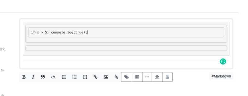
Also, the code feature in the editor needs some work, it lacks the proper quality of a coding editor such as line numbering, keyword colourization and a few other properties which I'd highlight as well later on.
This project will include 2 phases for the next 3 months of the internship.
The first phase will cover refinement on each section's layout (title, thumbnail image, location, text area and hashtags) as I will describe later on.
The second phase will focus on additional UI adjustments to make up for improper paddings and spacing, inconsistent styles like button sizes and background colours, active and hover states, popovers and related UI issues.
The final phase will be focused on fixing the code function in the markdown editor. The code feature isn't so great for technical content writers.
Proposed Solution
PHASE 1: REFINE EACH SECTION OF THE PUBLICLAB EDITOR
Each of these sections needs its preceding numbers to be renamed to a proper description of what the section is concerned about. For example, instead of having the number "1" in the title section, we can have "Title" and then have a different placeholder for more description. Also, other's like 2, 3, 4 and 5 can instead be labelled - Upload Cover Image, Add Location, Write Content and Add Tags.
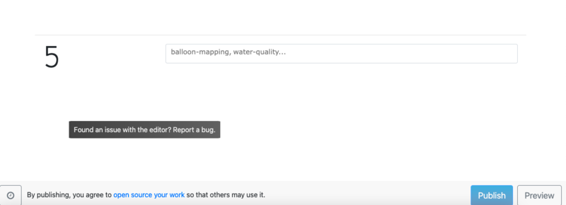
This is more descriptive than having numbers. Take a look at the Tags page when it's not in a hover state; one will be unsure of what the section is meant for:
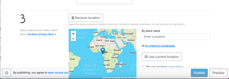
Section 3 (Add location) has some inconsistency with the z-index (the overlay priority). It has the map overlaying the publish/preview section:

Section 4 (Write Content) has inconsistent text area size for rich text and markdown modes. Though this is adjustable, a similar default height should be set for both modes.
Section 5 (Add Tags) needs the hinted section to be visible to users and not hidden by default as it guides them on the usage. Also in addition to its guide, it should mention to the user the need to have the tags separated by commas.
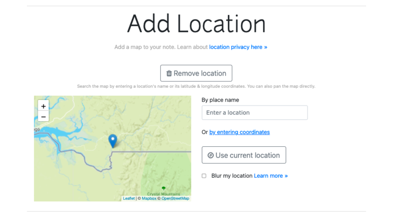
Here's what each section should look like at the end of this phase:
-------------SECTION 1--------------

-------------SECTION 2--------------

-------------SECTION 3--------------
-------------SECTION 4--------------
-------------SECTION 5--------------

PHASE 2: ADDITIONAL UI FIXES TO COVER FOR INCONSISTENCIES AND POOR UX
In this phase, I will cater for inconsistencies and make additional UI touches. Below is the list of UI changes I will be effecting:
Buttons
I will ensure similar border-radiuses, border-colours, text colours, paddings and sizes, hover and active states as well as focus states.

Popovers
Popovers don't close when the ESC button is clicked or when the page body is clicked. For example, the hyperlink, image and attachment popovers, I would expect it to close when the ESC key is hit or when the user clicks elsewhere on the page but instead the popovers only close when the page is scrolled.
You can replicate this by clicking on the hyperlink or image button and you'd see that there is no way to close the popover.
This is a sample of what gets stuck on your page:

Some popovers have improper overlay priority (z-index) making them overlay important areas on scroll. I will re-order z-index preferences so that popovers can scroll under the navigation bar. Because of this, they become a bit messy when they are all open. To address this, I will attach a keypress event listener and also a click event on the body to hide the popover when the ESC button or the page body is clicked. I raised these issues at issue - https://github.com/publiclab/PublicLab.Editor/issues/750
Please see the image below for more reference:
Hover and active states
Some elements have either inconsistent hover/active states or none at all. I will be attaching cursor pointers to clickable elements such as buttons, checkboxes, dropdown items and links on the https://publiclab.org/post page and also adding background colours for hover states.
See a sample image below:
 Overlap issues
There are some elements with improper z-index priorities. I will re-order the priorities and determine what overlays or underlays other elements to improve the writer's experience on the https://publiclab.org/post page.
See sample images below: 

Padding and Spacing
Some elements lack proper paddings and spacing. I will add proper paddings and margins to elements in this category on the https://publiclab/post page. This is an example of a page that begs for proper padding and spacing:
PHASE 3: FIX THE CODE FUNCTION IN THE EDITOR
This is the last phase and this phase is going to tackle the code function on the editor. The current code function makes it difficult for technical writers to write code snippets. There are 2 major challenges with the code function.
1. It re-instantiates every single time the code button is clicked and the output is unpleasant. Here's a view of what it looks like after clicking the code button 5 times:

2. It lacks line numbering, code indenting and syntax colouring. These features help technical writers to easily explain codes and also make them feel at ease as though they are in their regular code editor. To fix this, I will be utilizing Ace (https://ace.c9.io/) by embedding the code editor every time the code button is clicked.
Timelines and tasks
PHASE 1: Refine each section of the publiclab editor
Week 1. Dec 6 - Dec 13: Engage mentors and familiarise with files that I will be working with and making changes to.
Week 2. Dec 14 - Dec 21: Make changes to sections 1 and 2; the Title section and the Thumbnail Image (Set Cover Image) section. These changes include (but are not limited to_ alignments, resizing, renaming, layouts and repositioning as you saw in the images above for these sections.
Week 3. Dec 22 - Dec 29: Make changes to the map section where I will also do some renaming, alignments, positioning and layout as well. Also, ensure all button's active and hover states are consistent with other buttons on the page. Also work on tags section (section 5).
Week 4. Dec 30 - Jan 6: Make changes to the text area. Set same default text area height for aarich and markdown mode so that when the writer toggles, there is no unintended scroll. Also, realign elements, rename section title from "4" to "Write content", change layouts so that the text area spans the entire width and makes the user focus on it while writing. Make hint visible by setting visibility to visible or opacity to 1.
PHASE 2: Additional UI fixes to cover for inconsistencies and poor UX
Week 5. Jan 7 - Jan 14: Create a style library for buttons to accommodate for their sizing, text colour, border style, background colour, hover and active styles.
Week 6. Jan 15 - Jan 22: Apply button styles from buttons style library to buttons in each section (sections 1 - 5) including popovers in each section.
Week 7. Jan 23 - Jan 30: Fix z-indexes for all popovers in the publiclab.org/post page.
Week 8. Jan 31 - Feb 6: Resolve spacing and padding issues for popovers and other elements on the https://publiclab/post page.
PHASE 3: Fix the code function in the publiclab editor
Week 9. Feb 7 - Feb 14: Enable closing all popovers using the ESC button or by clicking on page body.
Week 10. Feb 15 - Feb 22: Make up for uncompleted tasks should there be any and review with mentor all contributions so far. Make necessary updates if need be.
Week 11 and Week 12: Study ace documentation on embedding code editors. Finally embedding Ace's code editor into the publiclab editor to accommodate for code function issues on publiclab editor.
Contributions
Here a my 2 cents to the publiclab editor so far
FTO issue - https://github.com/publiclab/plots2/pull/10326
Other issues
https://github.com/publiclab/PublicLab.Editor/issues/750
https://github.com/publiclab/PublicLab.Editor/issues/752
https://github.com/publiclab/PublicLab.Editor/issues/753

2 Comments
Hi @NaruDesigns thanks so much for your proposal! I really appreciate the careful UI/UX analysis here and like your proposed solutions. One thing is we've been really trying to get the editor to read compactly on mobile devices, so I'm curious about your ideas for that. Even on desktop it's maybe not as compact and streamlined as it could be.
That said, and as much as I agree that the design proposals are helpful, I was curious if you had thoughts about the testing issues we've faced and how to address them -- or even where in your schedule you would dedicate time to reworking our tests. They're quite important to the maintainability of the project and will also help to solve a few key bugs in the Editor, as they'll help us isolate and reproduce the bugs. Can you think about how these tasks will fit into your project plan? Thank you!
Is this a question? Click here to post it to the Questions page.
Thank you very much Warren. For smaller screens I will use relative font units which will scale down to fit in. I'm very concerned about responsiveness (when you have the time, please checkout my website portfolio's responsiveness https://narudesigns.netlify.app). Containers also will be relative sizes rather than fixed.
To accommodate for the tests, (thank you for pointing that out by the way), Will it be okay if I took out the code function to use the time to make up for tests for each of the UI changes? If not, I can adjust tasks for these tests to fit in by merging some tasks to fit in a week and making room for the tests. Once again thank you for the feedback, it is much appreciated!
Is this a question? Click here to post it to the Questions page.
Reply to this comment...
Log in to comment
Login to comment.