_This is a draft wiki page that will change frequently!_
## Understanding air quality data
[Question: What are some of the first things you do with air quality monitoring data to better understand it?](https://publiclab.org/questions/bhamster/10-22-2021/what-are-some-of-the-first-things-you-do-with-air-quality-monitoring-data-to-better-understand-it)
### Different kinds of air quality data
Becoming familiar with the kind of air quality data you have can help you on the way to figuring out what you eventually want to do with the data.
**Here are some questions to consider about the data:**
+ Is the data from a **sensor**?
+ Is the data from a stationary sensor 📍 or a portable one 🚶🏽🚴🏽 that was used at different locations?
+ Is the data collected continuously over time ⏳ 🔁 or only at certain times and dates 🕑 📆 (intermittently)?
+ Is the data for a **general outdoor area** 🏙️ (ambient air) or a **specific emission source** 🏭 (e.g., fenceline monitoring)?
+ Is the data from a **lab report** ⚗️📄 for an **air grab sample** taken at a specific place and time?
+ Did you **collect the data yourself** 🙋🏾♀️ or is it from an existing **database with publicly accessible data** 🔓 💻?
+ If it’s from an existing database, is the data from regulatory monitors or another monitor network (e.g., community monitors, low-cost monitor networks)
+ Considering the equipment used to collect the data, what are its **detection limits** and **data resolution**? (This could look like minimum and maximum levels for measurements ⬇️⬆️, and how small a change ↔️ the equipment can measure)
+ Is your data from **indoor** air 🏠 or **outdoor** air ☀️ (ambient)?
+ Is the data mostly **not numerical (qualitative)**?
+ An odor log or odor report? 👃🏽
+ An oral history? 💬
+ A visual observation? 👀 (e.g., soot, colored dust, smoke)
**More about different kinds of environmental data (not specific to air quality data):**
+ “[Kinds of environmental data you might have](https://publiclab.org/wiki/presenting-data#Kinds+of+environmental+data+you+might+have)” on the Presenting Environmental Data wiki page
+ “[Types of samples](https://publiclab.org/wiki/start-enviro-monitor-study#Types+of+Samples)” and “[Interpreting the data](https://publiclab.org/wiki/start-enviro-monitor-study#Interpreting+the+Data)” on the Start an Environmental Monitoring Study wiki page
_What other questions can help with understanding air quality data? Please edit this page to add more!_
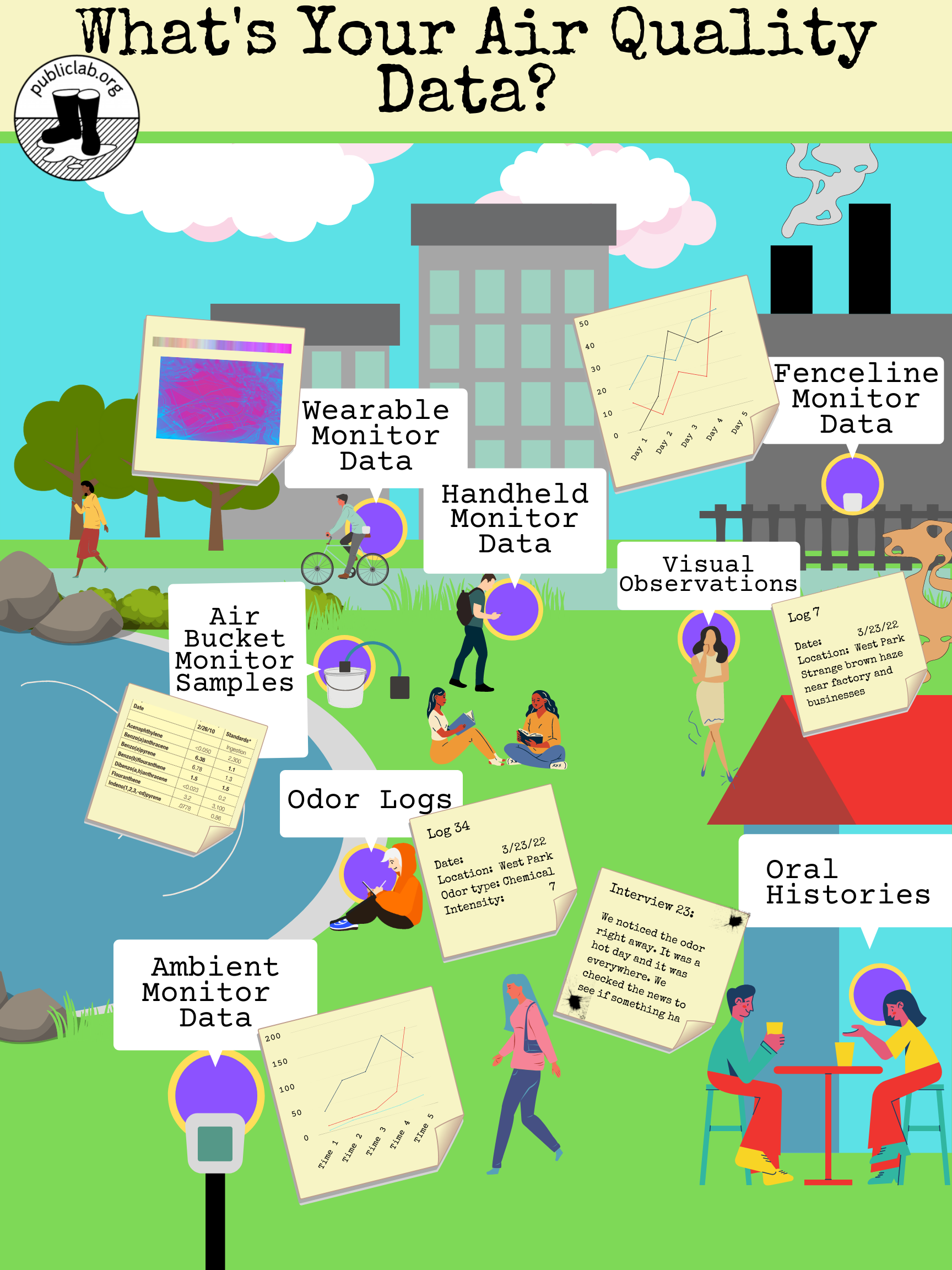 _Image: A variety of different kinds and sources of air quality data, by @renee._
### Initial analysis & visualizations to understand data
#### Units of measurement
Looking closely at units in data can help you understand the scale of your measurements and start thinking about how to communicate that scale so it’s meaningful to other people.
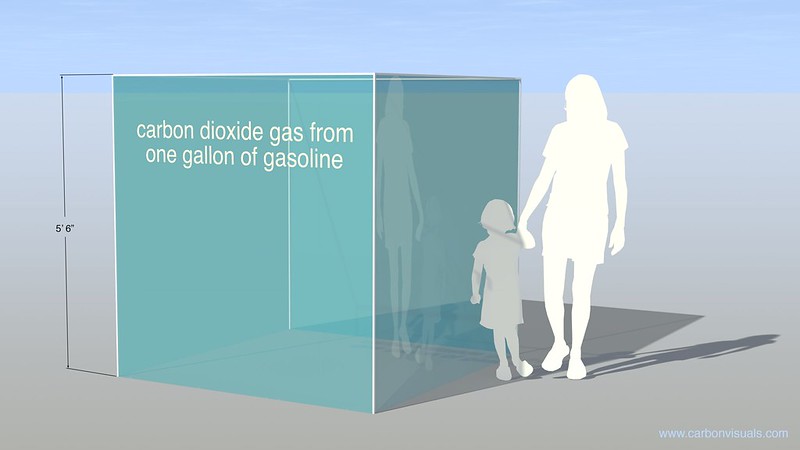 _Image: Illustrating the volume of carbon dioxide emitted from burning one gallon of gasoline. [Carbon Visuals](https://www.flickr.com/photos/carbonquilt/8228690605/), [CC BY](https://creativecommons.org/licenses/by/2.0/)_
**Resources on units of measurement:**
+ [Common Units in Air, Soil, and Water Testing](https://publiclab.org/notes/kgradow1/12-17-2020/common-units-in-air-soil-and-water-testing): a workshop guide from _[Statistics for Action](https://sfa.terc.edu/materials/activities.html)_ that helps "participants discuss, read, and practice using one or more units of measurement found in environmental science."
#### Making tables of tidy data
Putting your air quality data into an organized table gets it ready for making charts, graphs, and other visualizations. Below are some resources on making tables of tidy data and on "cleaning data."
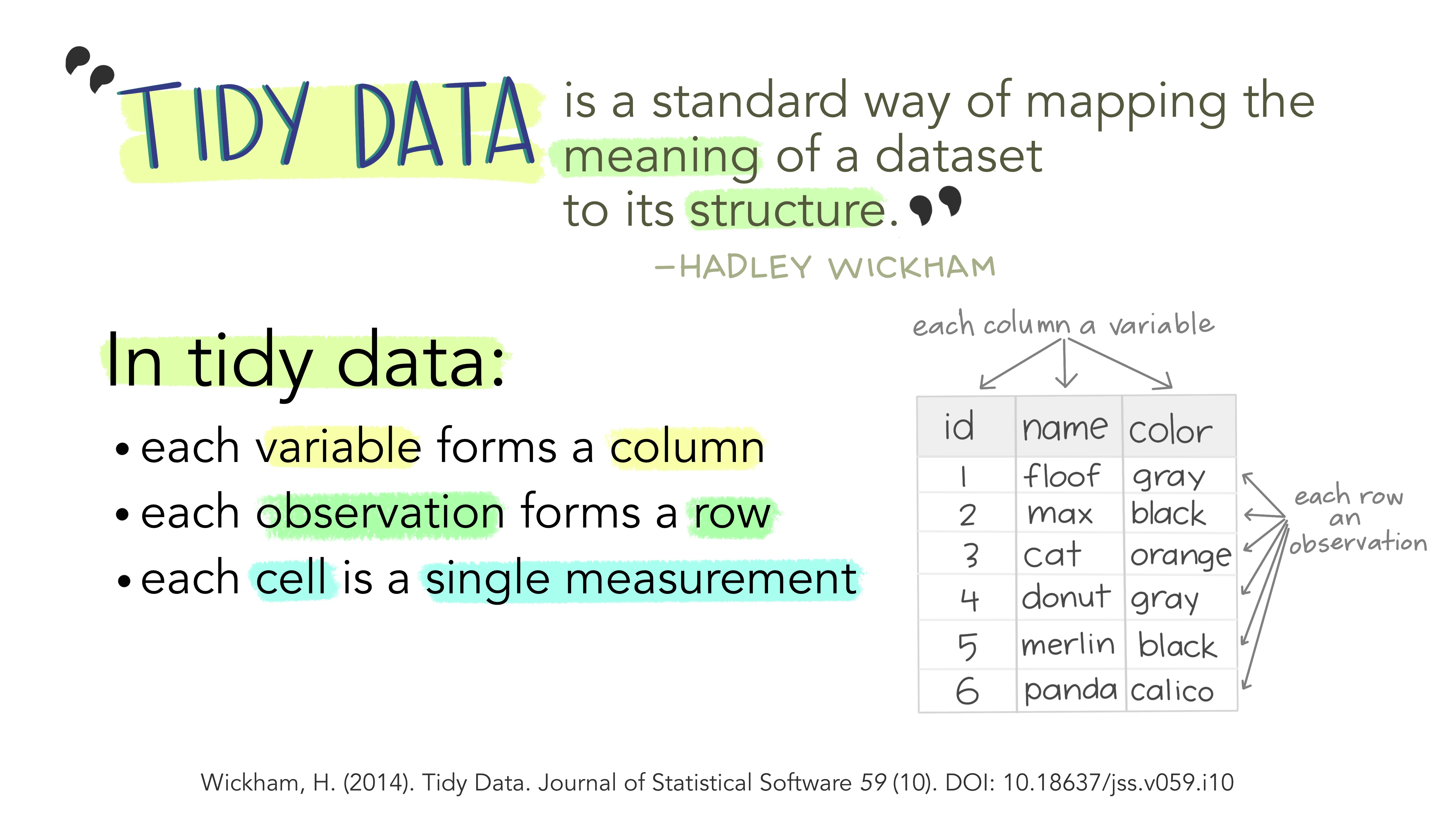
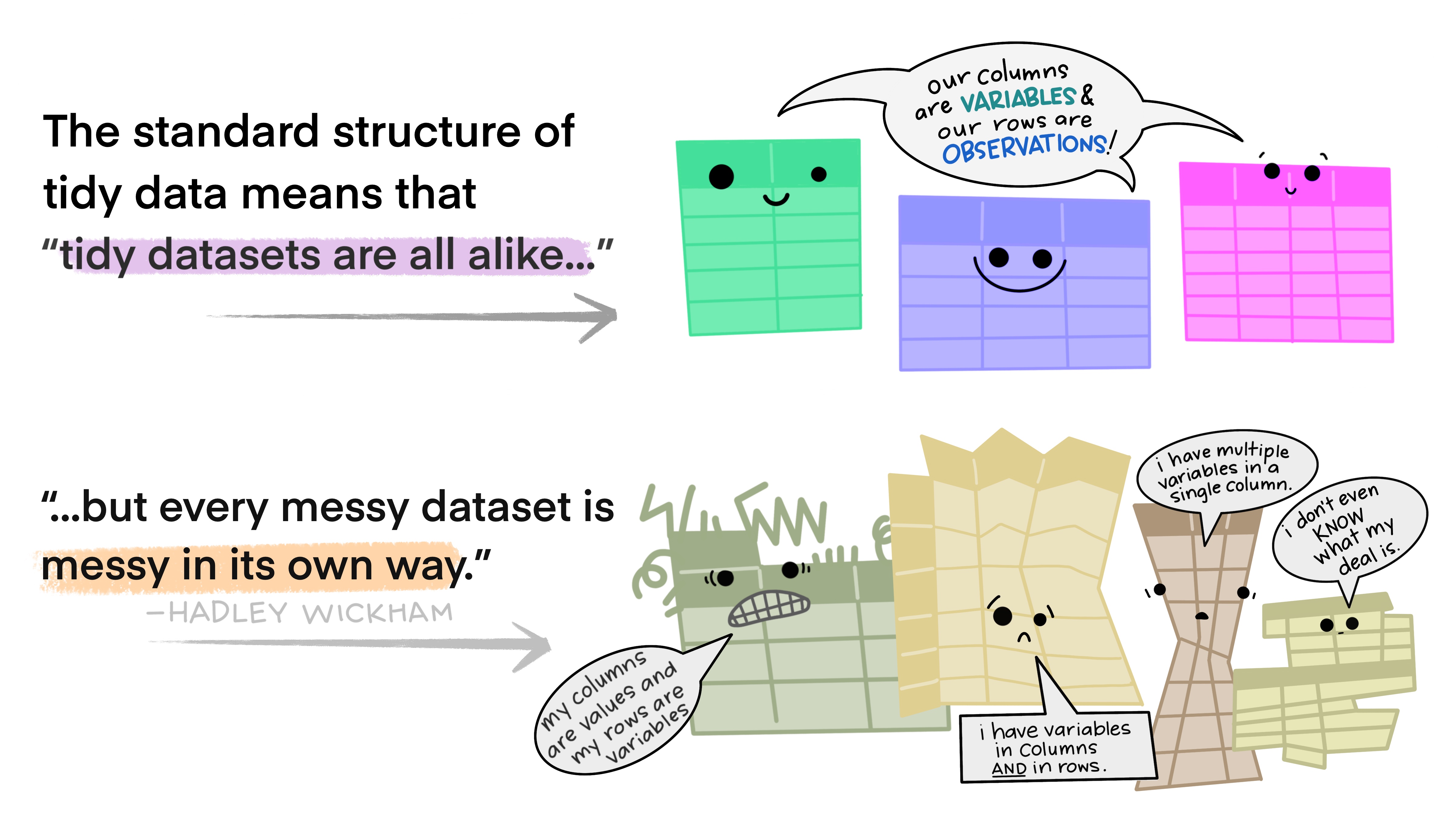
_Images: Illustrations from the [Openscapes](https://www.openscapes.org/) blog “[Tidy Data for reproducibility, efficiency, and collaboration](https://www.openscapes.org/blog/2020/10/12/tidy-data/)” by Julia Lowndes and Allison Horst, [CC BY](http://creativecommons.org/licenses/by/4.0/)_
An example of “tidy data” from an air quality sensor might look like this:
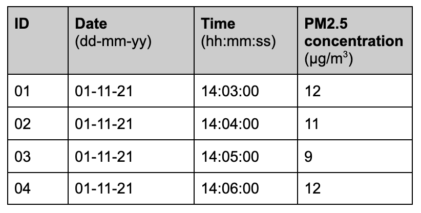
_Each variable forms a column_: sensor ID number, date, time, and the air quality measurement of particulate matter are individual variables. Each variable gets its own column in the table. The column header at the top lists the variable name and its units of measurement.
_Each observation forms a row_: this sensor took an air quality measurement every minute. Each measurement gets its own row in the table.
_Each cell is a single measurement_: each block in the table shows one piece of data--one time, one PM measurement, etc.
**More resources on organizing and cleaning data:**
+ [Formatting Data Tables in Spreadsheets](https://datacarpentry.org/spreadsheets-socialsci/01-format-data/): guidance and exercises from a [workshop session](https://marwahaha.github.io/2019-05-30-nas/) on “Data Organization in Spreadsheets,” from Data Carpentry.
#### Making visualizations to see trends and potential problems
_more to come here_
## Communicating with air quality data
### Designing a data story
_more to come here_
### Ways to present air quality data
_more to come here_
### Tools for making visualizations and other media
_editable table of tools coming soon_
### Communicating the data
_more to come here_
## Questions about air quality data
Questions tagged with `question:air-quality-data` will appear here
[questions:air-quality-data]
## Activities about air quality data data
Activity posts tagged with `activity:air-quality-data` will appear here
[notes:activity:air-quality-data]
## Further reading and resources
+ **[Data Viz Project](https://datavizproject.com/)**: a comprehensive online tool cataloging examples of data visualizations from the design firm Ferdio.
+ **[Data Carpentry](https://datacarpentry.org/)**: “Data Carpentry develops and teaches workshops on the fundamental data skills needed to conduct research.”
+ Wilson G, Bryan J, Cranston K, Kitzes J, Nederbragt L, Teal TK. 2017. **Good enough practices in scientific computing**. PLoS Comput Biol, 13(6): e1005510. [LINK to paper](https://doi.org/10.1371/journal.pcbi.1005510).